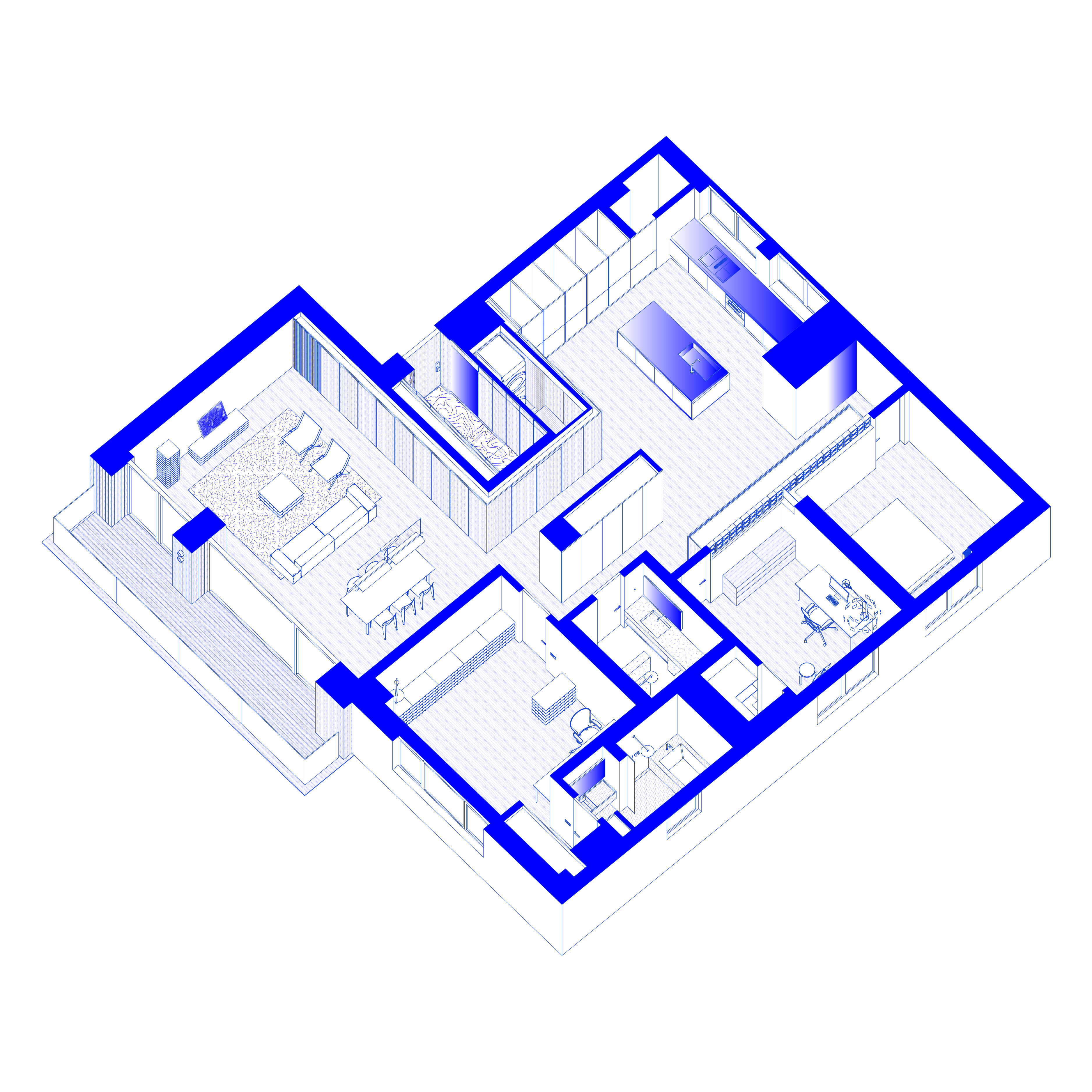
Itaewon House
Itaewon House
Period : 2023.09 - 2024.01
Team : SeungBum Ma, Minji Kim
Lighting Design : Studio Formgiver, Jiyoon Park
Construction : Artwork, Now & Here co. Ltd., JunBum Kwon (작품 오늘)
We live today amid constant stimulation and stress. For that reason, the home is meant to serve as a sanctuary for rest and renewal — a place where one can truly turn inward and focus on oneself.
A setting has been created to feel warm and comforting in daily life, while gracefully capturing the passage of time, the change of seasons, and the subtle movement of weather.
Each space has been refined through careful attention to the material’s inherent qualities, and composed with thoughtfully designed objects, light, and views — allowing one to immerse in the fleeting beauty that arises in everyday moments.
Even a brief moment can hold a deep and enriching spatial experience —
a precious value that only architecture can offer.
오늘날 우리는 끊임없는 자극과 스트레스 속에서 살아가고 있다.
그래서 집은 휴식과 재충전을 위한 안식처로, 오롯이 자신에게 집중할 수 있는 공간이어야 한다.
일상의 따뜻하고 편안한 배경이 되면서도, 시간의 흐름과 계절의 변화, 날씨의 움직임을 우아하게 담아내는 장소를 만들고자 했다.
공간별로 의도된 감각적 경험을 위해 재료의 물성을 세심히 정제하고, 신중히 디자인한 사물들과 빛, 조망을 두어 일상 속에서 이들이 만들어내는 찰나의 아름다움에 몰입할 수 있도록 했다.
비록 짧더라도 깊고 풍요로운 공간적 경험을 만드는 일 — 그것은 오직 건축만이 제공할 수 있는 소중한 가치이기 때문이다.
일상의 따뜻하고 편안한 배경이 되면서도, 시간의 흐름과 계절의 변화, 날씨의 움직임을 우아하게 담아내는 장소를 만들고자 했다.
공간별로 의도된 감각적 경험을 위해 재료의 물성을 세심히 정제하고, 신중히 디자인한 사물들과 빛, 조망을 두어 일상 속에서 이들이 만들어내는 찰나의 아름다움에 몰입할 수 있도록 했다.
비록 짧더라도 깊고 풍요로운 공간적 경험을 만드는 일 — 그것은 오직 건축만이 제공할 수 있는 소중한 가치이기 때문이다.
Foyer
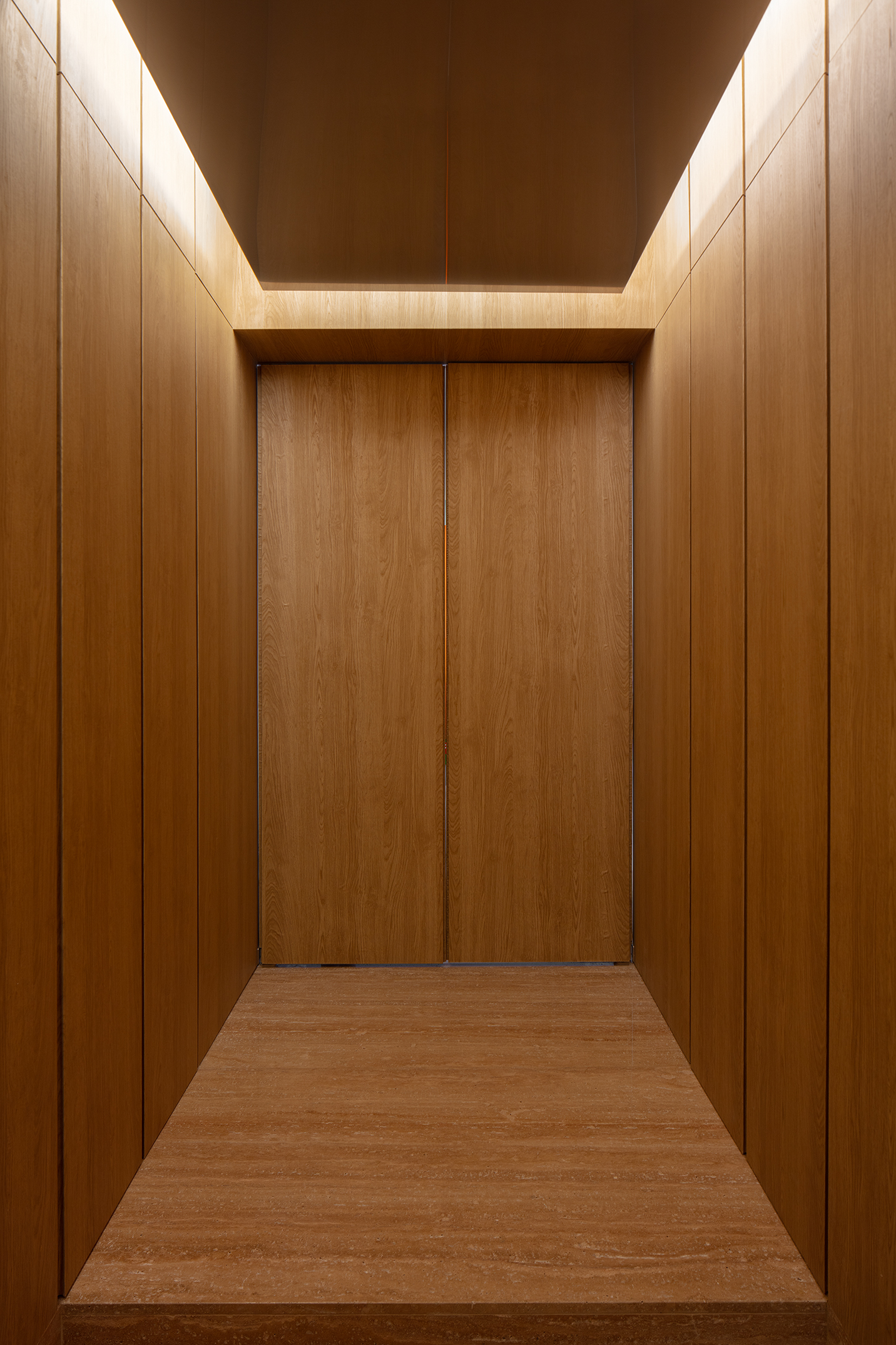
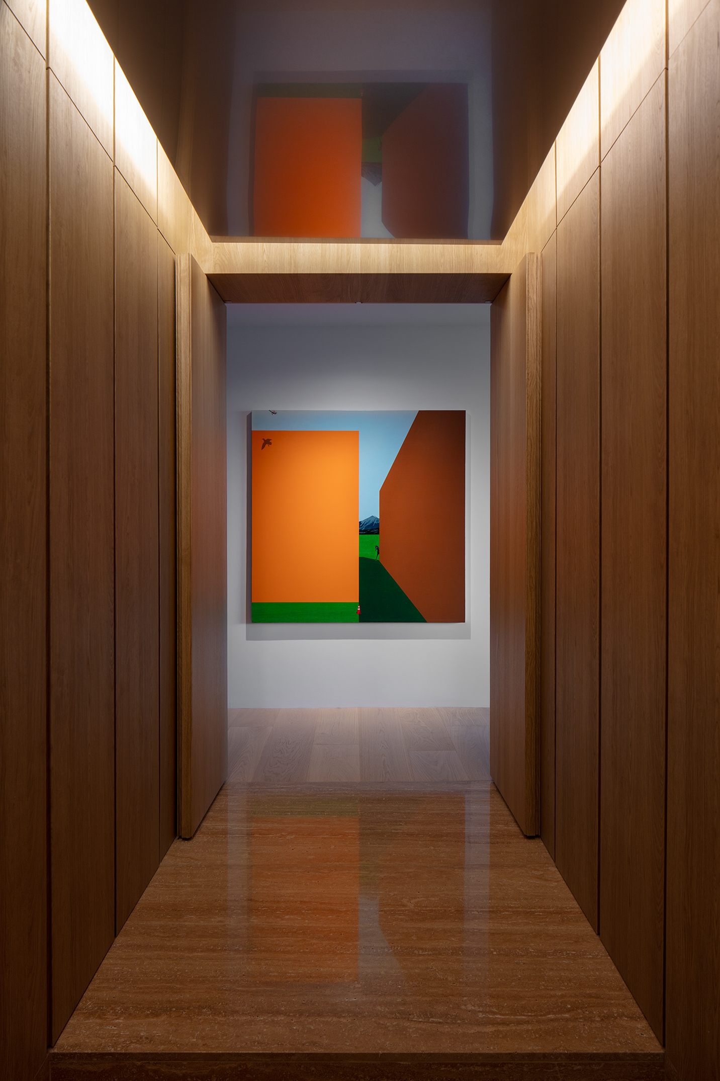
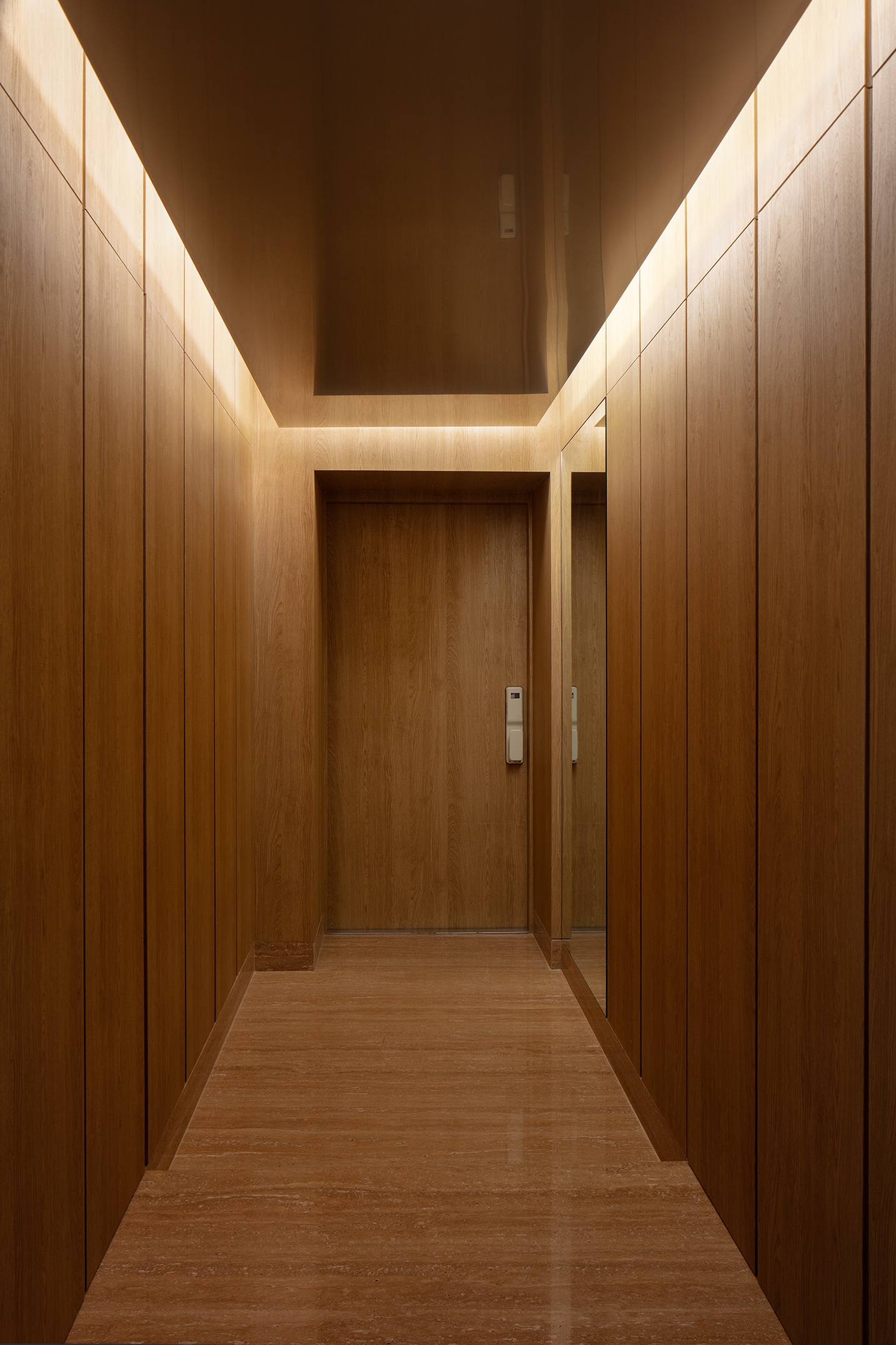
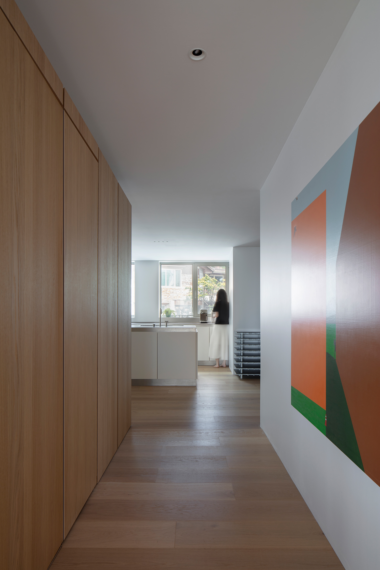
Photo by Kiwoong Hong
The entrance is the first space encountered upon entering the home. It was intended to evoke the feeling of stepping into a new world — a threshold designed to shield and protect the private realm beyond.
The vertical grain of the wood rises upward; the quiet, undulating patterns of stone stretch horizontally; and the softly reflective surface of metal mirrors the scene like a tranquil lake, enveloping the space in stillness.
Beyond the inner door, a painting by Jimin Chae is revealed — a work created long ago with the couple in mind, now finally finding its rightful place.
현관은 집에 들어서서 처음으로 만나게 되는 장소다.
마치 새로운 세계에 온 듯한 분위기를 만들고 싶었고, 사적 영역을 가리고 보호하는 영역을 의도했다.
수직으로 상승하는 나뭇결, 조용히 요동하는 수평의 돌무늬, 고요한 호수처럼 현관의 장면을 은은하게 반사하는 금속의 표면.
중문을 열면 채지민 작가의 그림이 맞이해준다. 이 그림은 채작가가 우리 부부를 생각하며 오래 전에 작업하였는데, 드디어 자신의 자리를 찾았다.
수직으로 상승하는 나뭇결, 조용히 요동하는 수평의 돌무늬, 고요한 호수처럼 현관의 장면을 은은하게 반사하는 금속의 표면.
중문을 열면 채지민 작가의 그림이 맞이해준다. 이 그림은 채작가가 우리 부부를 생각하며 오래 전에 작업하였는데, 드디어 자신의 자리를 찾았다.
Kitchen
(Collaboration with VOBIA)
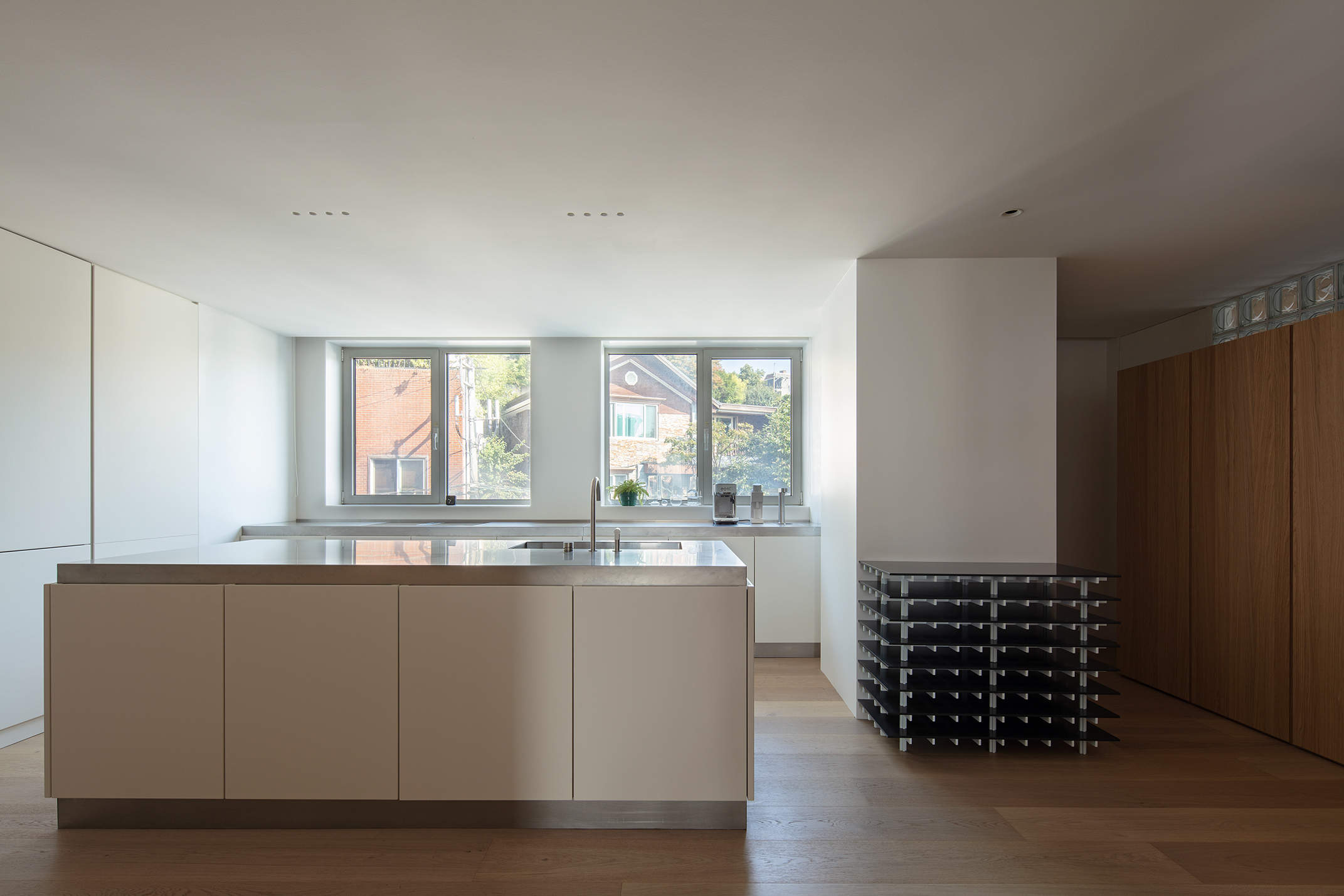
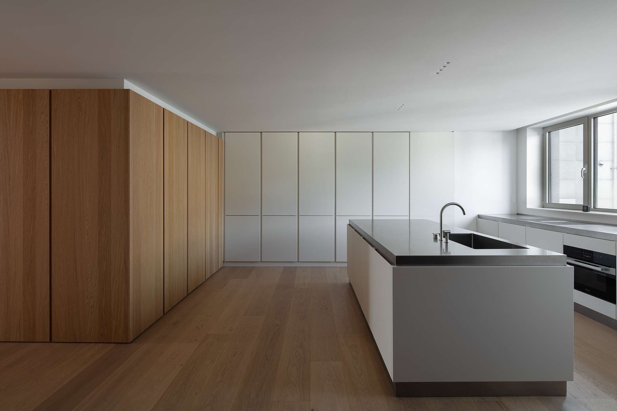

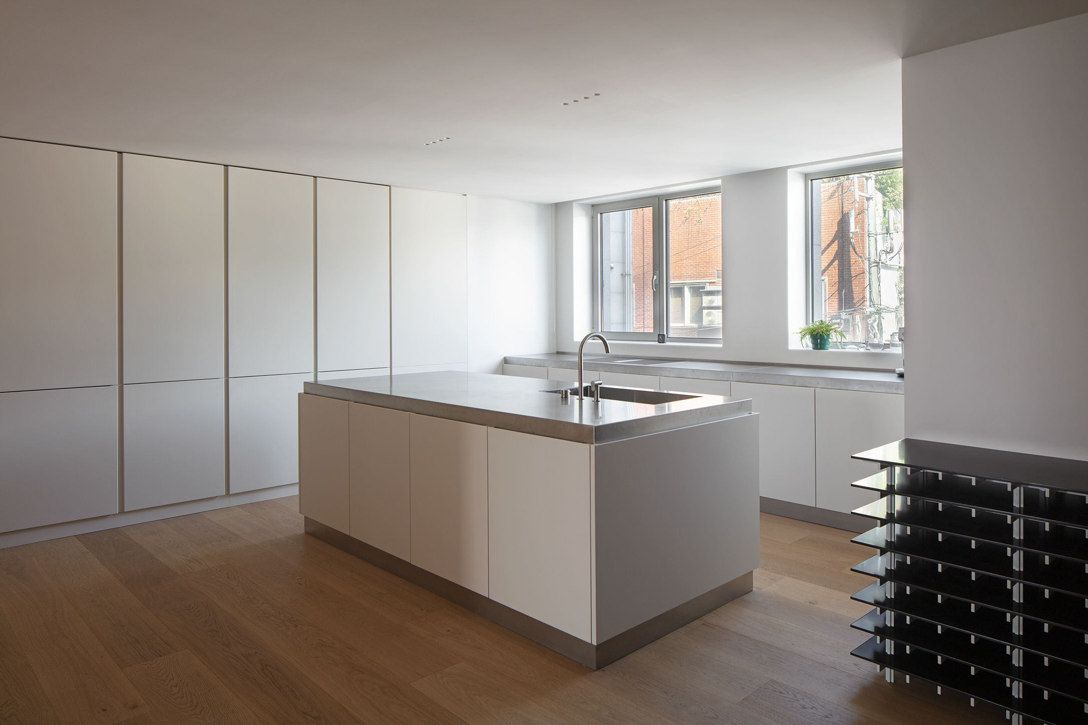
Photo by Kiwoong Hong
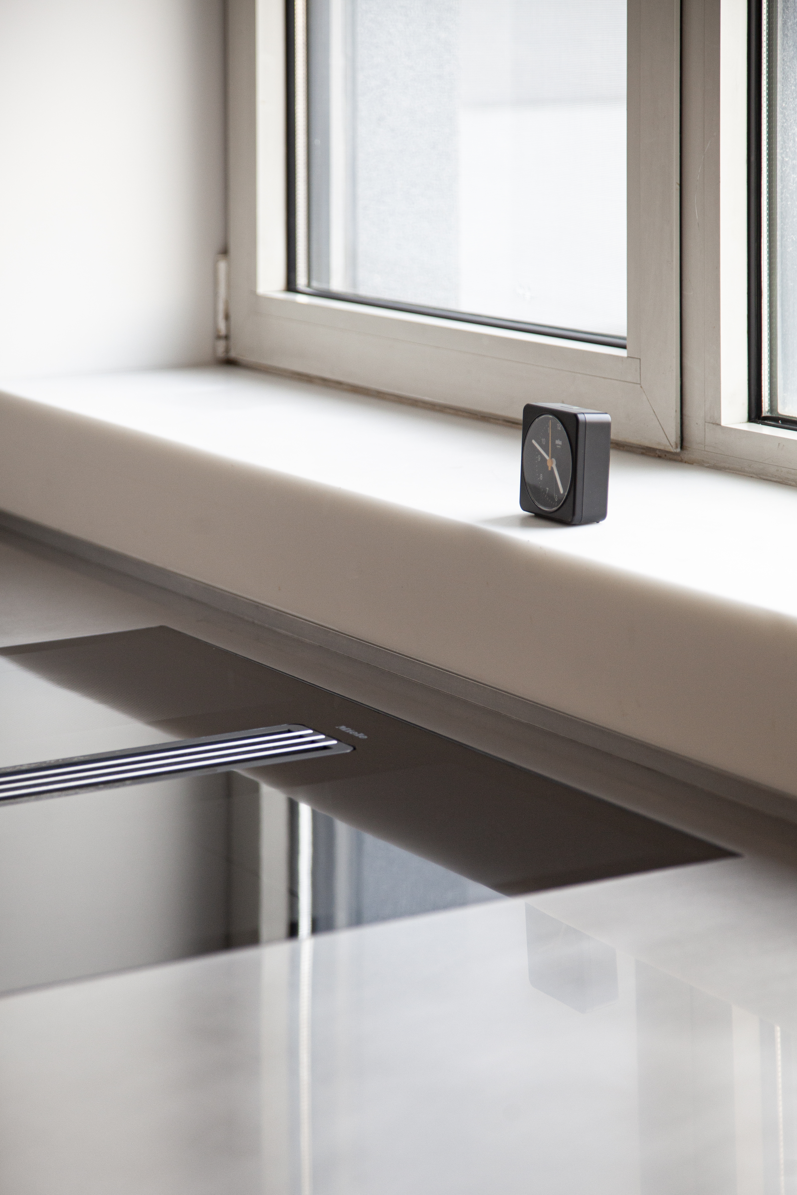
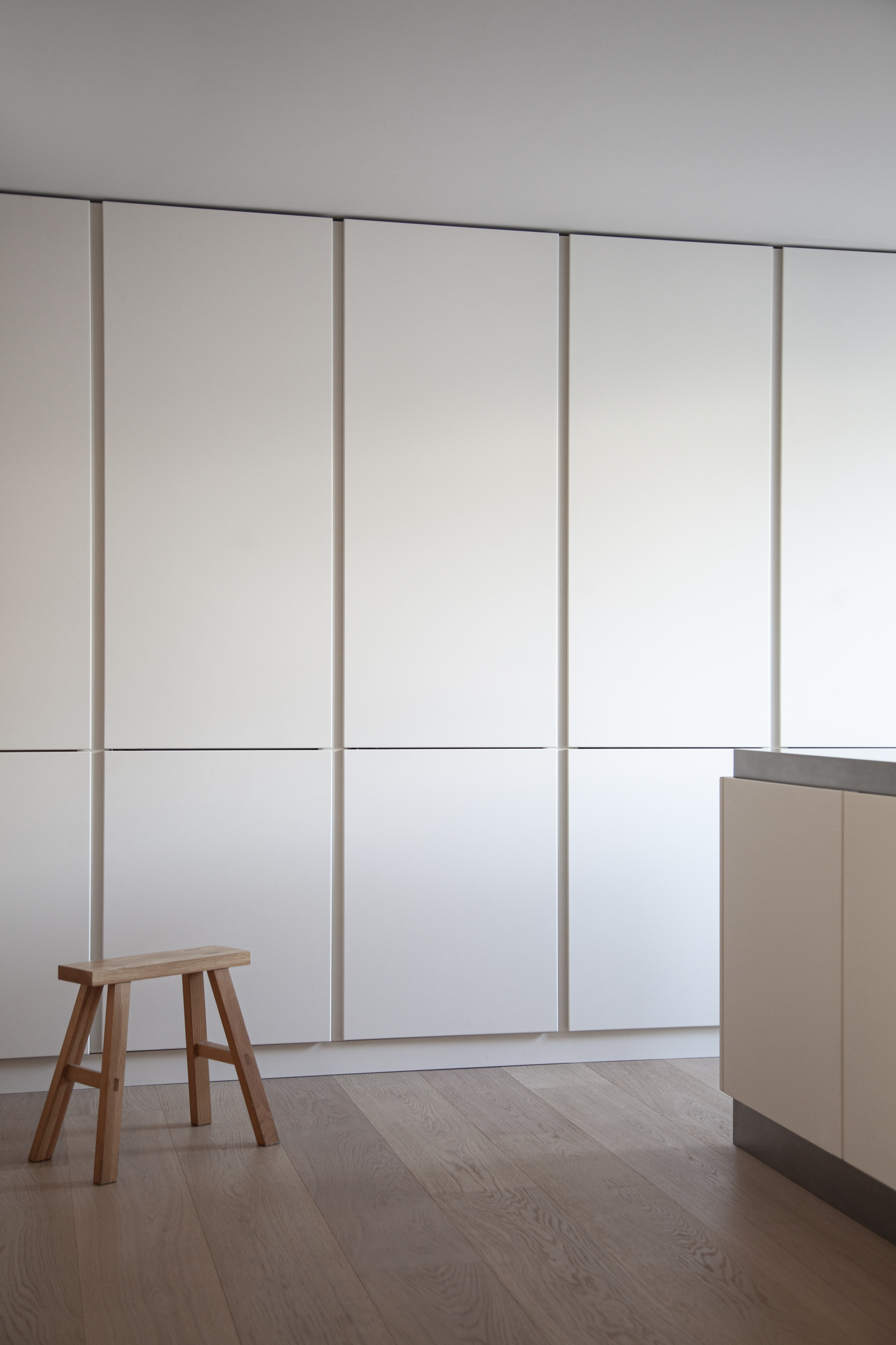
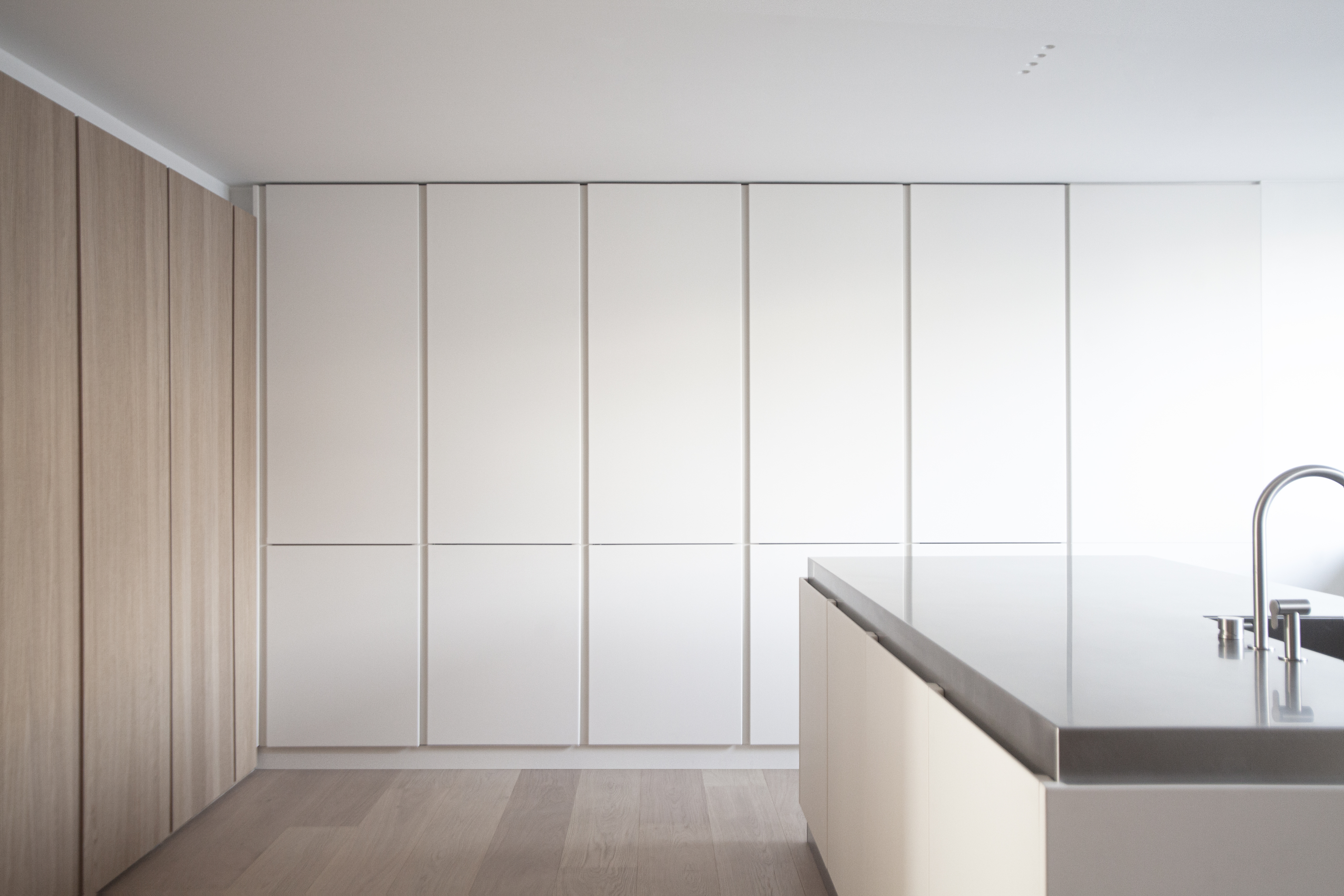
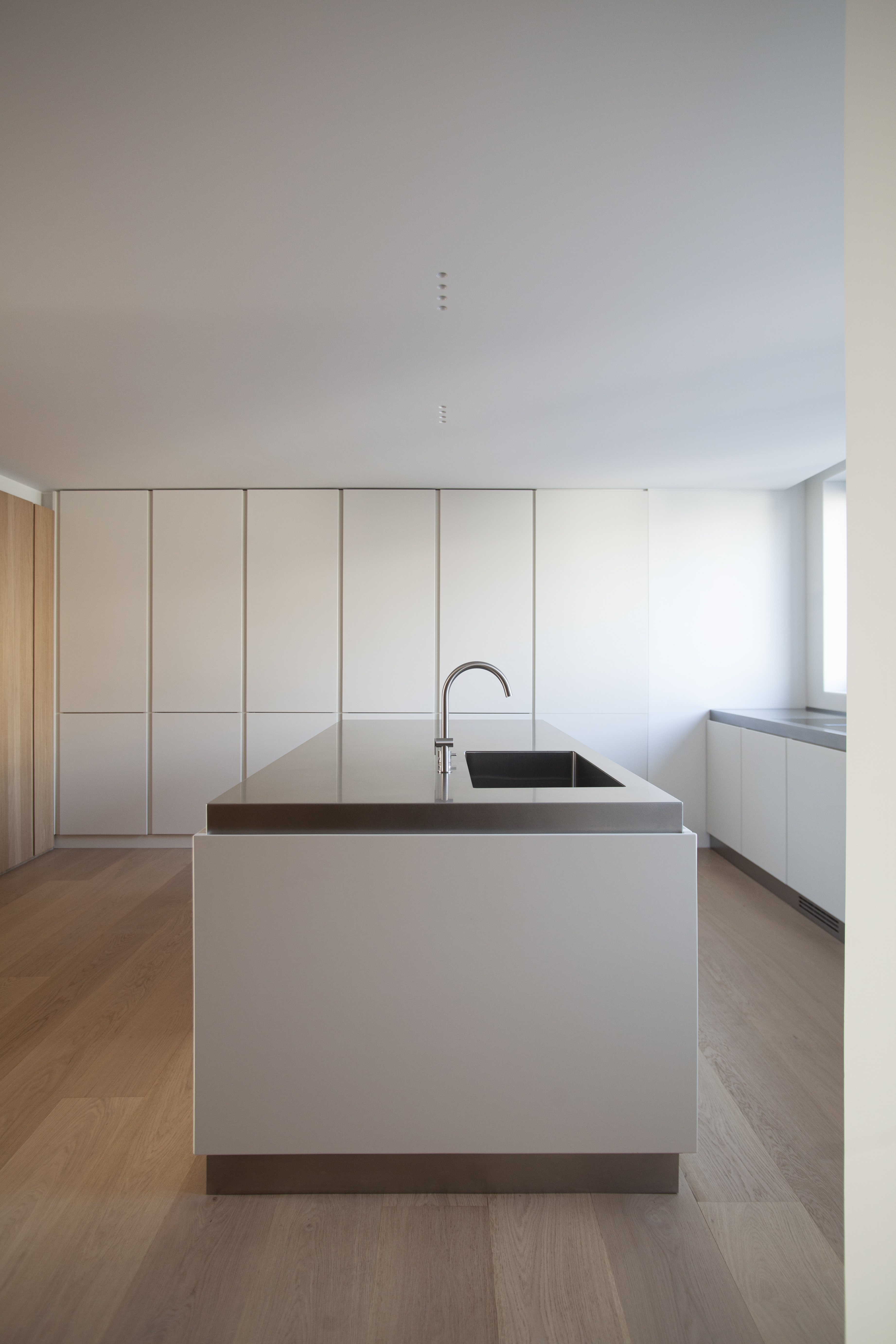
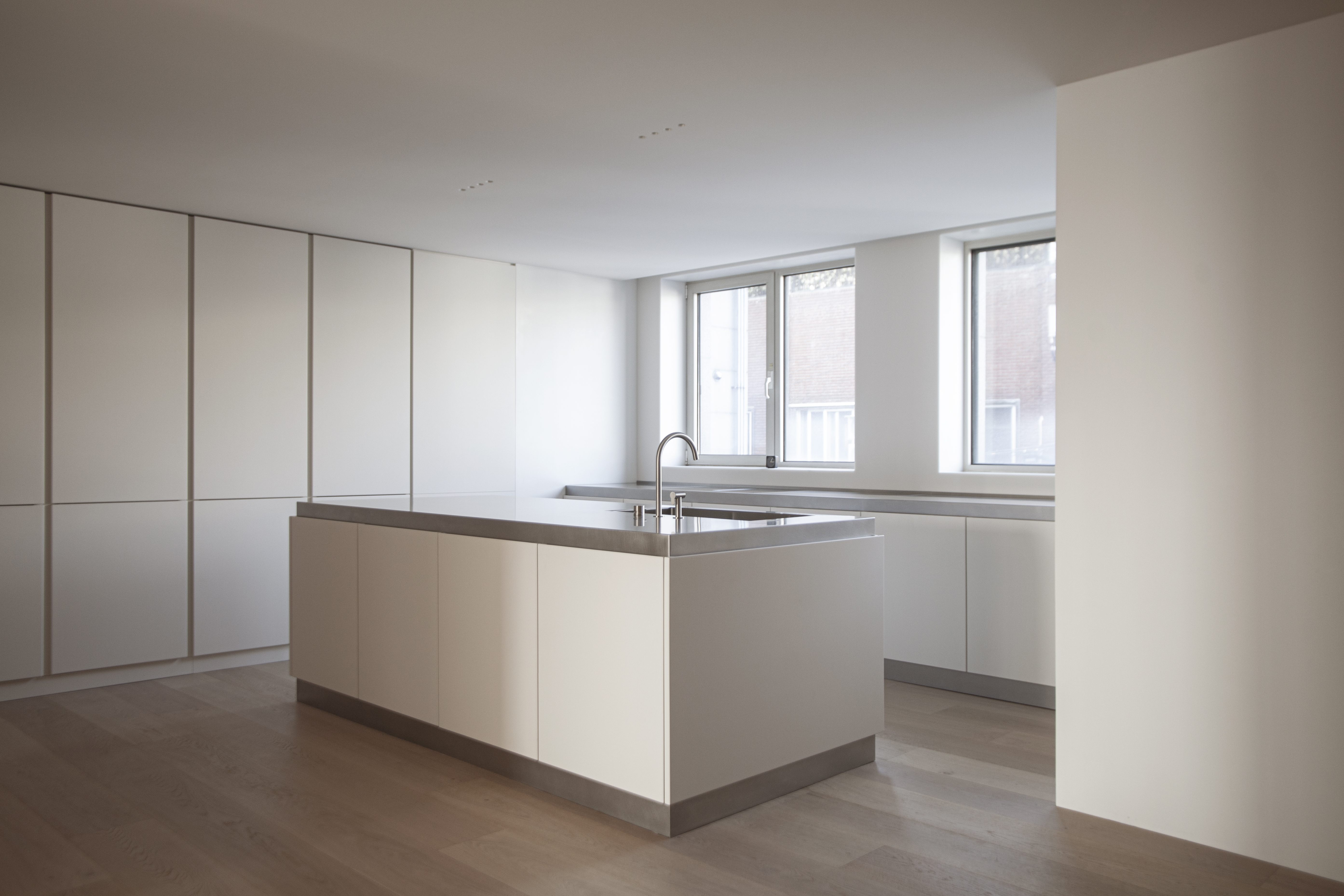
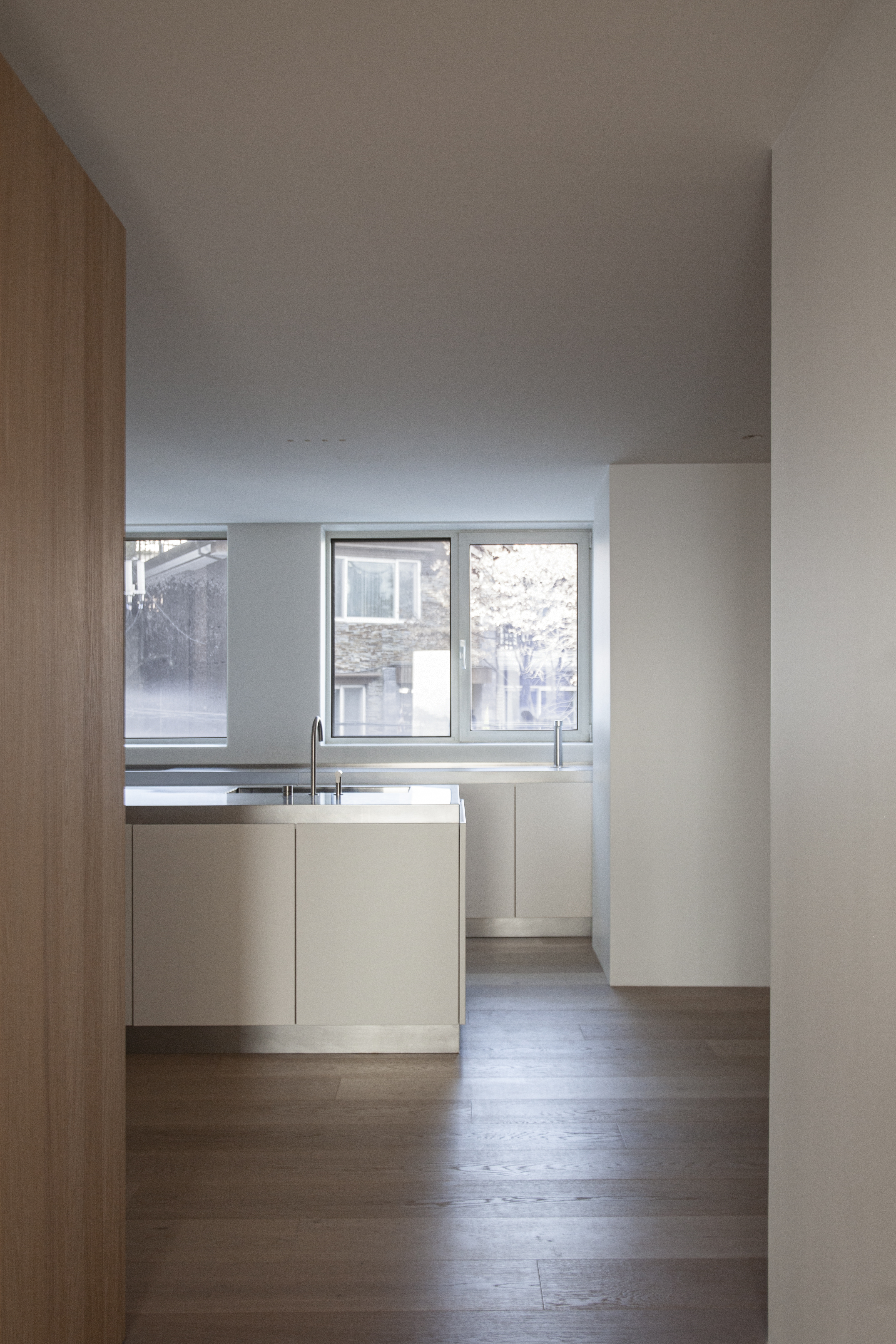
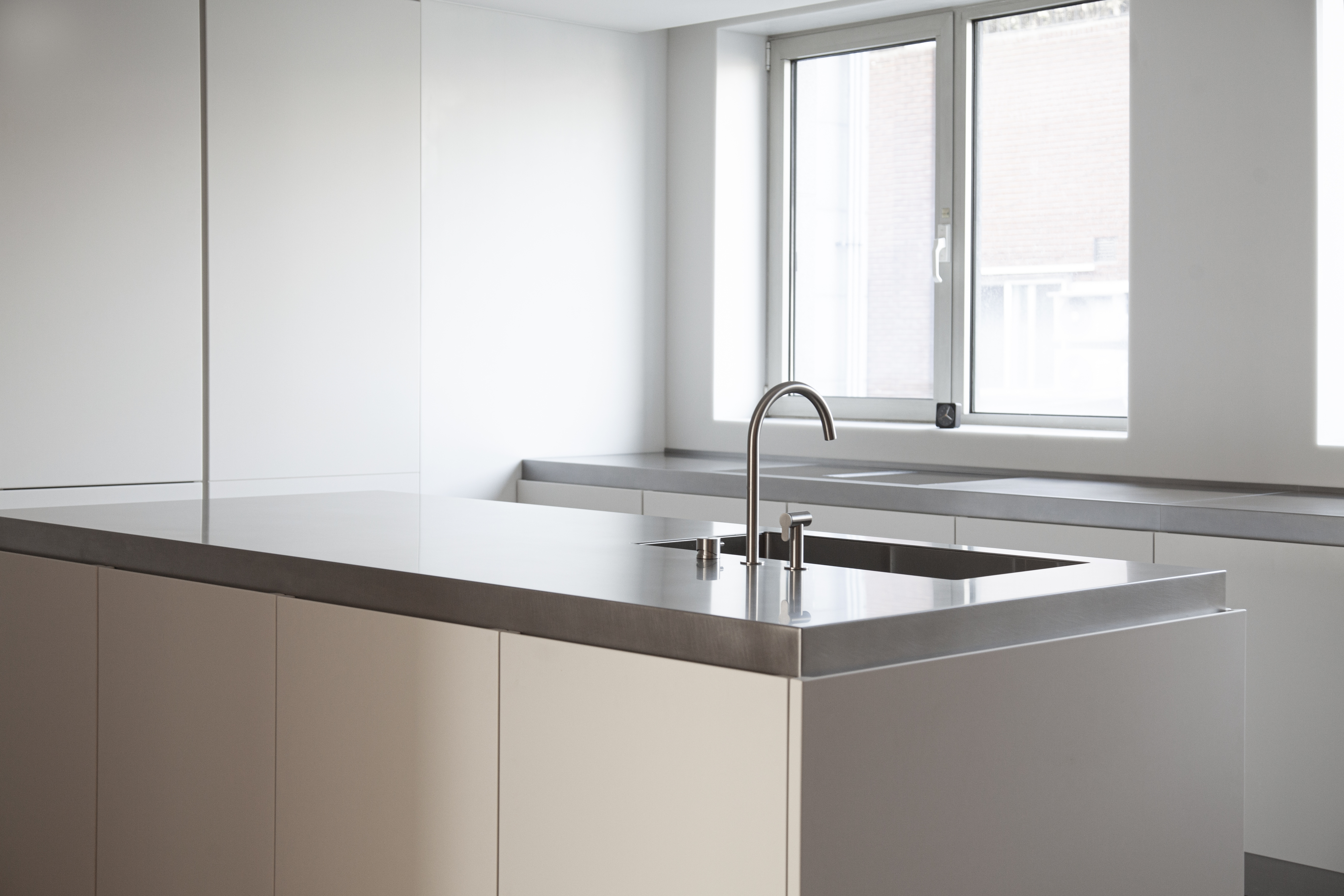
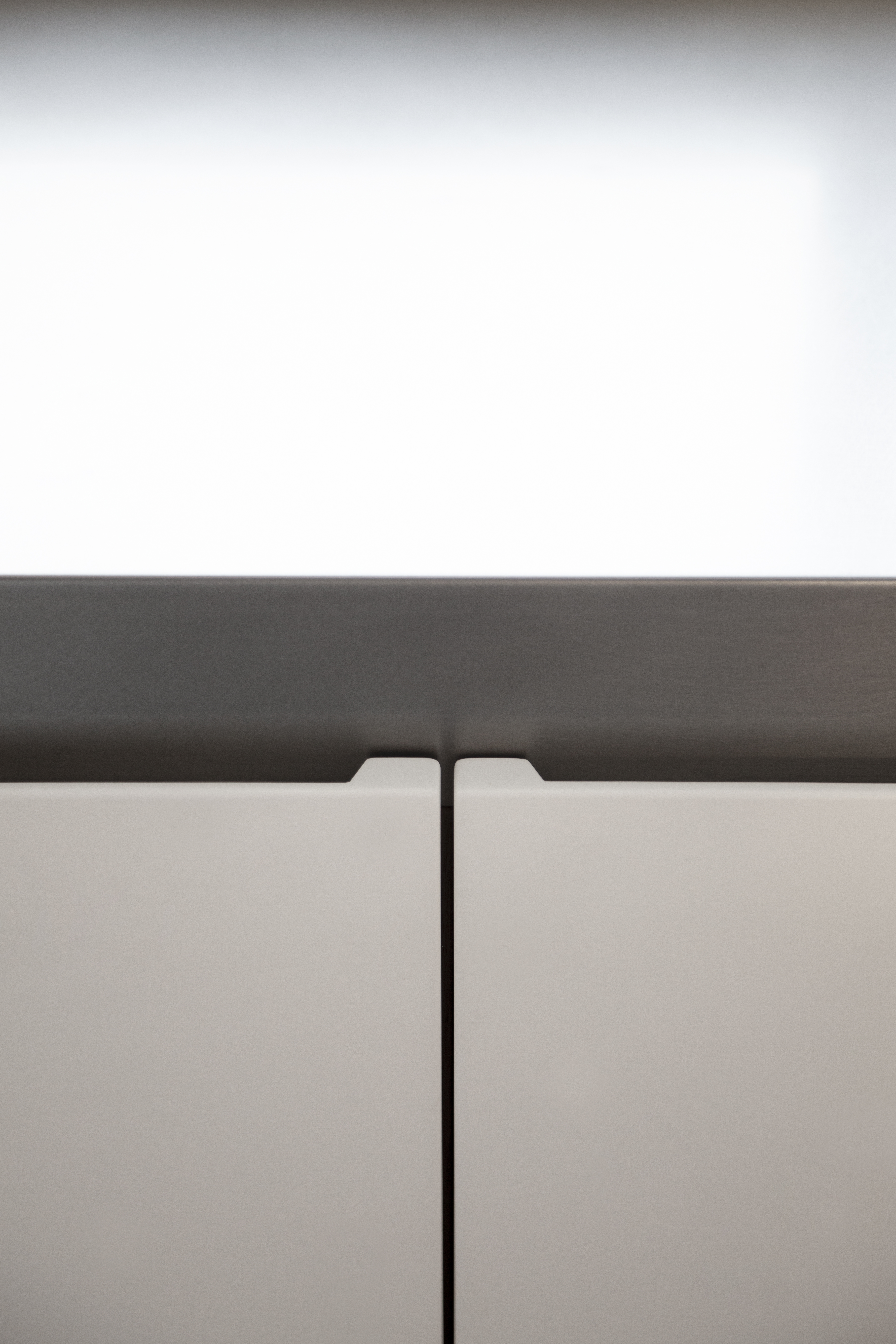
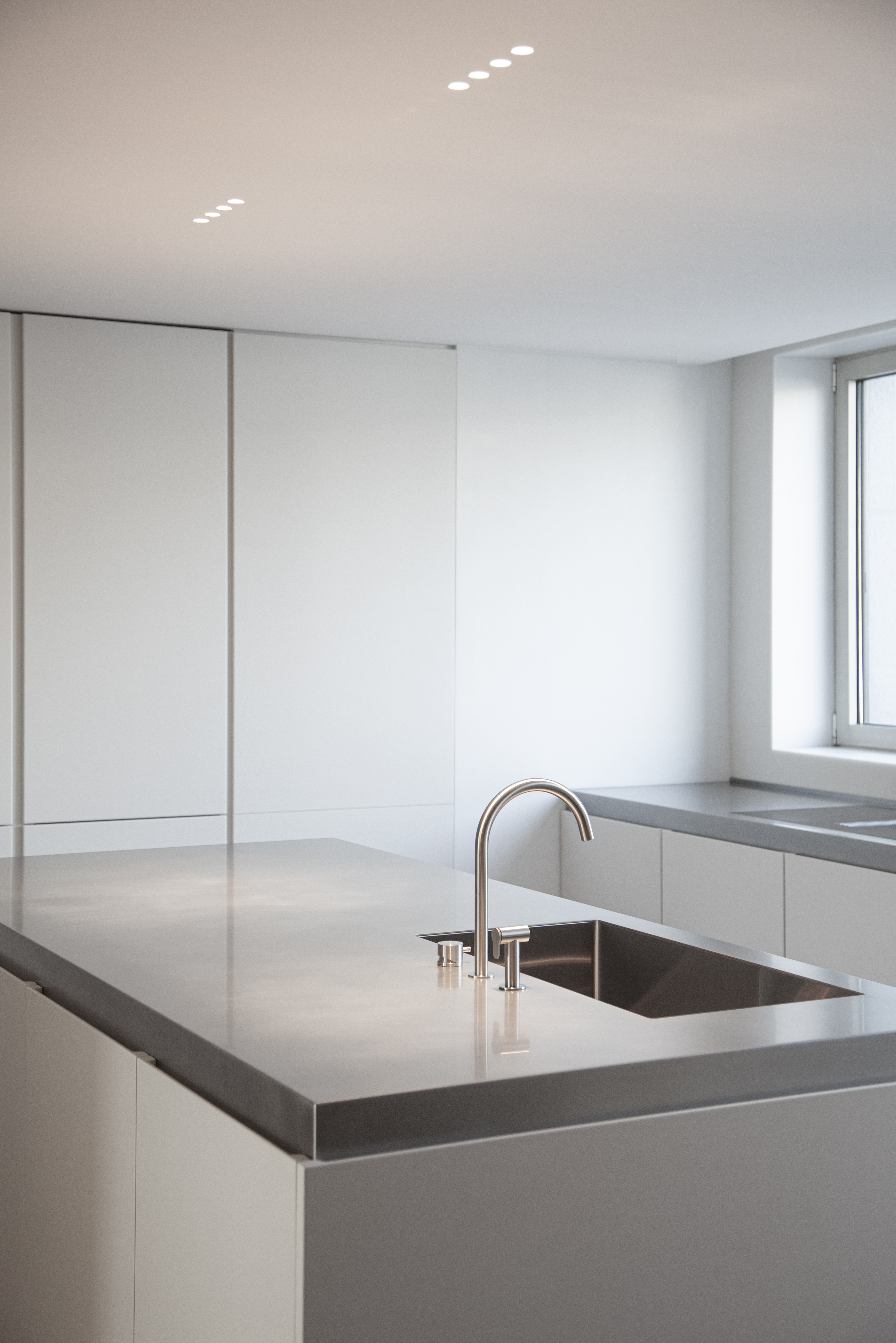
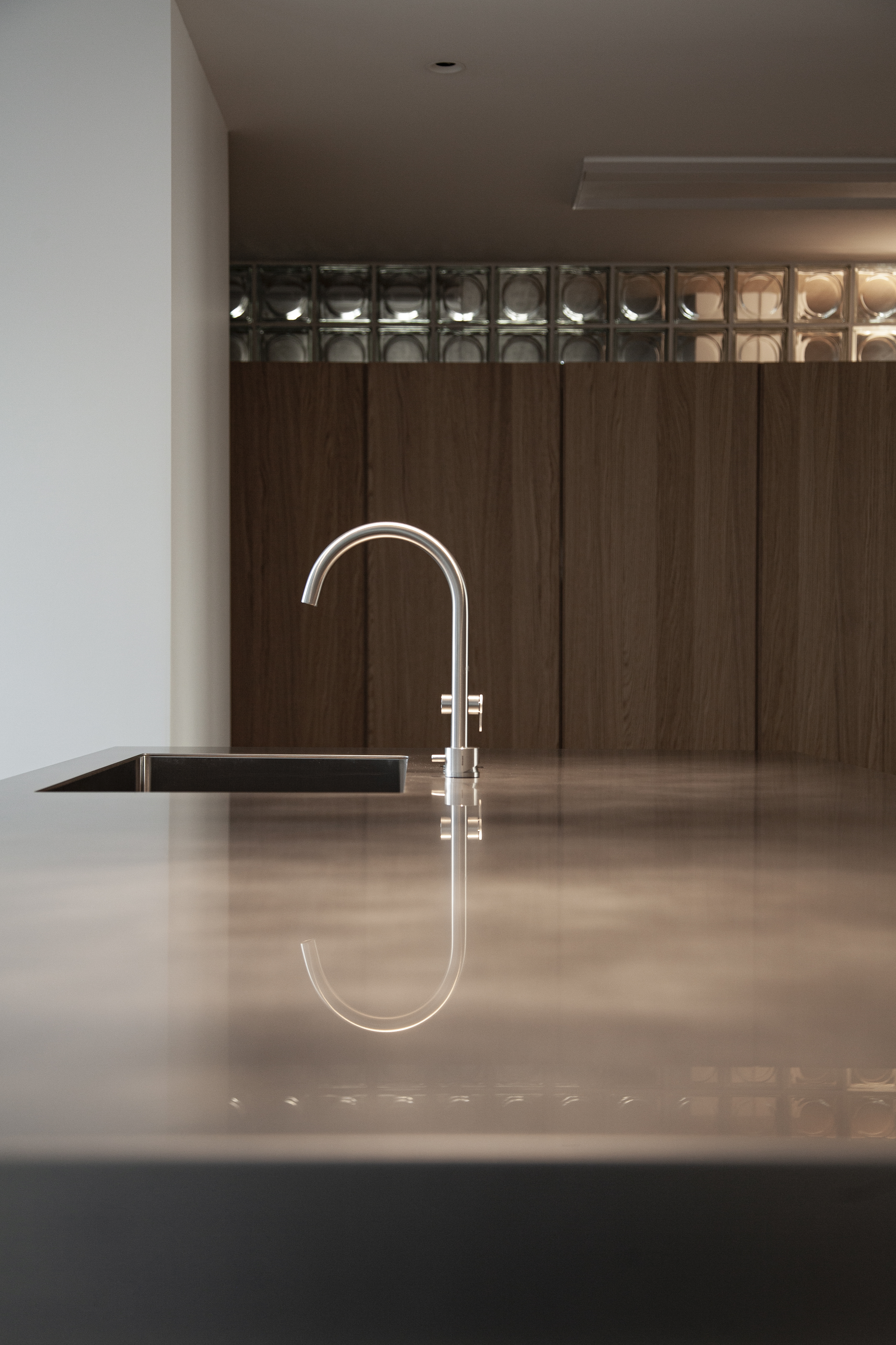
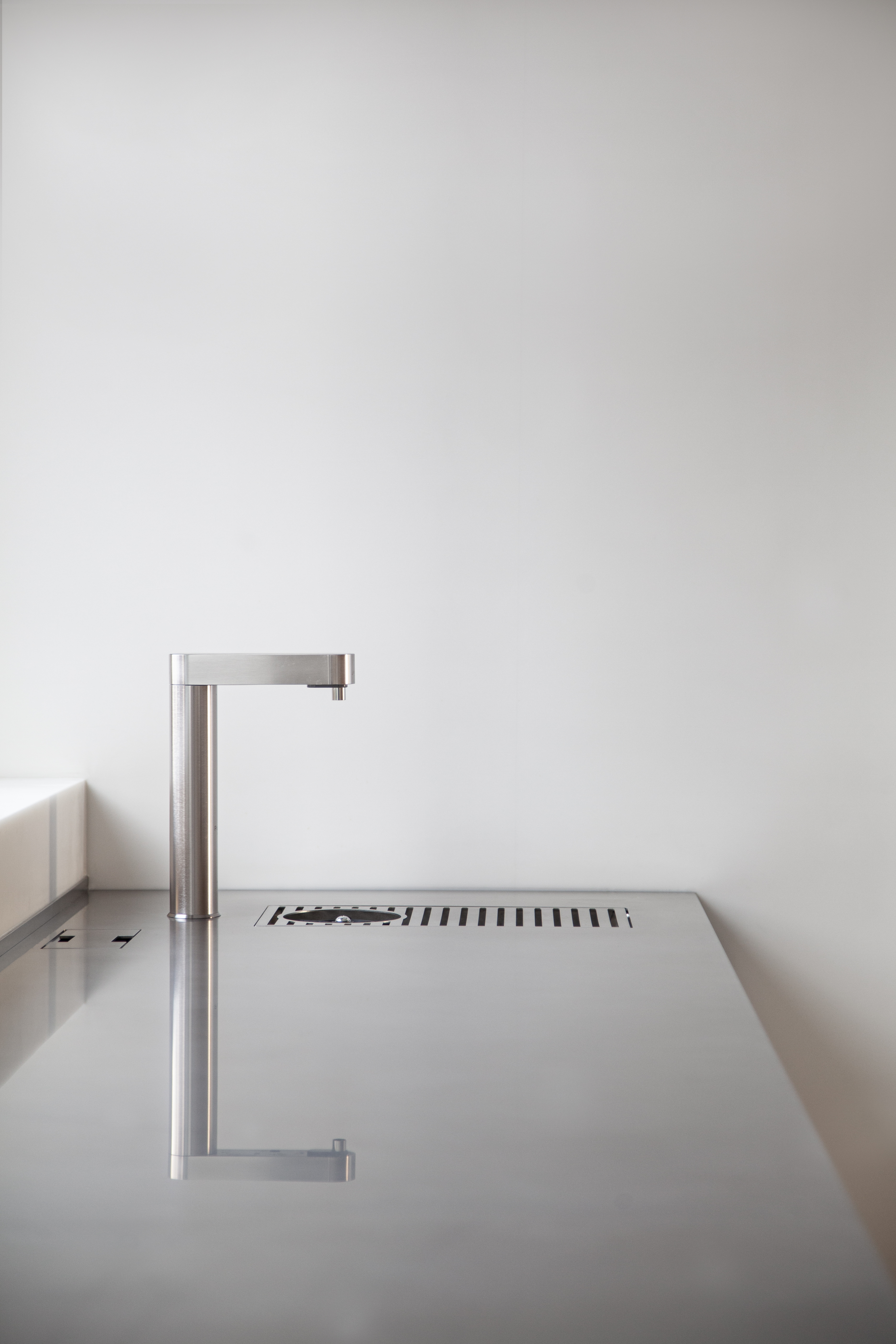
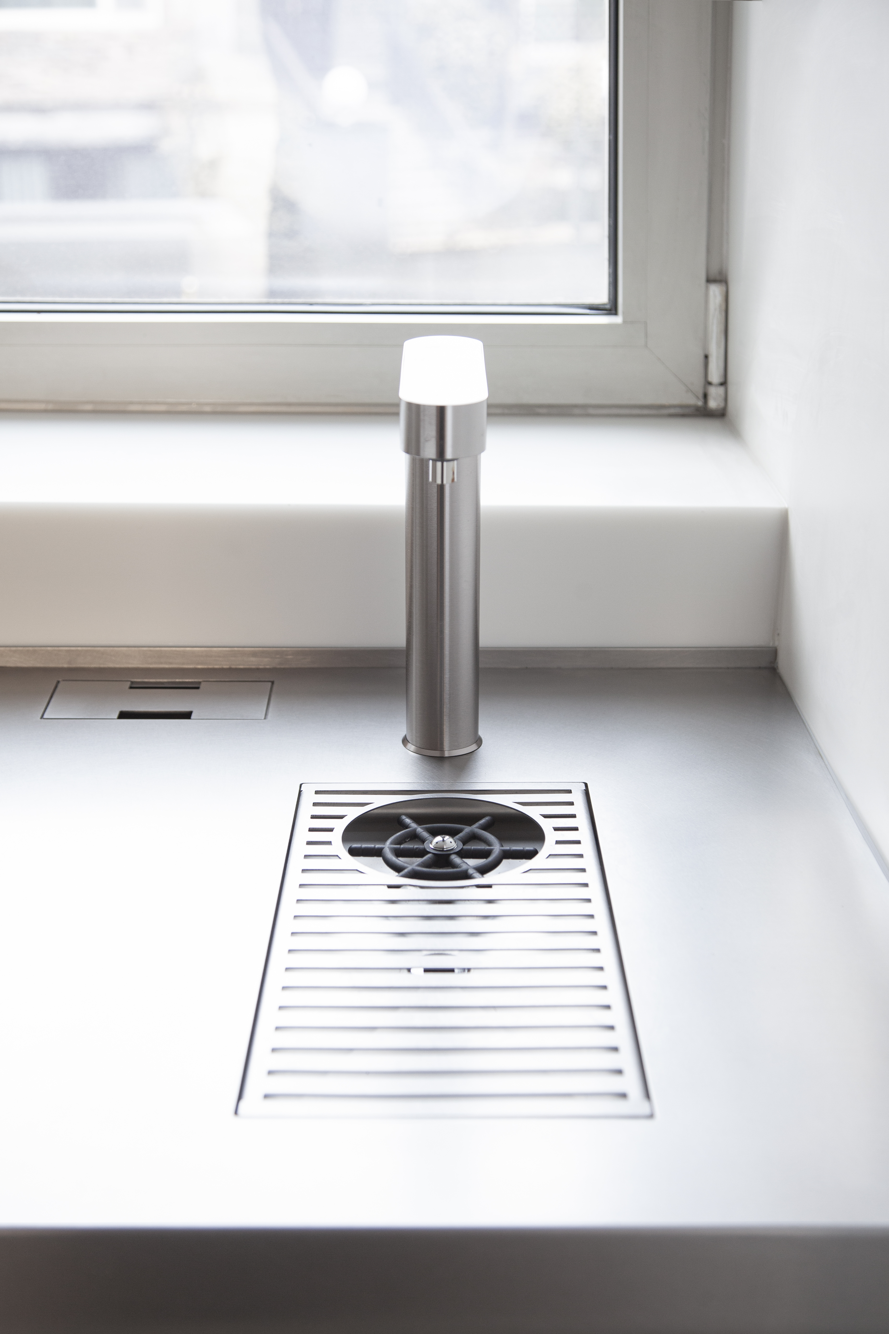
Photo by Ungdon Kim (VOBIA)
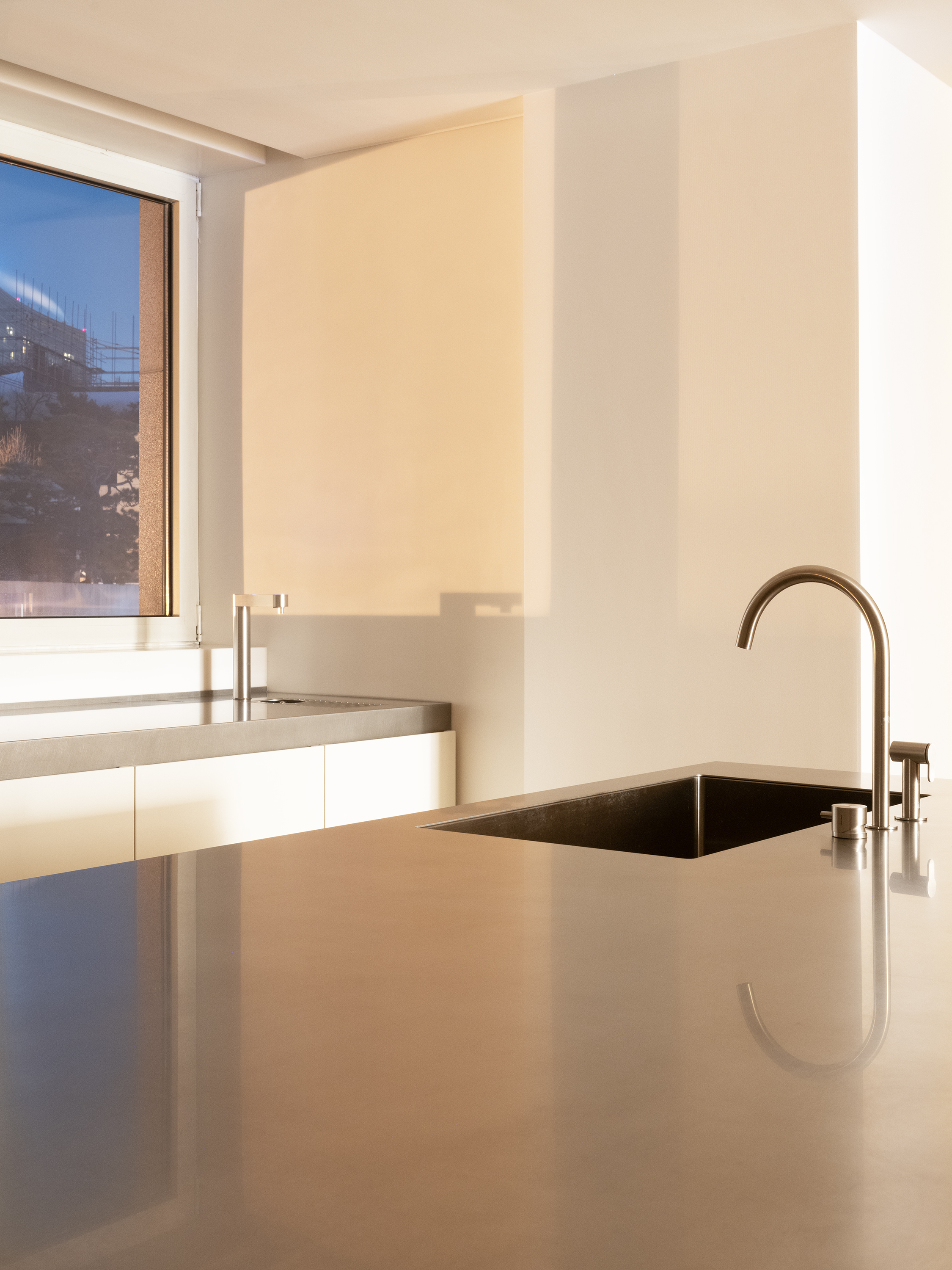
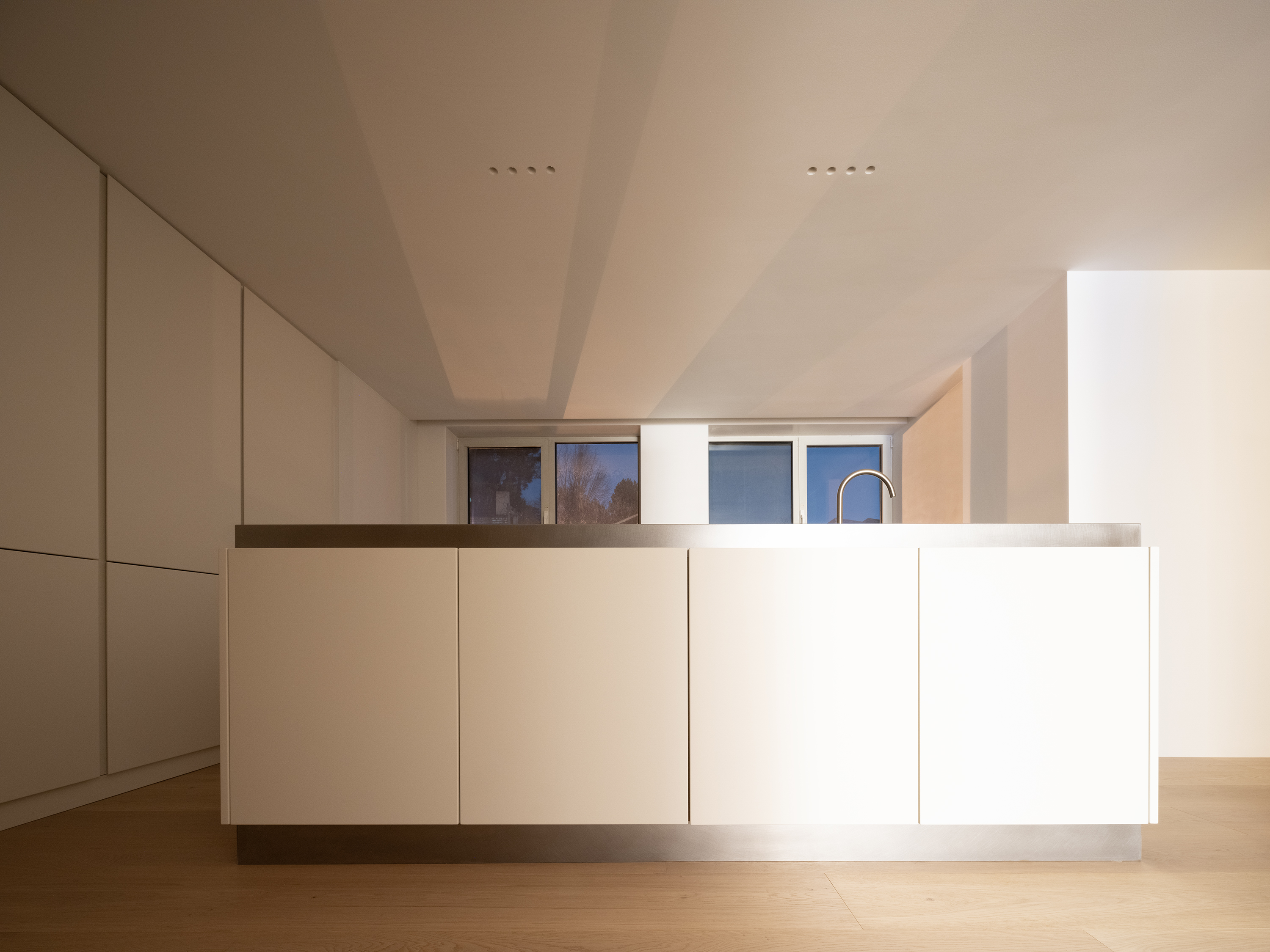
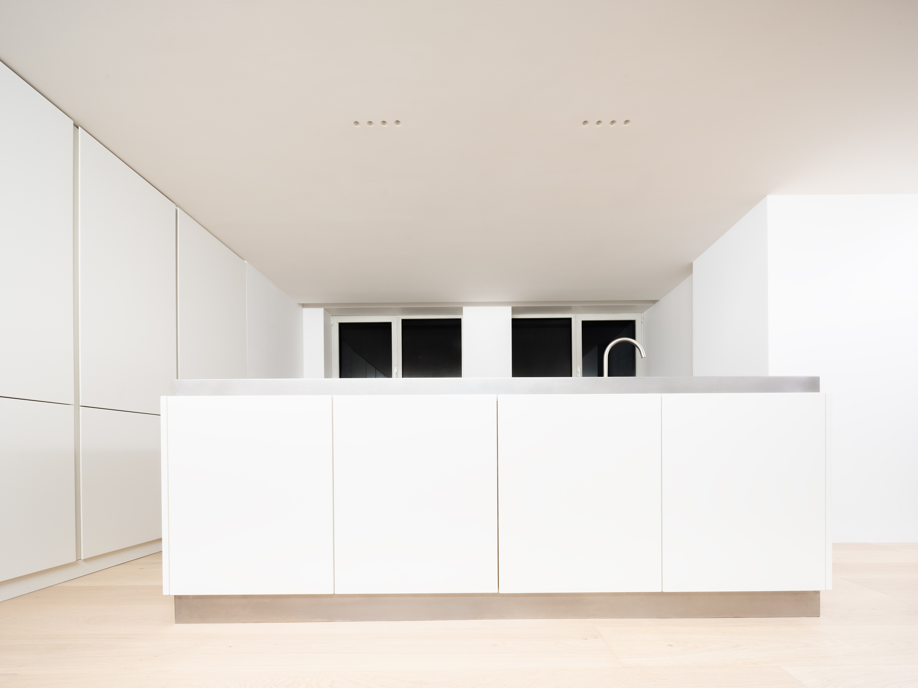
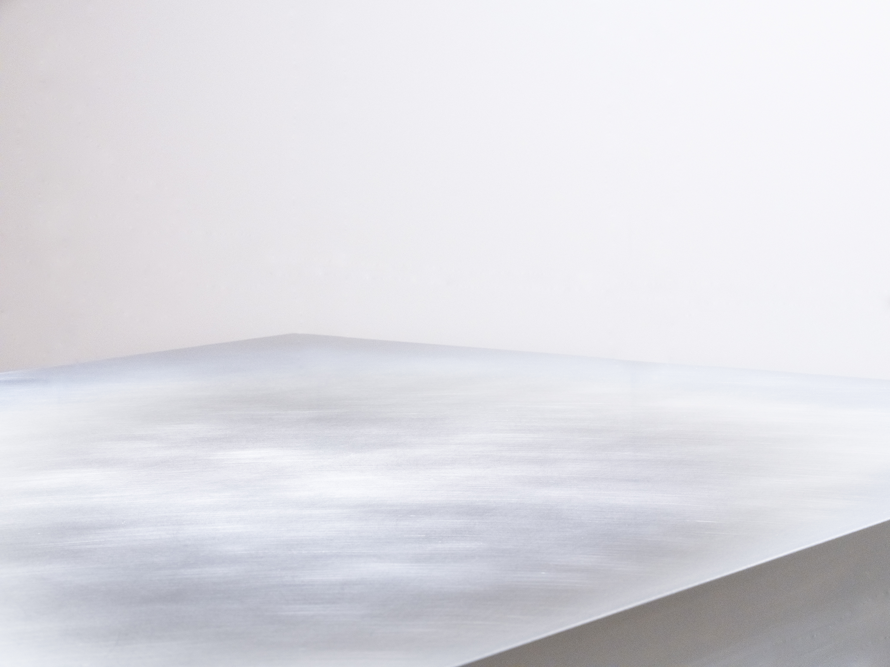

Photo by Jihyun Jung
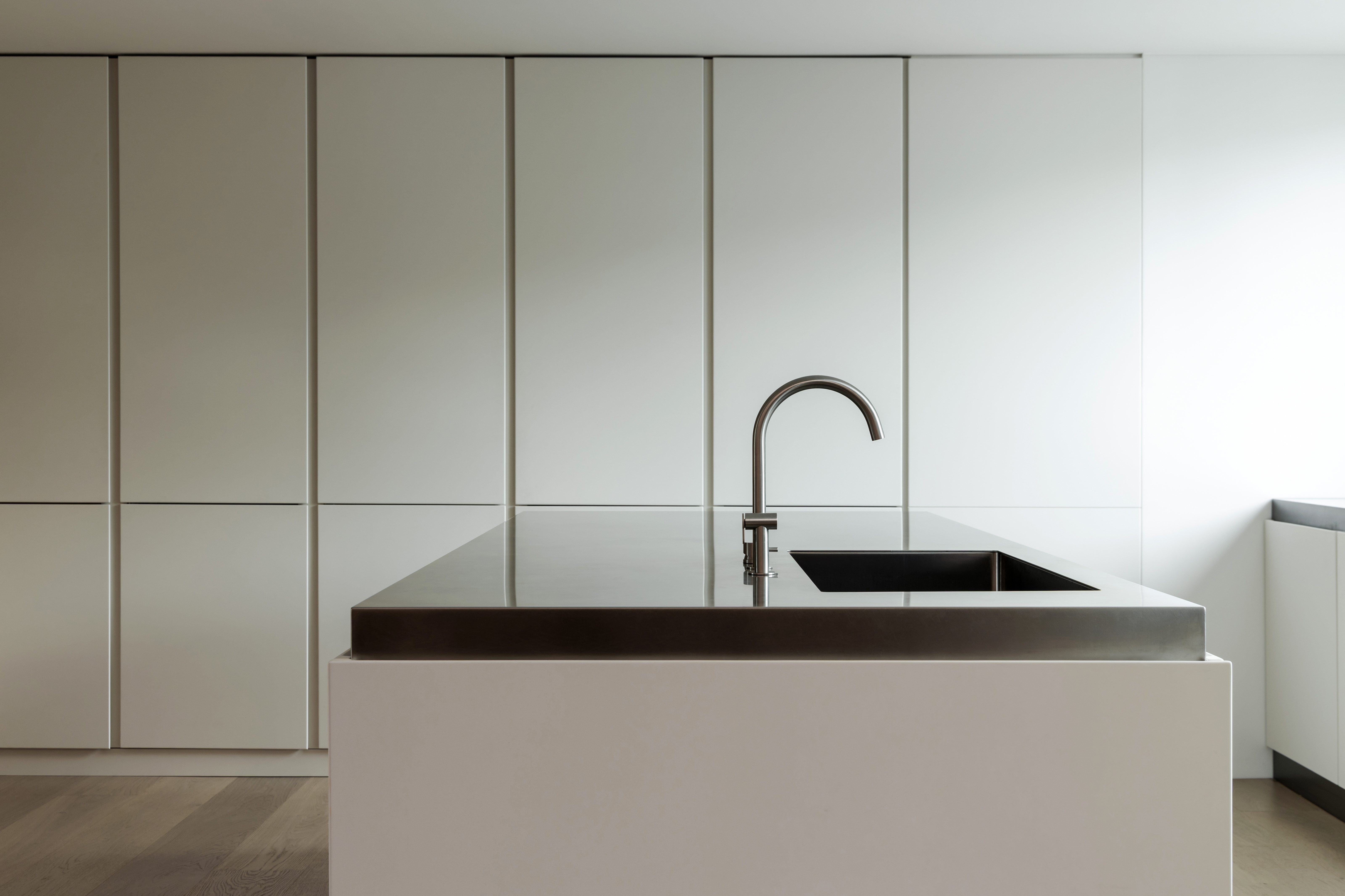
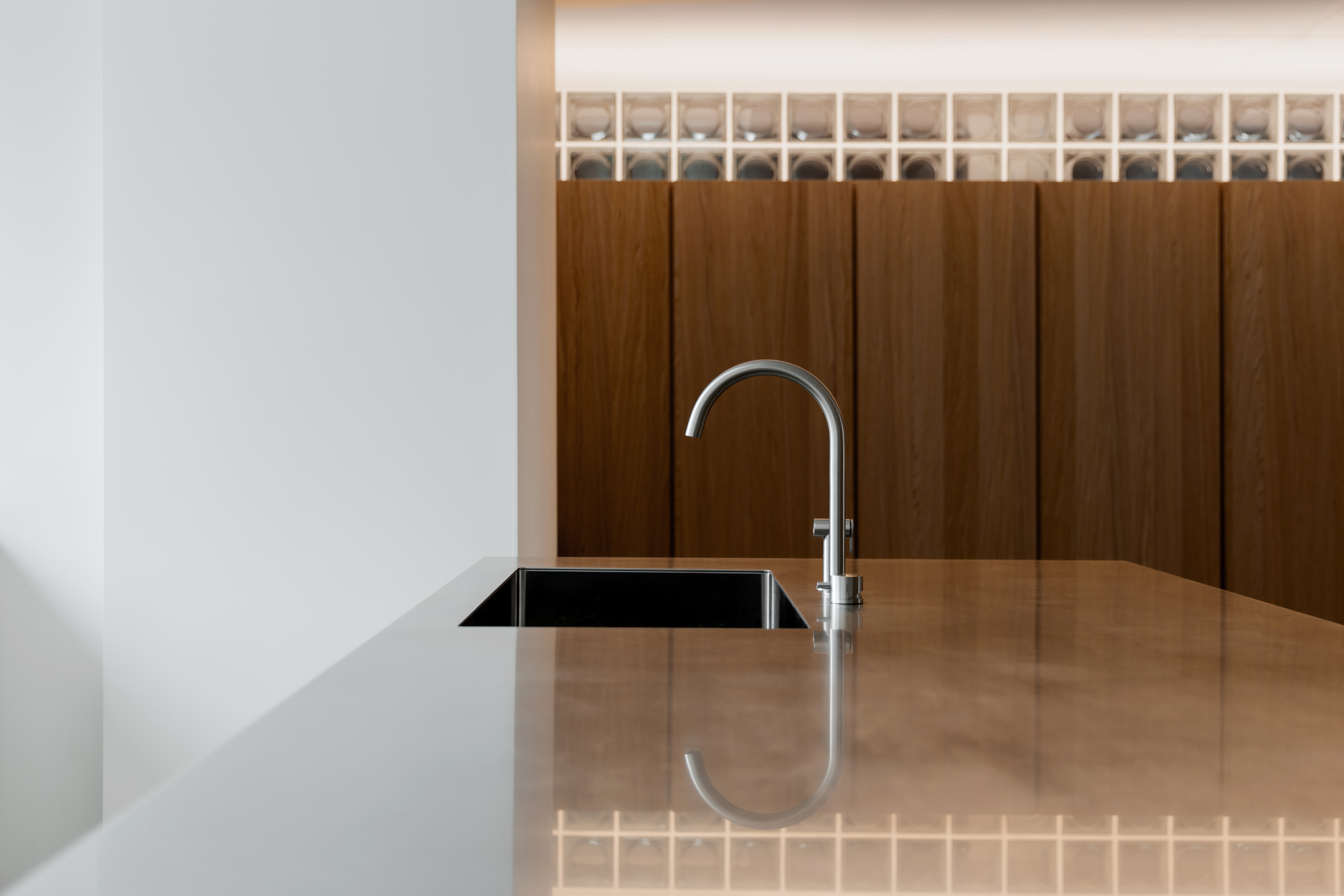


Photo by Eunsil Yoon
This space is where the couple — both passionate about cooking — spend much of their time.
Originally, the kitchen was divided into two parts: a main area with a small island and a service kitchen by the window, separated by a wall. To unify the space, the wall was removed and the circulation reconfigured so that cooking could take place while enjoying the view outside. At the center, a large island accessible from all sides was introduced.
Great care was taken to refine the background so that the island’s solid and restrained design language could stand out. All storage is concealed within a white backdrop, allowing natural light to filter gently through the vertical rhythm of the space.
Recessed lighting remains discreet throughout the day, yet at night it softly illuminates the island’s surface — like a frozen winter lake, quietly shimmering in the dark.
요리를 즐기는 부부가 오랜 시간을 머무는 공간이다.
기존에는 작은 아일랜드가 있는 본 주방과, 벽으로 가려진 창가의 서비스 주방으로 나뉘어 있었다. 주방을 하나의 공간으로 통합하기 위해 벽체를 철거하고, 창밖의 풍경을 바라보며 요리할 수 있도록 동선을 새롭게 구성했다.
중앙에는 사방에서 접근할 수 있는 큰 아일랜드를 배치했다. 아일랜드의 묵직하고 간결한 디자인 언어가 돋보이도록 배경을 정제하는 데 많은 공을 들였다. 모든 수납은 하얀 배경 속에 숨겨지고, 수직의 리듬감 사이로 자연광이 스며든다.
매입된 조명은 아침과 낮에는 그 존재를 감추지만, 밤이 되면 아일랜드의 표면을 살얼음 낀 겨울 호수처럼 은은히 밝힌다.
중앙에는 사방에서 접근할 수 있는 큰 아일랜드를 배치했다. 아일랜드의 묵직하고 간결한 디자인 언어가 돋보이도록 배경을 정제하는 데 많은 공을 들였다. 모든 수납은 하얀 배경 속에 숨겨지고, 수직의 리듬감 사이로 자연광이 스며든다.
매입된 조명은 아침과 낮에는 그 존재를 감추지만, 밤이 되면 아일랜드의 표면을 살얼음 낀 겨울 호수처럼 은은히 밝힌다.
Bedroom
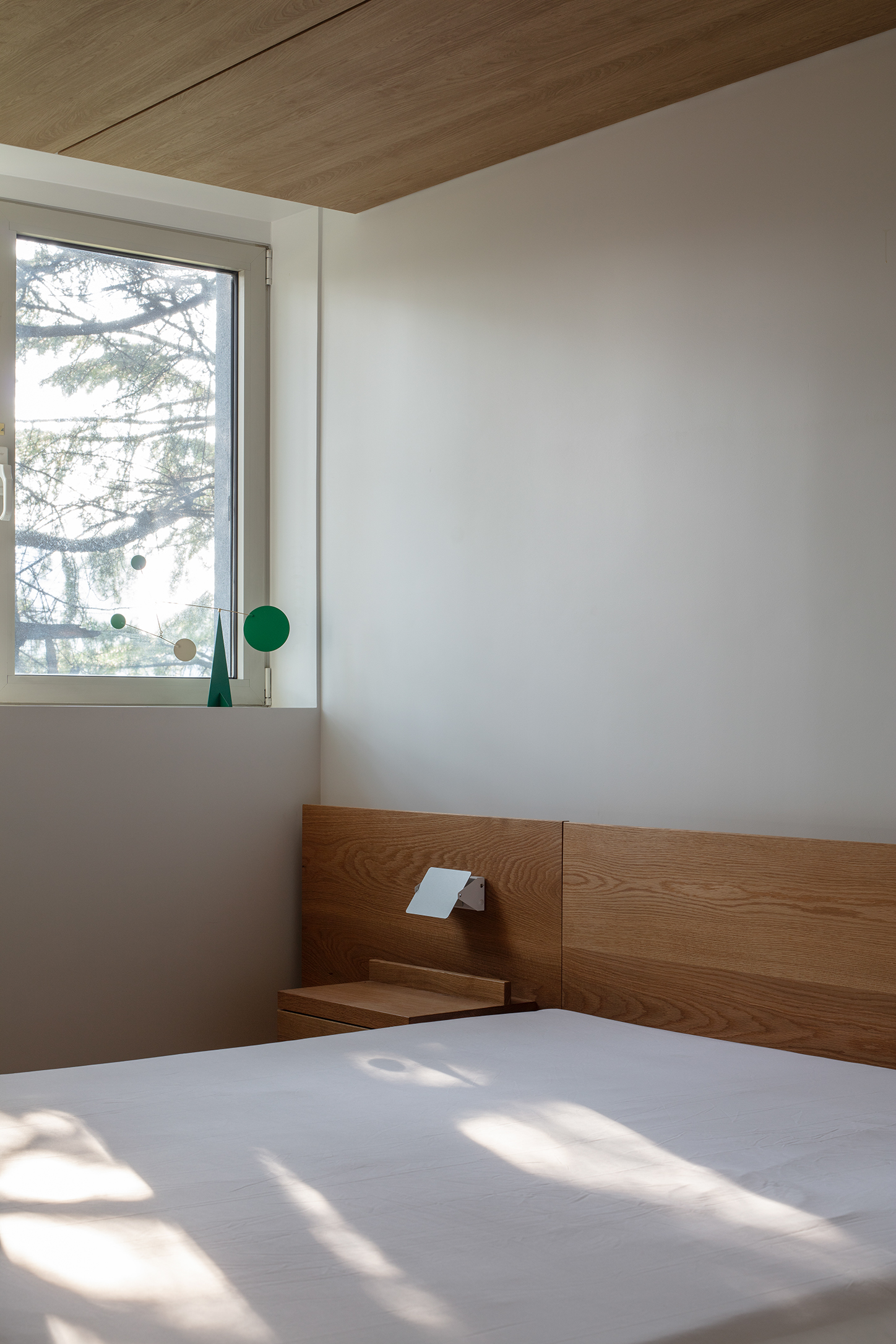
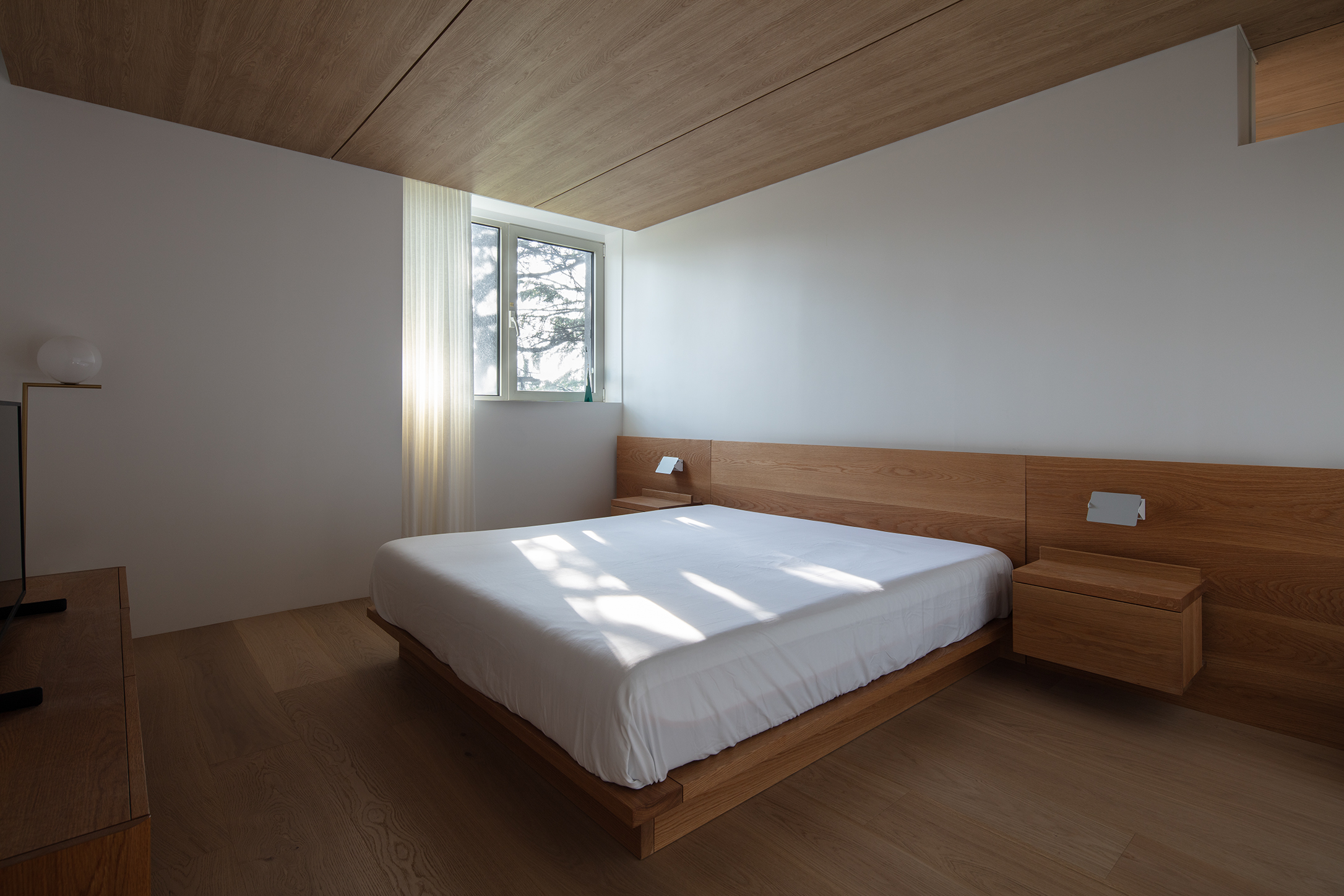
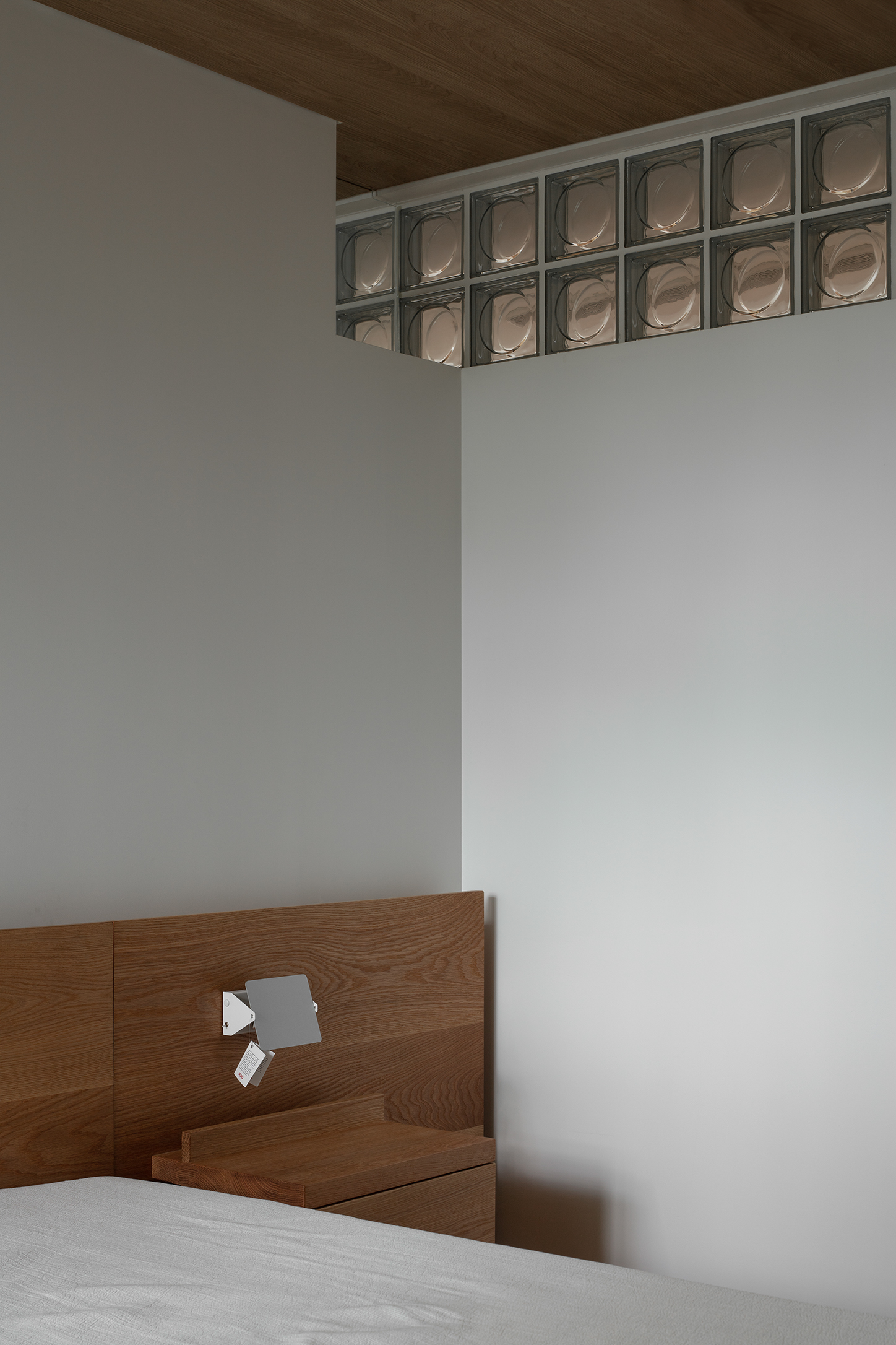
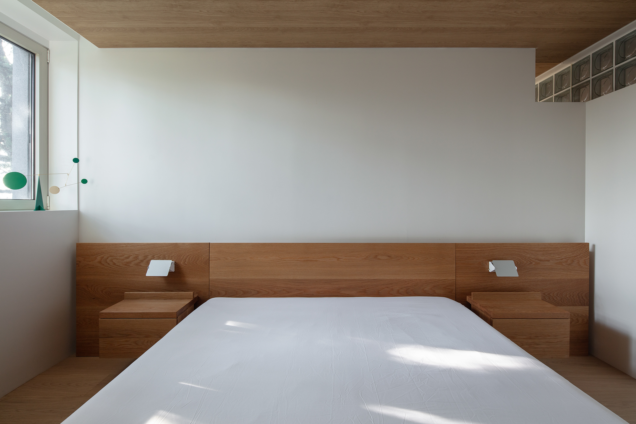
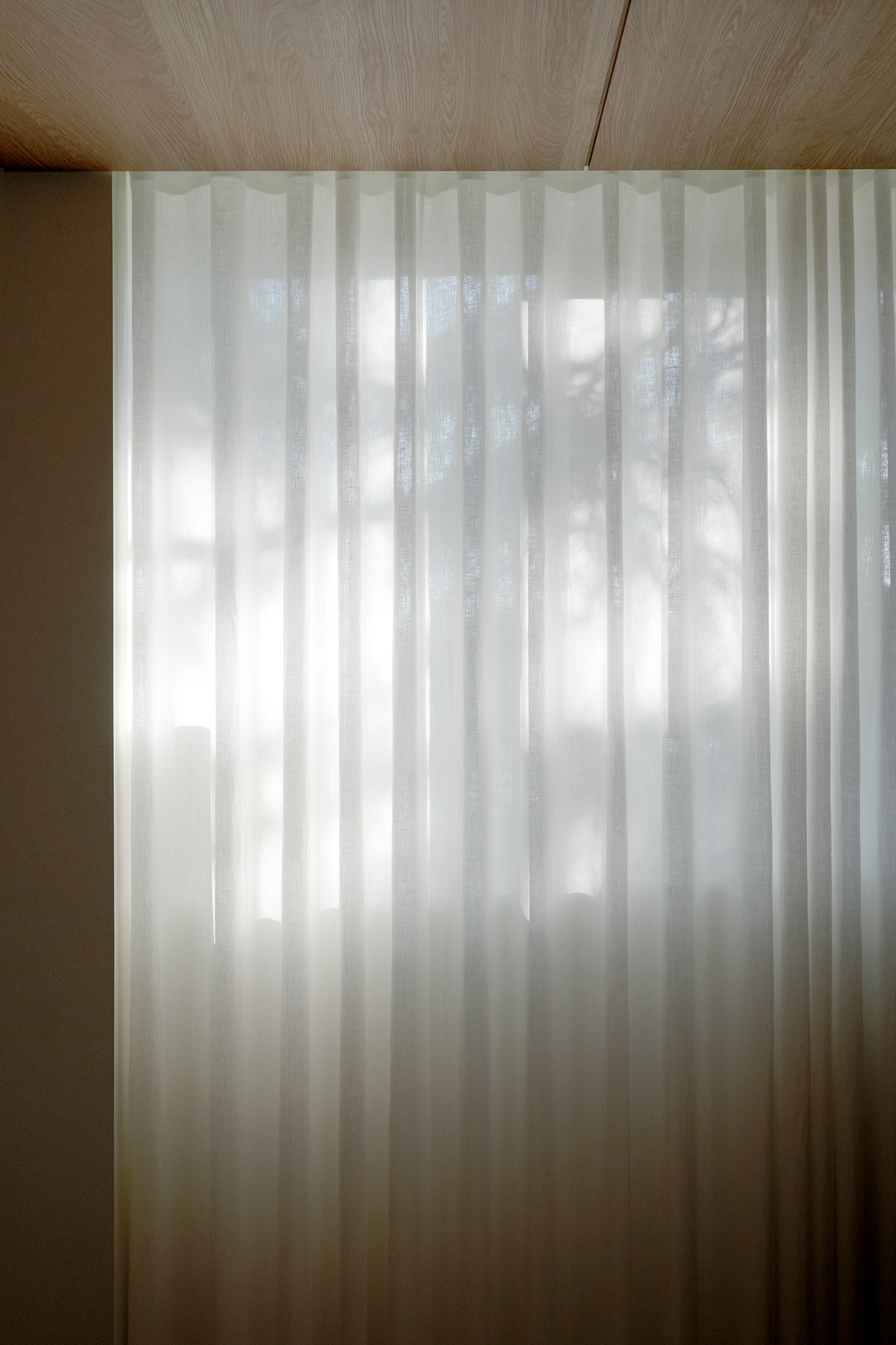

Photo by Kiwoong Hong, SeungBum Ma
This space captures both the end and the beginning of each day.
To create a warm atmosphere, the ceiling was finished in white oak. A band of glass blocks was installed at the upper part of the corridor wall to give a sense of openness to the relatively compact room. The glass softly diffuses light, adding a sense of depth to both the bedroom and the adjoining kitchen. The corner wall was cut and finished in glass, creating a visual connection between adjacent spaces.
The bed frame was designed specifically for the scale of this room, emphasizing the solid texture of thick wood. All necessary storage elements were concealed within simple rectangular drawers.
The east-facing window gently fills the room each morning with warm, tender light.
하루의 끝과 시작을 담아내는 공간이다.
따뜻한 분위기를 위해 천장을 화이트 오크로 마감했다. 상대적으로 좁은 방에 개방감을 주기 위해 복도 쪽 벽 상부에 글라스 블록을 두었다. 글라스 블록은 빛을 은은하게 투과하며, 방과 주방 모두에 공간적인 깊이감을 더한다. 또한 옆방과 시각적으로 이어질 수 있도록 코너 벽을 절단해 유리로 마감했다.
침대 프레임 역시 이 방의 크기에 맞추어 디자인했다. 두께감 있고 묵직한 원목의 질감을 살리고자 했으며, 수납이 필요한 요소들은 모두 네모난 서랍 속에 숨겼다.
동향의 창문은 아침마다 따뜻한 빛으로 침실을 부드럽게 채운다.
따뜻한 분위기를 위해 천장을 화이트 오크로 마감했다. 상대적으로 좁은 방에 개방감을 주기 위해 복도 쪽 벽 상부에 글라스 블록을 두었다. 글라스 블록은 빛을 은은하게 투과하며, 방과 주방 모두에 공간적인 깊이감을 더한다. 또한 옆방과 시각적으로 이어질 수 있도록 코너 벽을 절단해 유리로 마감했다.
침대 프레임 역시 이 방의 크기에 맞추어 디자인했다. 두께감 있고 묵직한 원목의 질감을 살리고자 했으며, 수납이 필요한 요소들은 모두 네모난 서랍 속에 숨겼다.
동향의 창문은 아침마다 따뜻한 빛으로 침실을 부드럽게 채운다.
Small Office
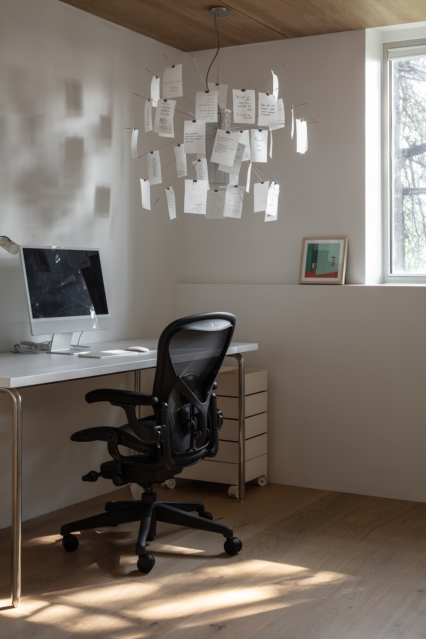
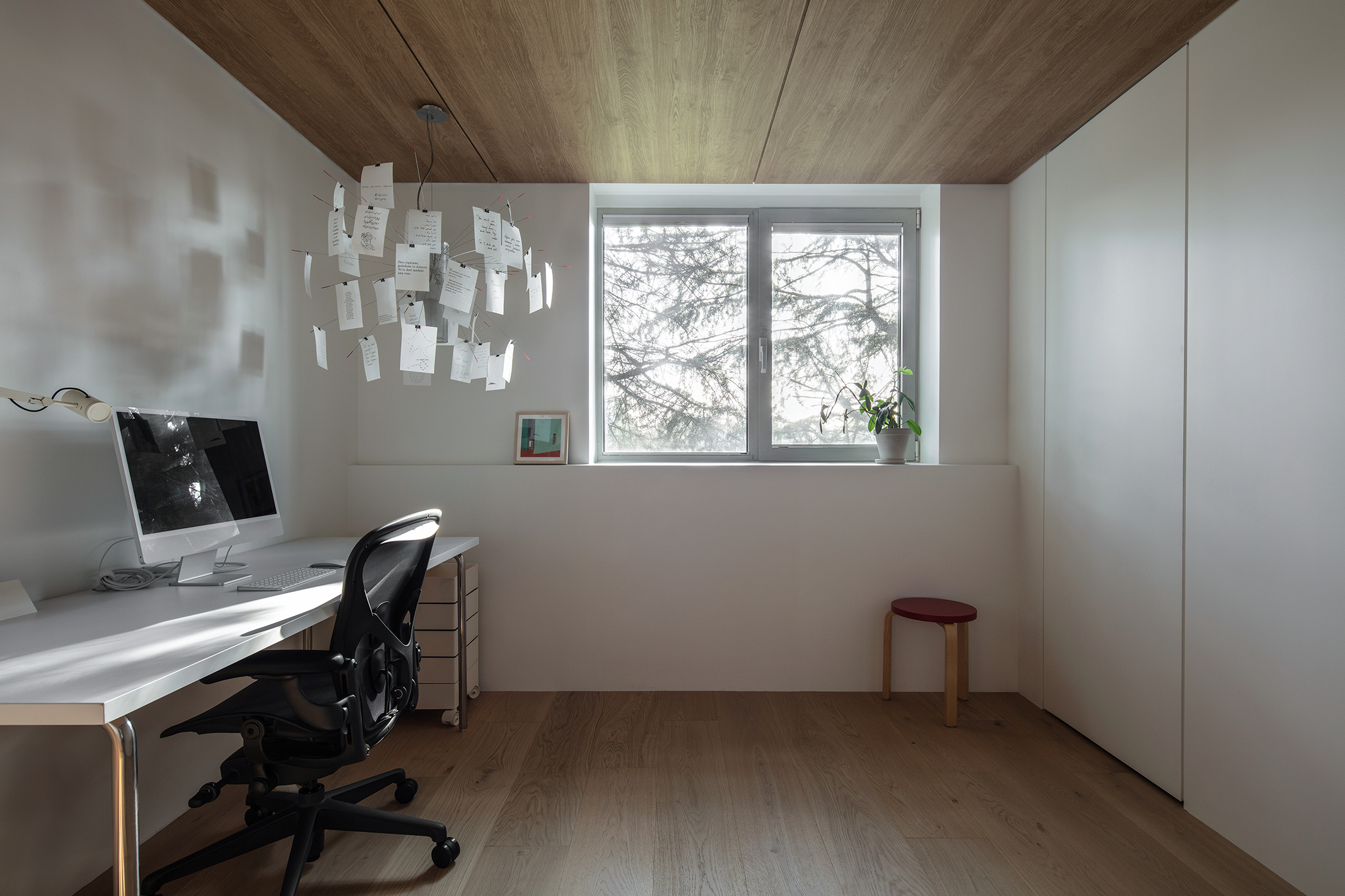
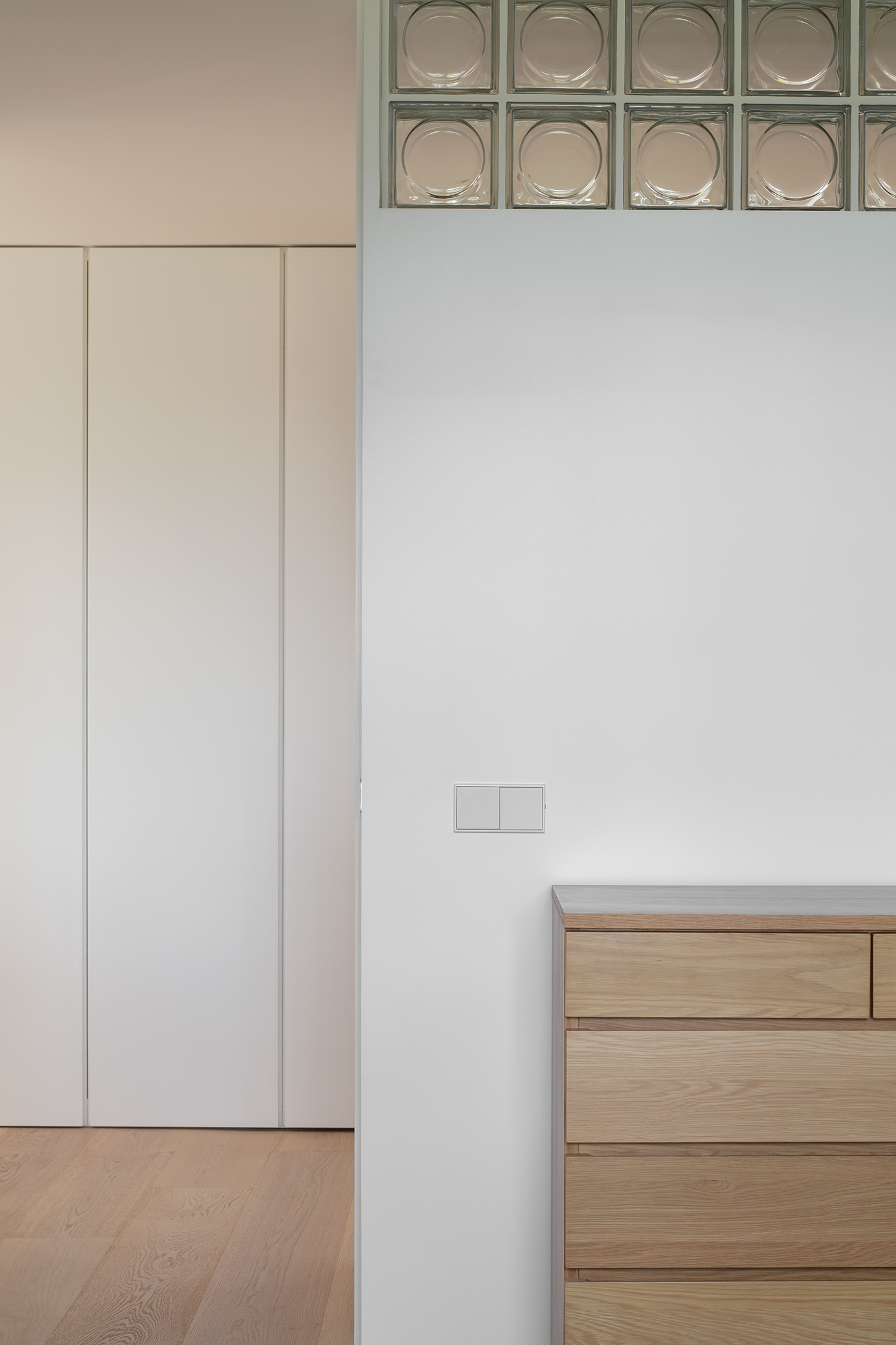
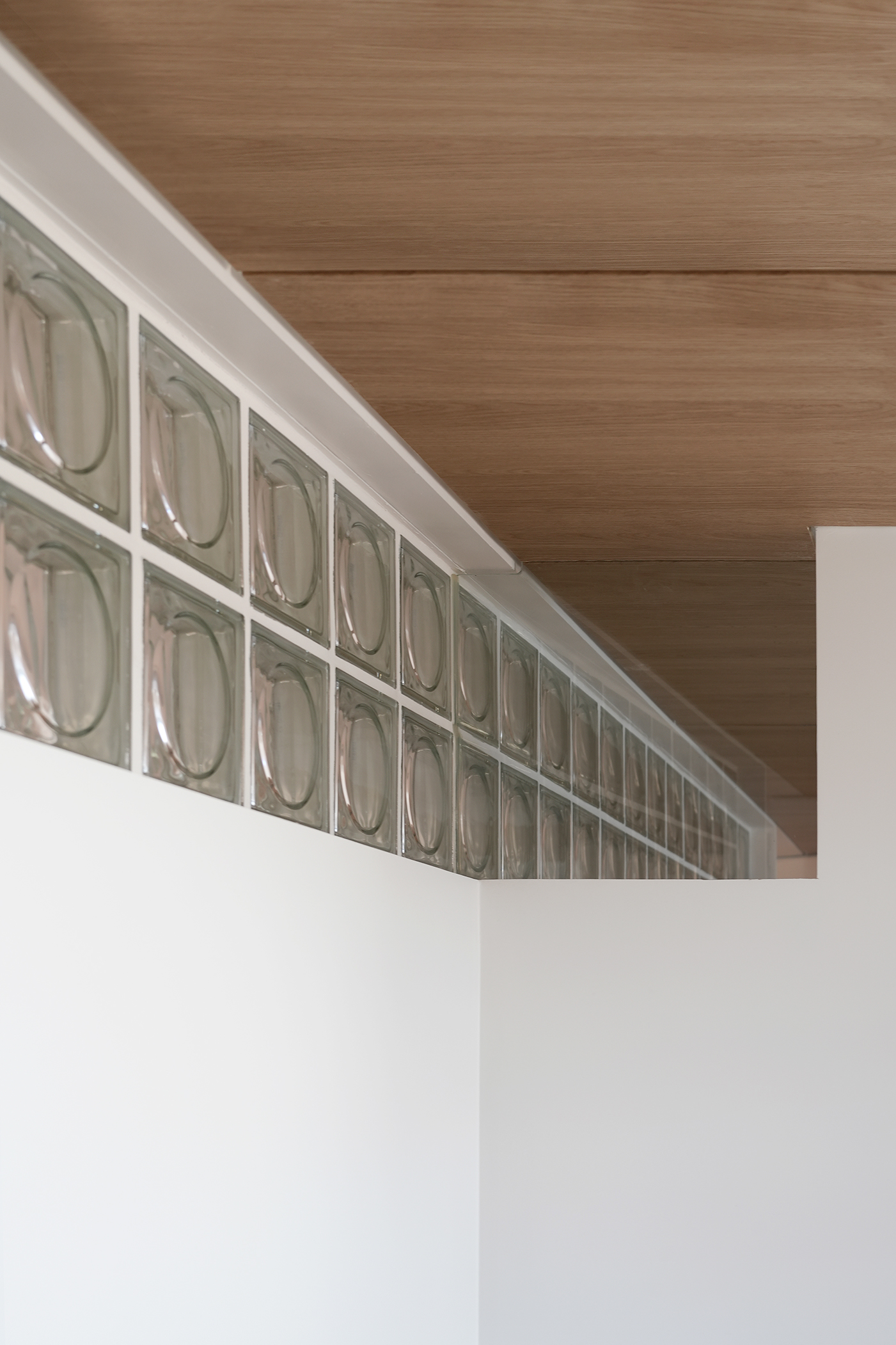
Photo by Kiwoong Hong, SeungBum Ma
The small office was designed with the same concept as the bedroom. The warm oak ceiling continues, and glass blocks are placed in the hallway to add to the openness of the room. The wall at the corner was cut out to add enjoyment to the space. The original storage cabinet was used as is, and a ledge was created in front of the window so that plants and pictures could be placed there. Ingo Maurer lighting adds lightness and playfulness to the space.
작은 작업실은 침실과 동일한 컨셉으로 디자인되었다. 따뜻한 참나무 천장이 시원하게 이어지고, 복도 방향으로는 글라스블럭을 두어 방의 개방감을 더하며, 코너의 벽체를 잘라내어 공간에 즐거움을 더했다. 원래 있던 수납장을 그대로 활용하였고, 창문 앞에는 턱을 만들어서 식물과 그림을 올려둘 수 있도록 하였다. 잉고 마우러 조명은 공간에 경쾌함과 장난스러움을 더한다.
Corridor

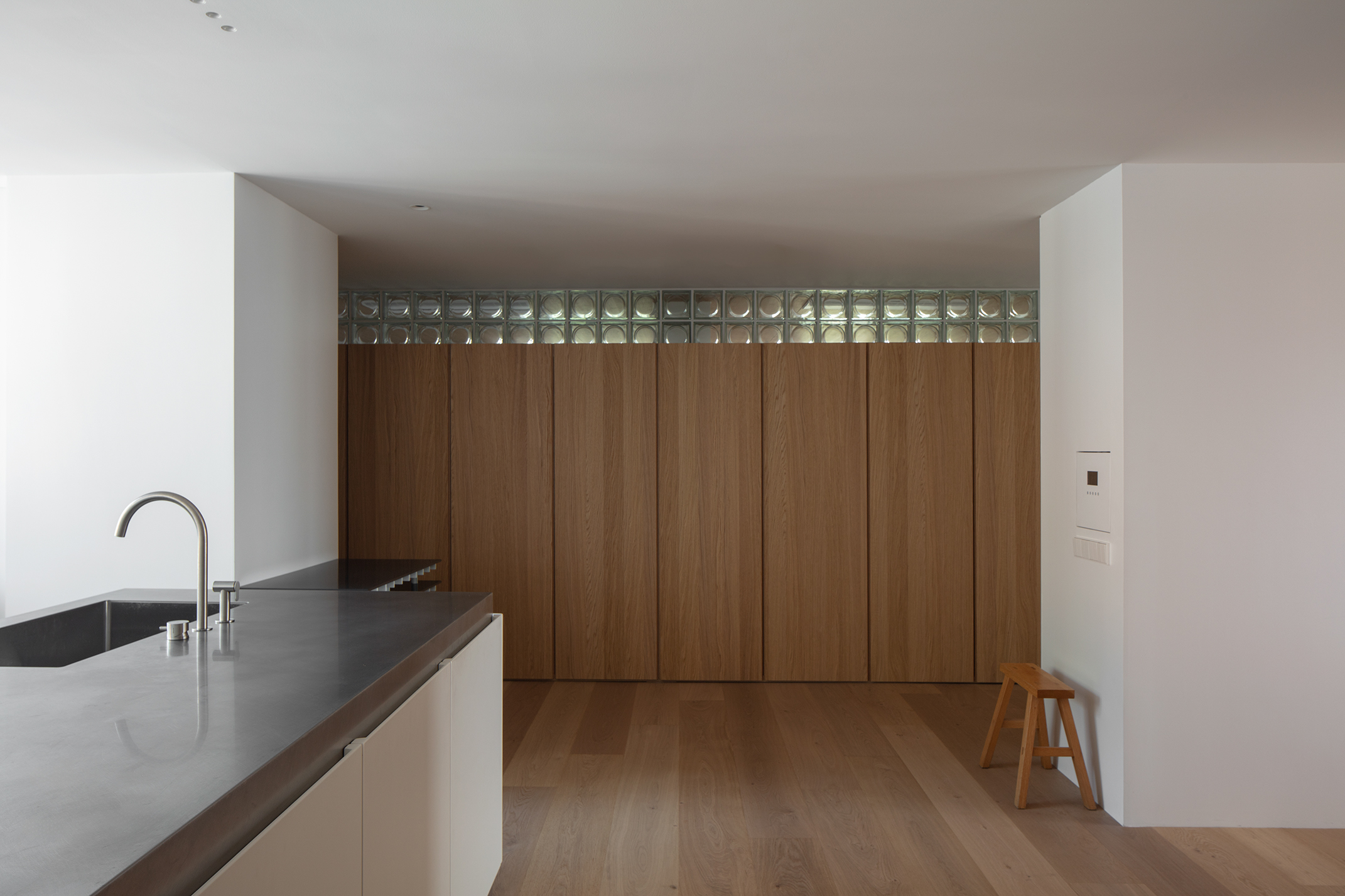
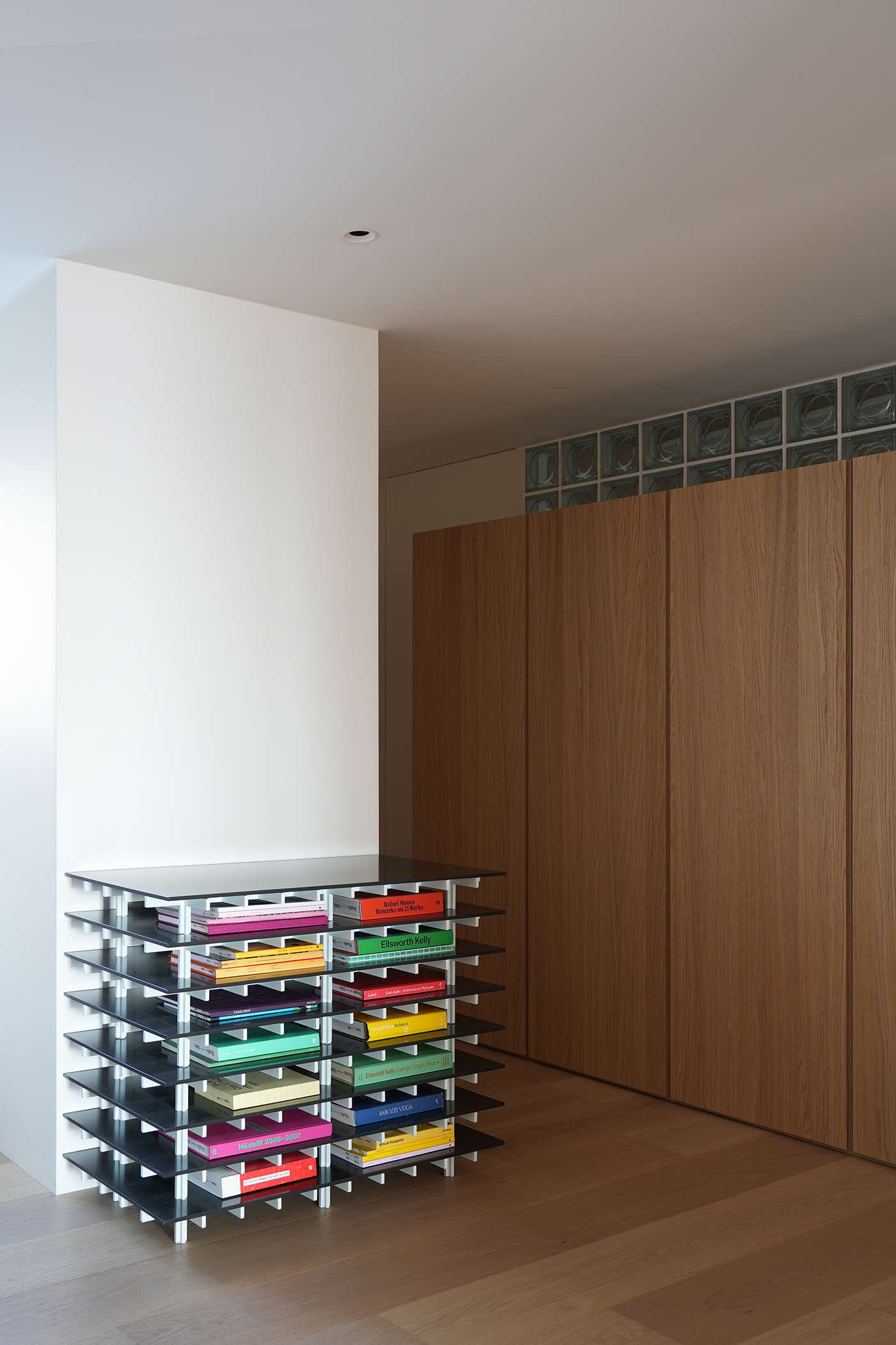
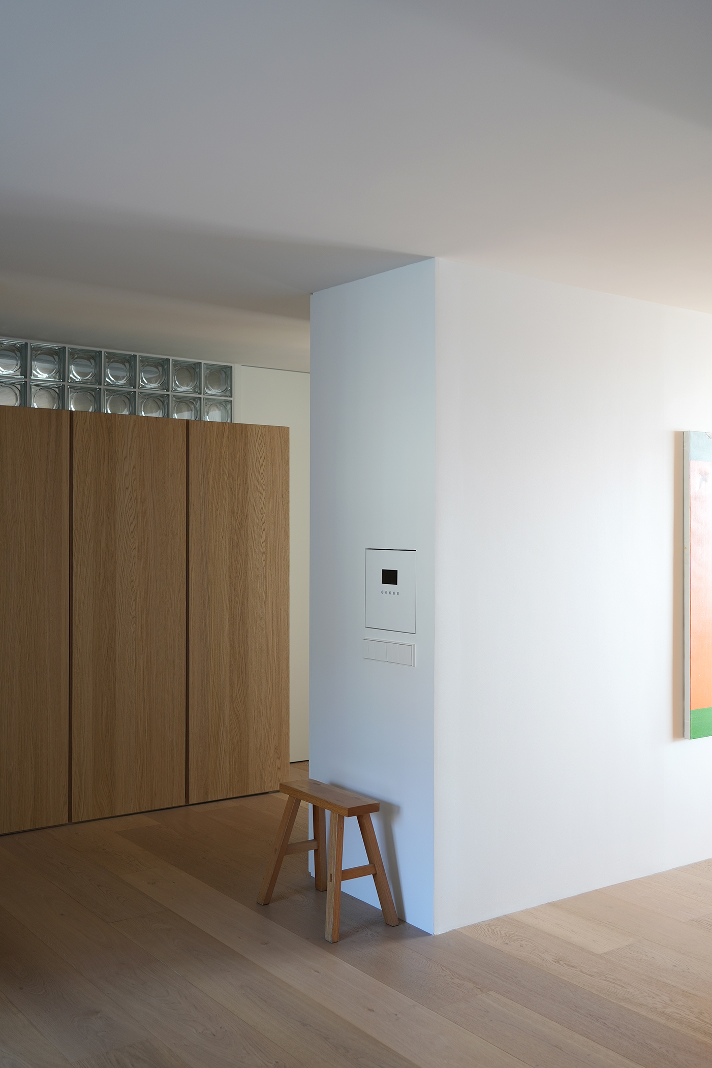
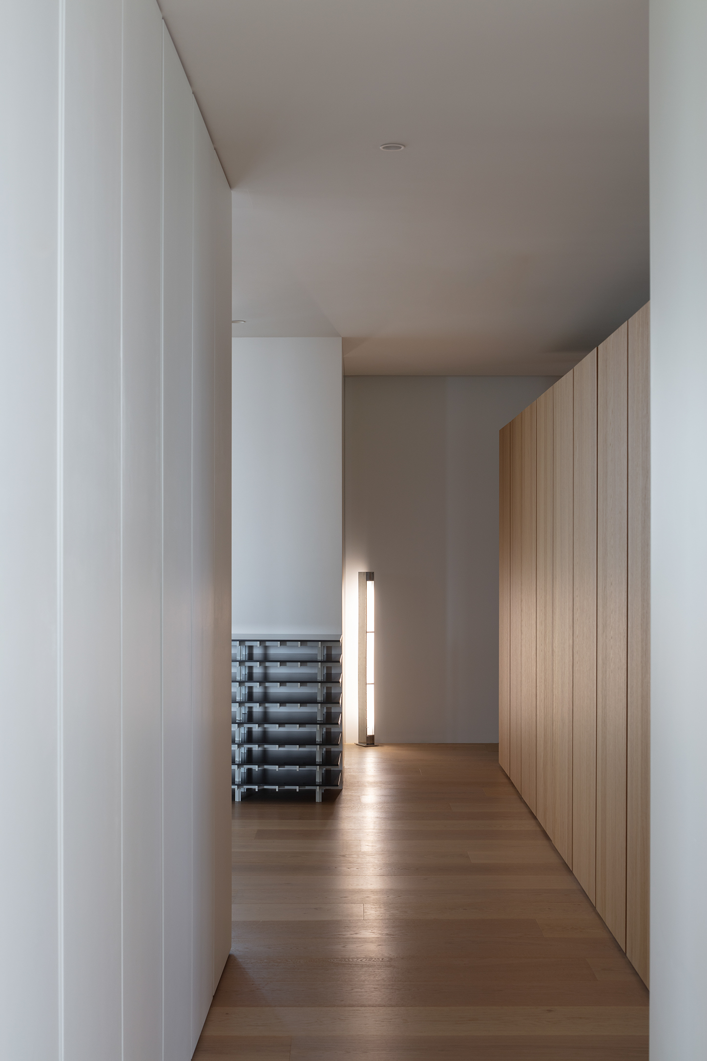
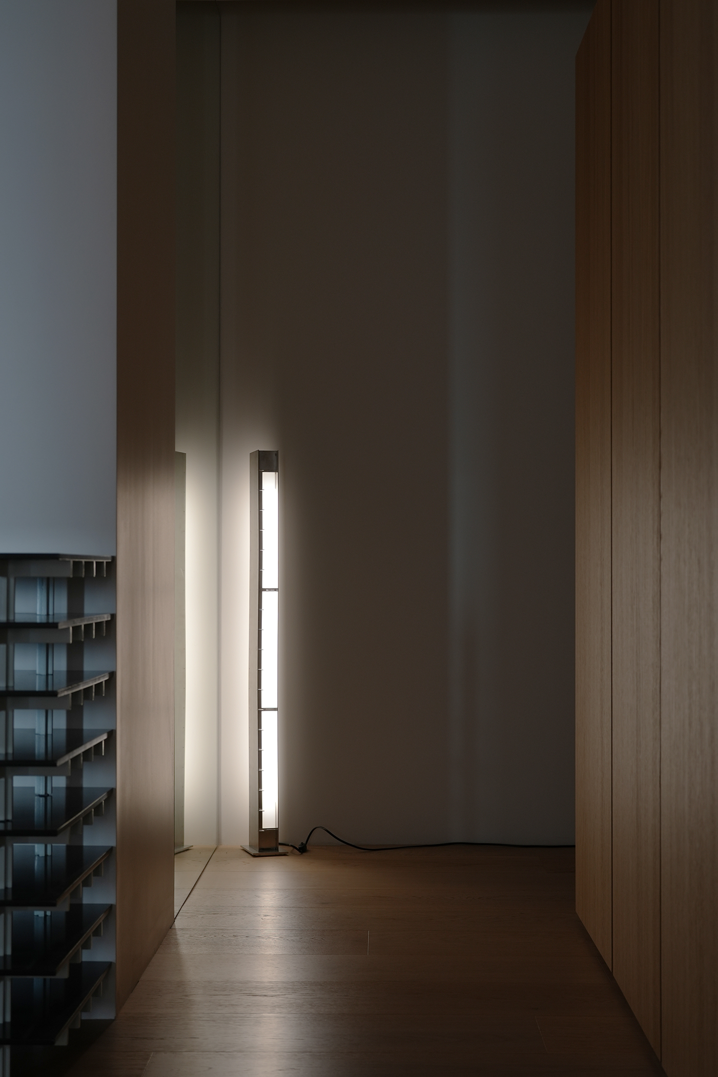
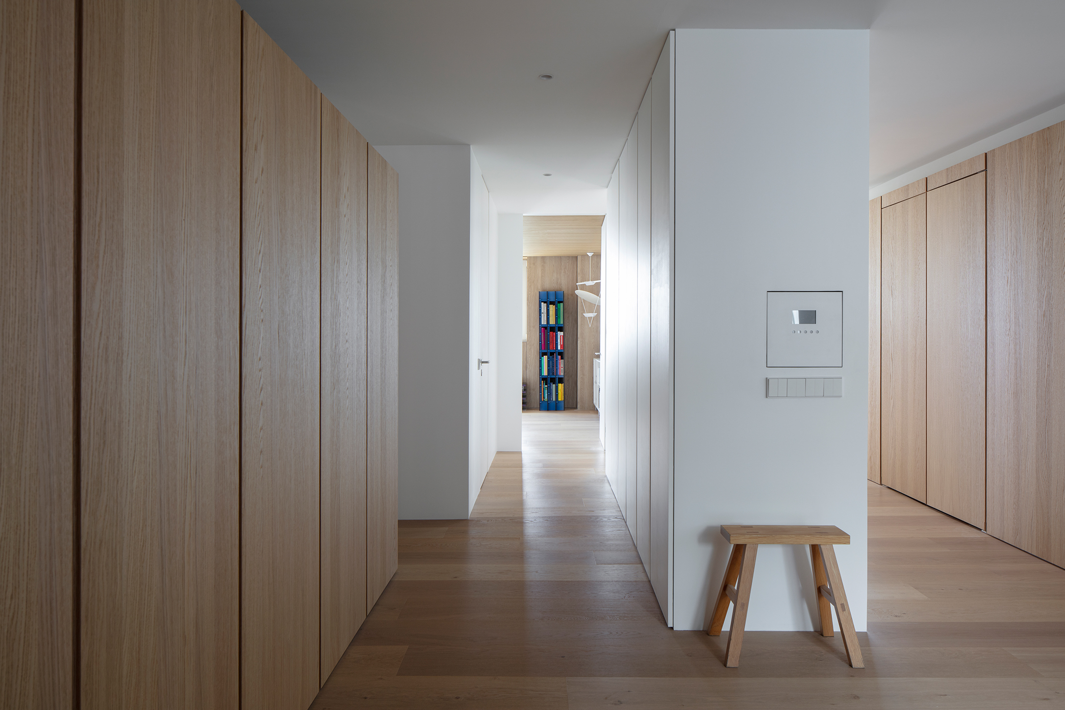
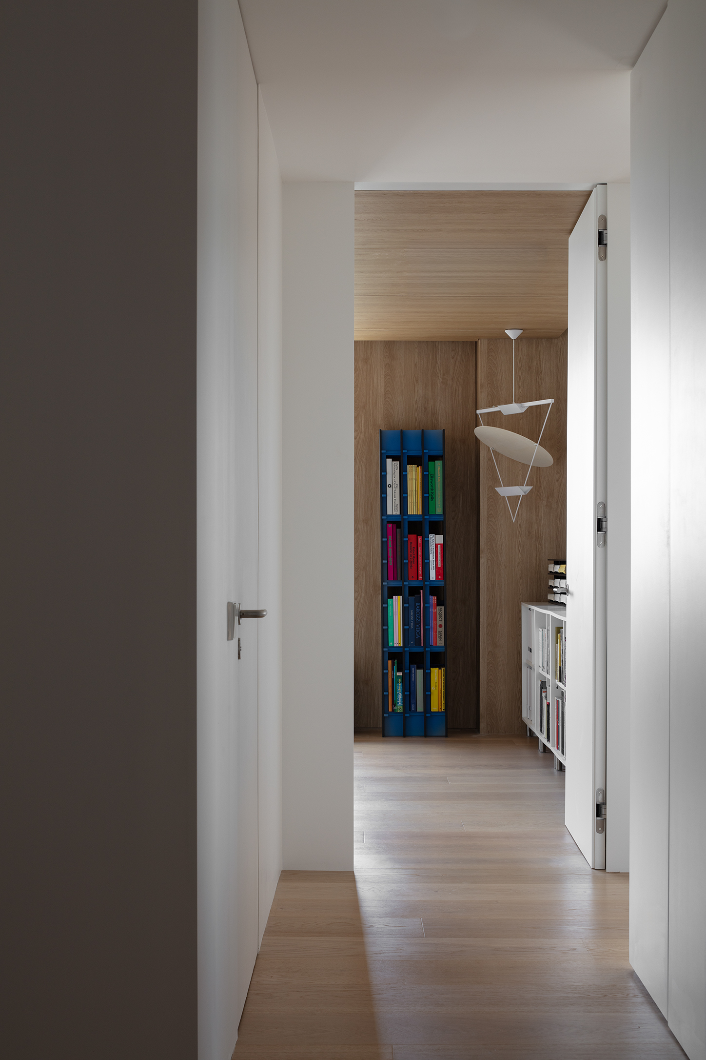
Photo by Kiwoong Hong, SeungBum Ma
The corridor is composed of a tall white cabinet volume and a low white oak cabinet volume. The white storage volume was created to surround the original column, dividing the space into a public hallway toward the entrance and a private hallway on the other side. Towards the entrance, it becomes a large blank wall where a painting is placed, and on the other side, it becomes a storage closet for clothes and miscellaneous items.
The white oak cabinet in front of the room was lowered in height to allow soft natural light to flow through the glass block. Indirect lighting was placed on the top of the cabinet so the glass block glows beautifully at night.
The white oak cabinet in front of the room was lowered in height to allow soft natural light to flow through the glass block. Indirect lighting was placed on the top of the cabinet so the glass block glows beautifully at night.
복도는 하얀색의 키큰 수납장 볼륨과 낮은 화이트 오크 수납장 볼륨으로 구성된다. 하얀색 수납장 볼륨은 원래 있던 기둥을 감싸며 만들어졌고, 공간을 현관쪽의 공적인 복도와 반대쪽의 사적인 복도로 분할한다. 현관 방향으로는 그림을 걸 수 있는 커다란 벽이 되고, 반대편에서는 옷과 잡동사니들의 수납장이 된다.
방 앞의 화이트 오크 수납장은 높이를 낮추어 글라스 블럭을 통해 은은한 자연광이 오갈 수 있도록 하였다. 수납장 상부에 간접등을 두어 밤에는 글라스 블럭이 아름답게 빛나도록 하였다.
방 앞의 화이트 오크 수납장은 높이를 낮추어 글라스 블럭을 통해 은은한 자연광이 오갈 수 있도록 하였다. 수납장 상부에 간접등을 두어 밤에는 글라스 블럭이 아름답게 빛나도록 하였다.
Bathroom
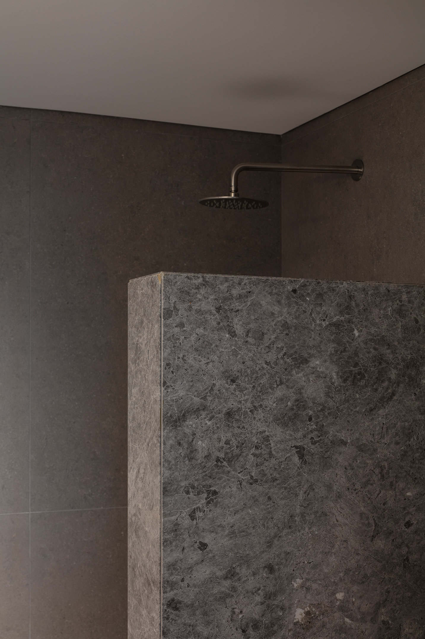
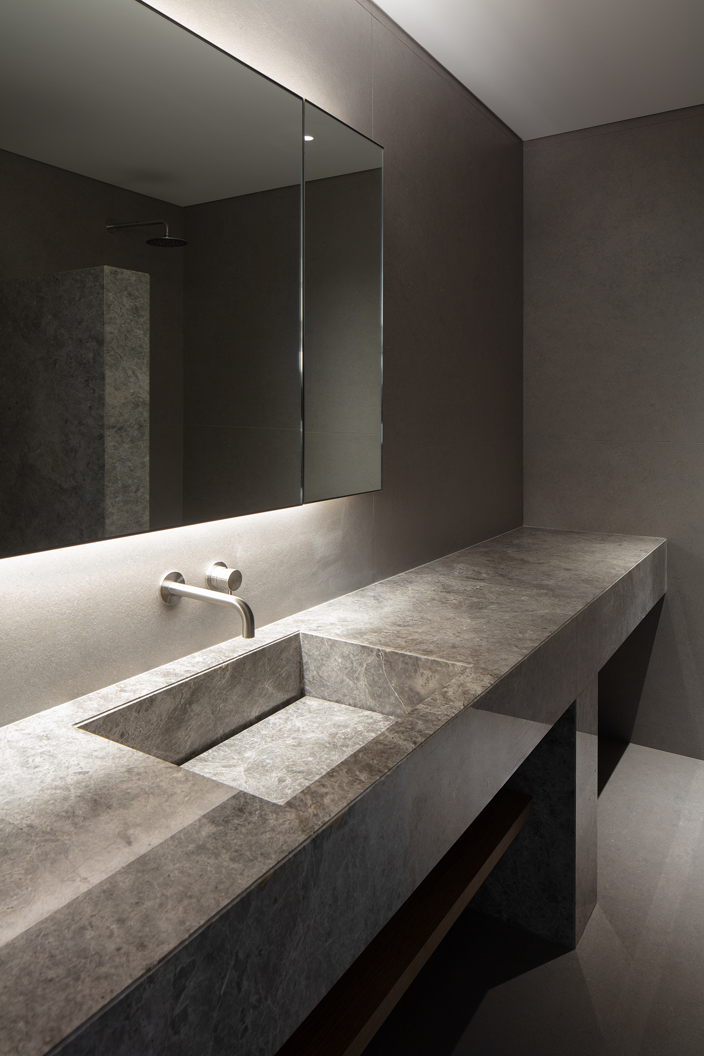
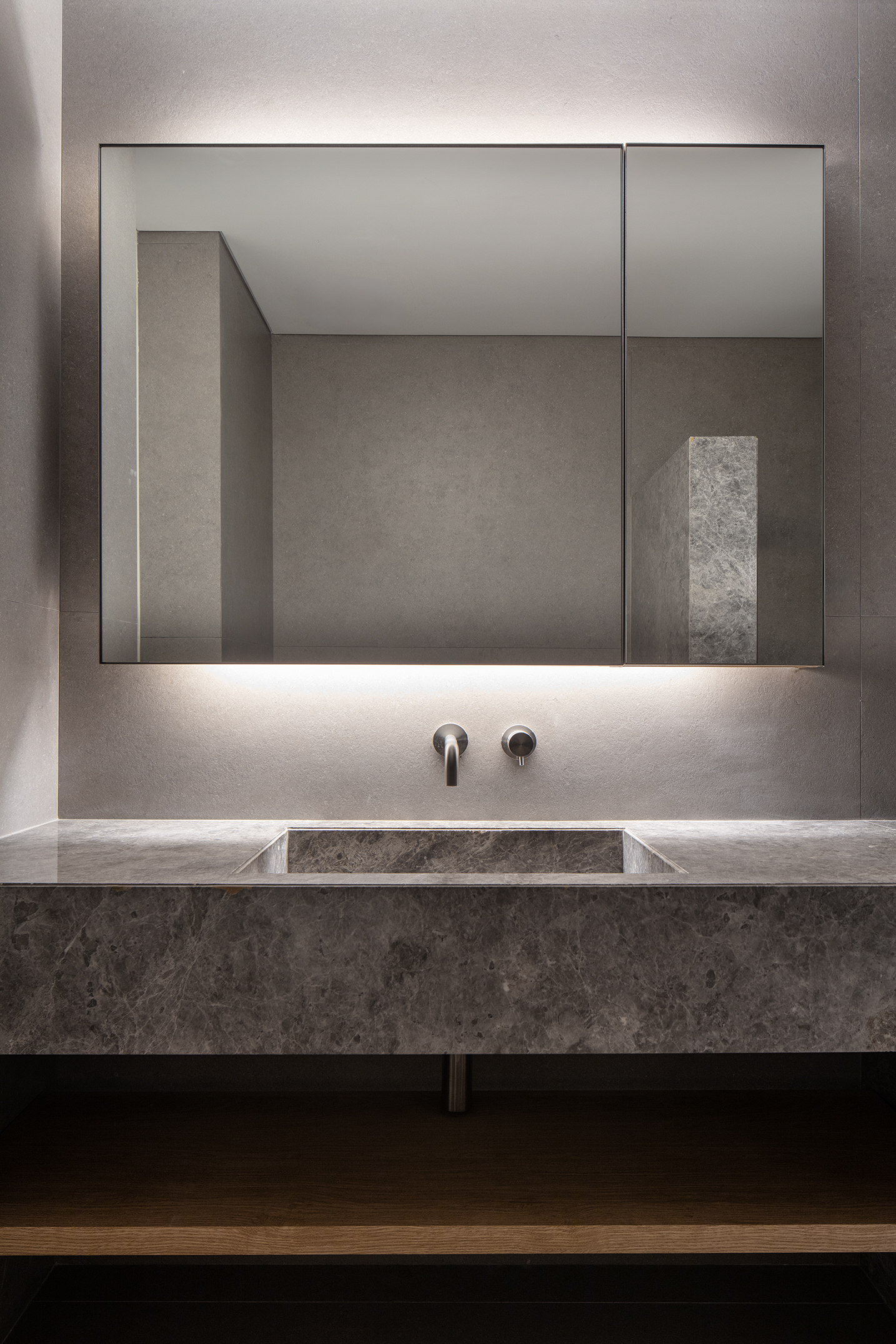
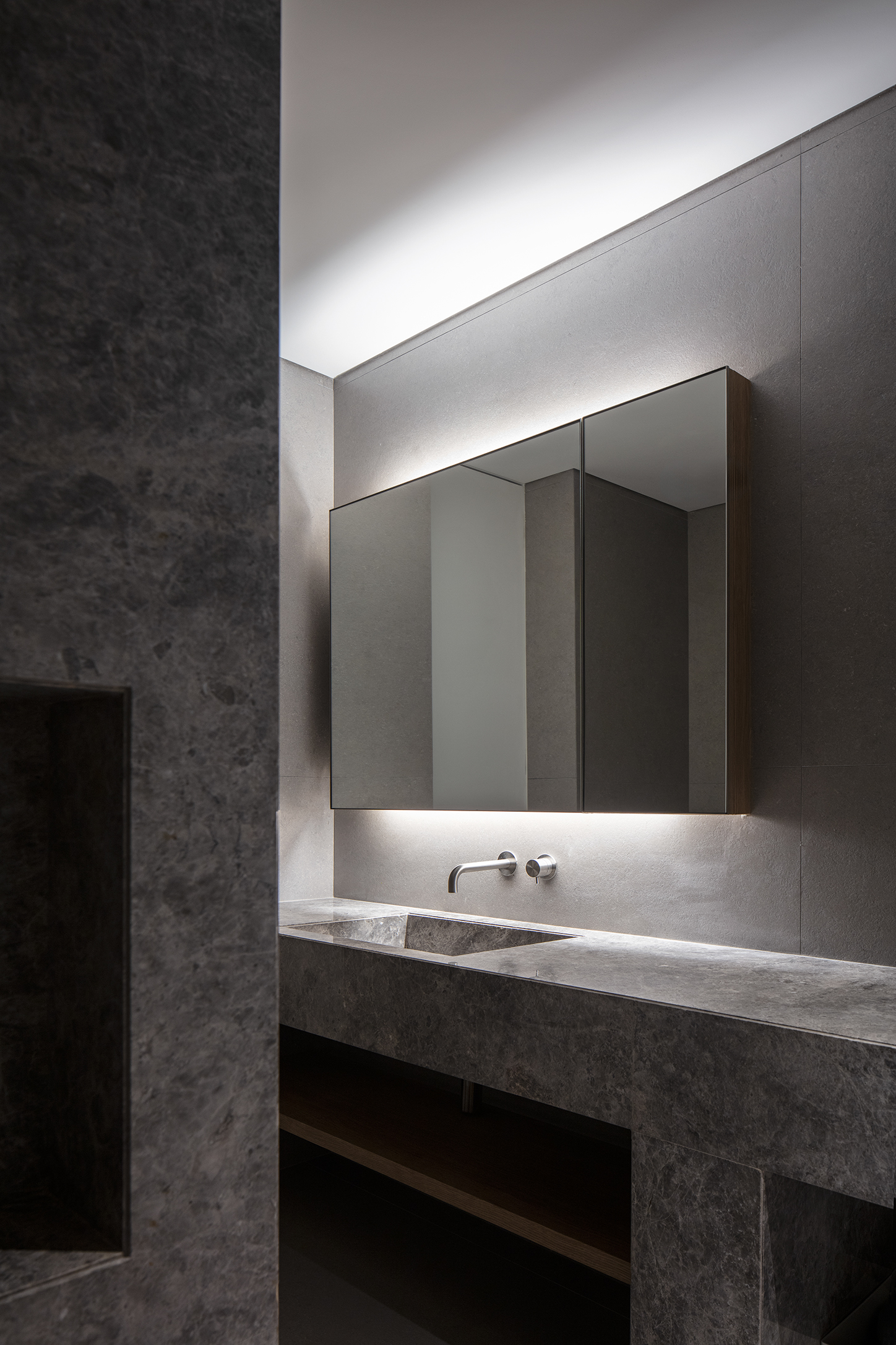
Photo by Kiwoong Hong
Home Office
![]()
![]()
![]()
![]()
![]()
![]()
![]()
![]()
Master Bathroom
![]()
![]()
![]()
![]()
![]()
![]()
![]()
![]()
![]()
Living room
![]()
![]()
![]()
![]()
![]()
![]()
![]()
![]()
![]()
![]()
![]()
![]()
![]()
![]()
![]()
![]()
![]()
![]()
![]()
![]()
The windowless bathroom adjoining the living area was finished in Tundra Gray, evoking the texture of a lunar surface. A long stone volume for the basin appears to float lightly in the air, while the partition mass that separates the shower area was deliberately kept low to enhance the sense of depth and dimensionality. All storage elements are concealed and hidden from view, lending the space an atmosphere of quiet mystery.
자연광이 없는 거실 화장실은 달의 표면을 연상시키는 툰드라 그레이 로 마감했다. 세면대의 기다란 석재 덩어리는 공중에 부유하듯 놓였고, 샤워 공간을 분할하는 매스는 의도적으로 높이를 낮추어 공간의 깊이감과 입체감을 더했다. 수납되는 모든 요소들은 숨겨지고 가려져서 공간의 분위기를 보다 신비롭게 만들어준다.
Home Office
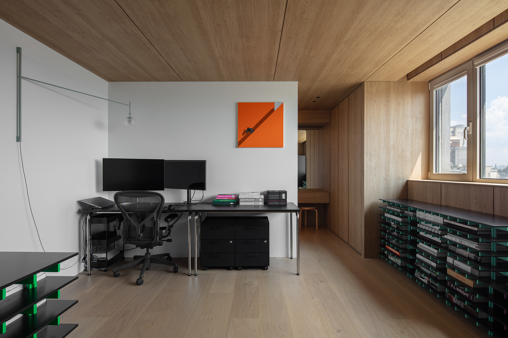
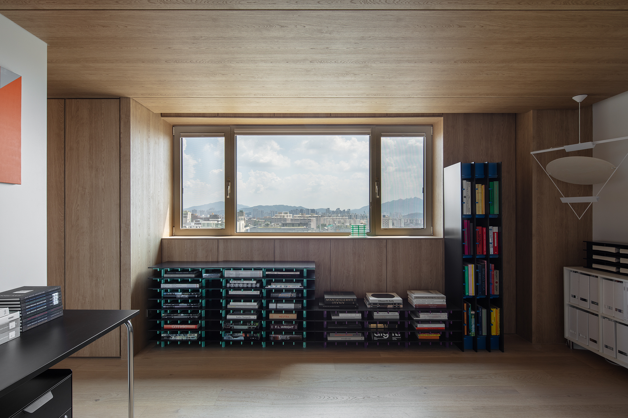
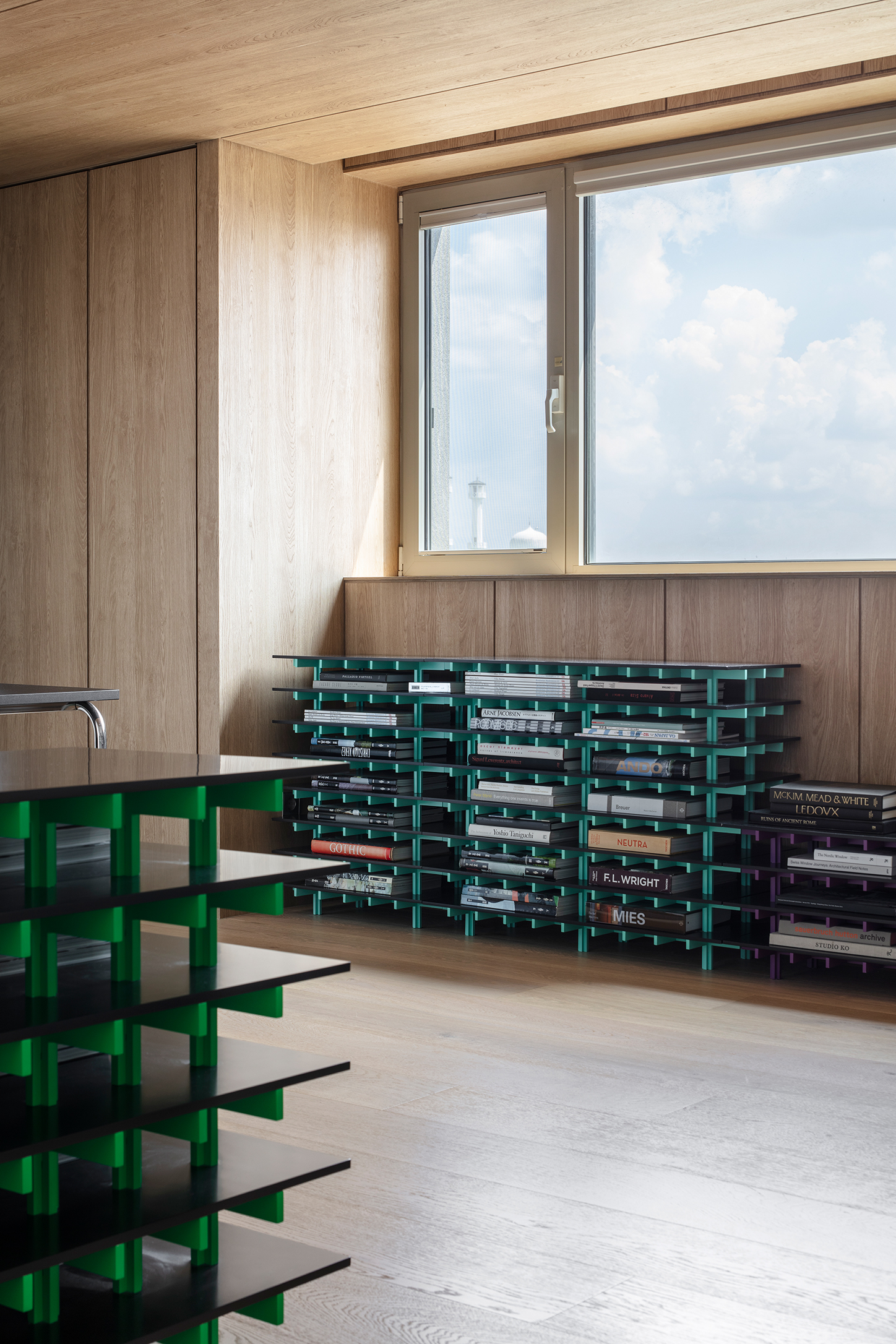
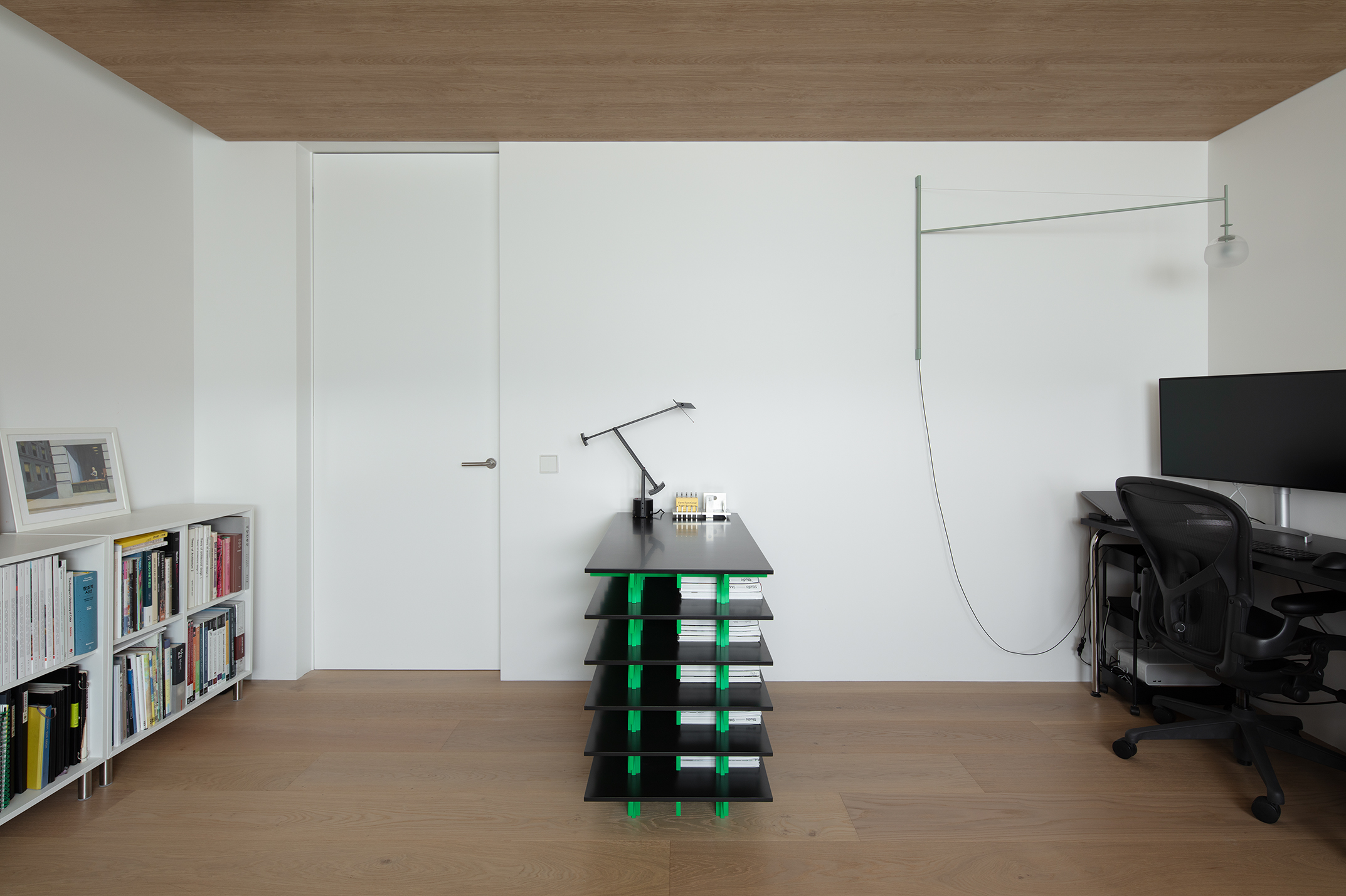
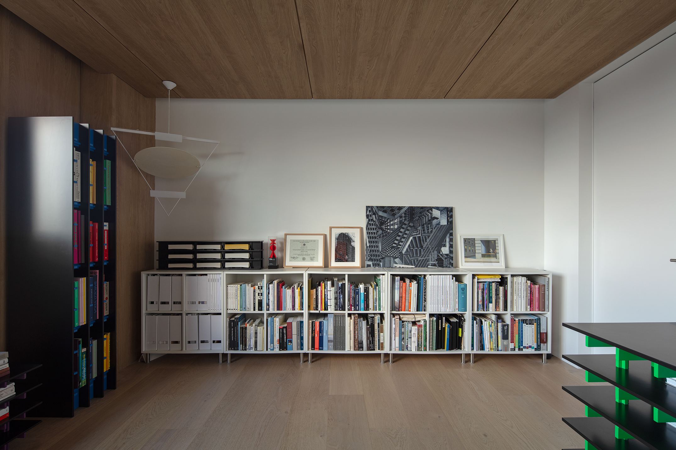
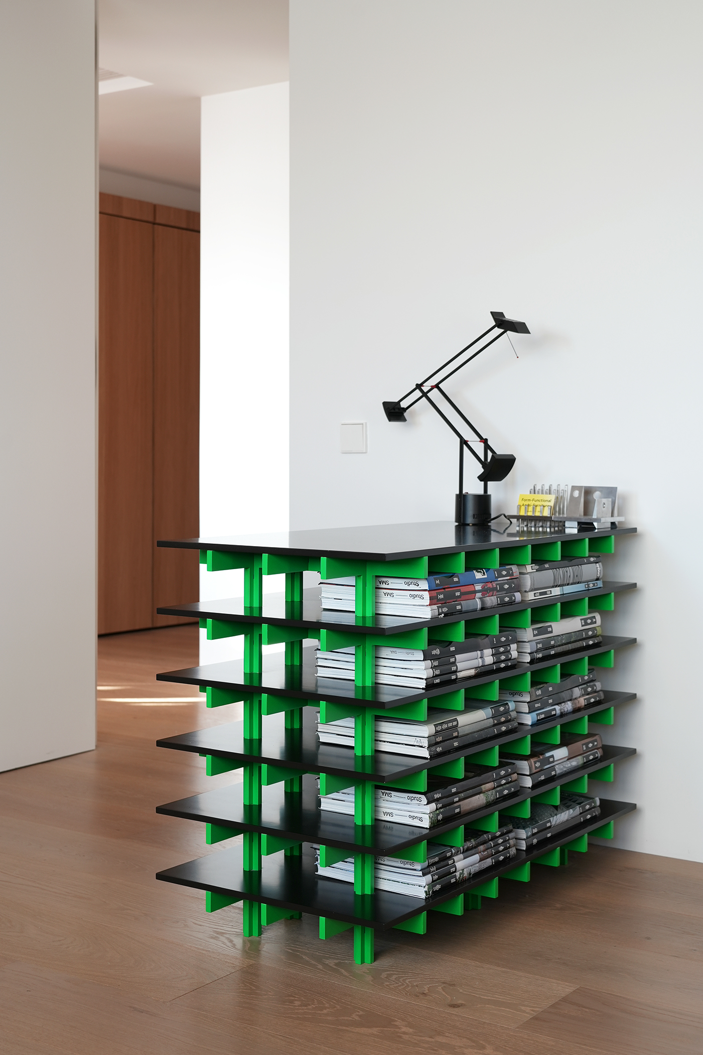
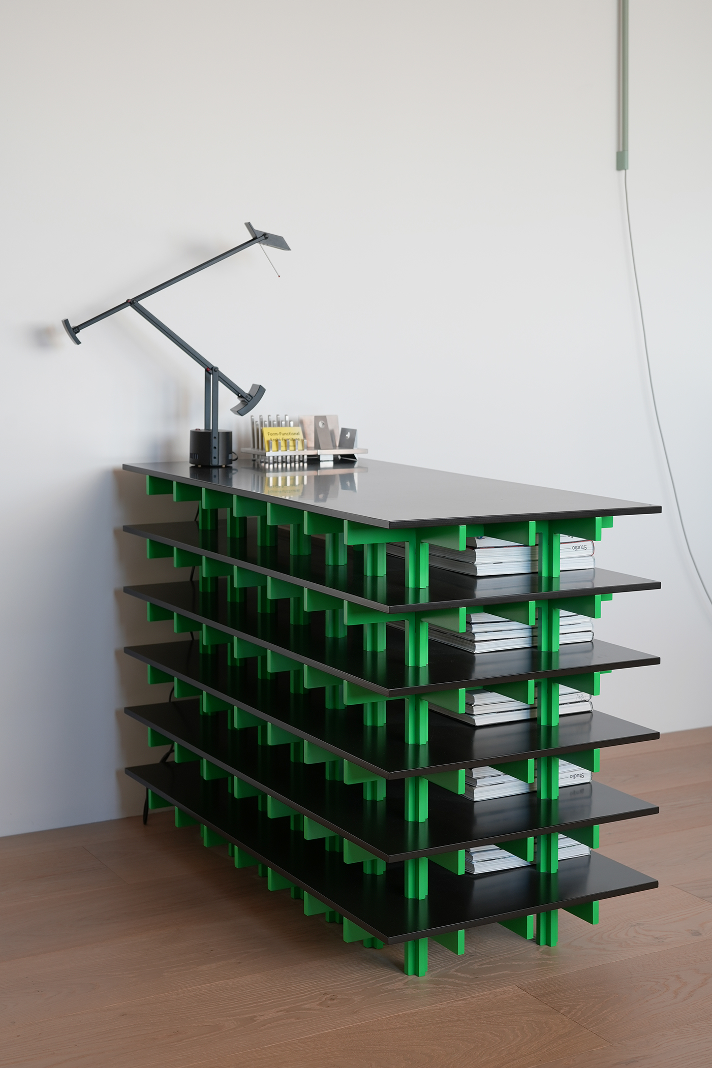
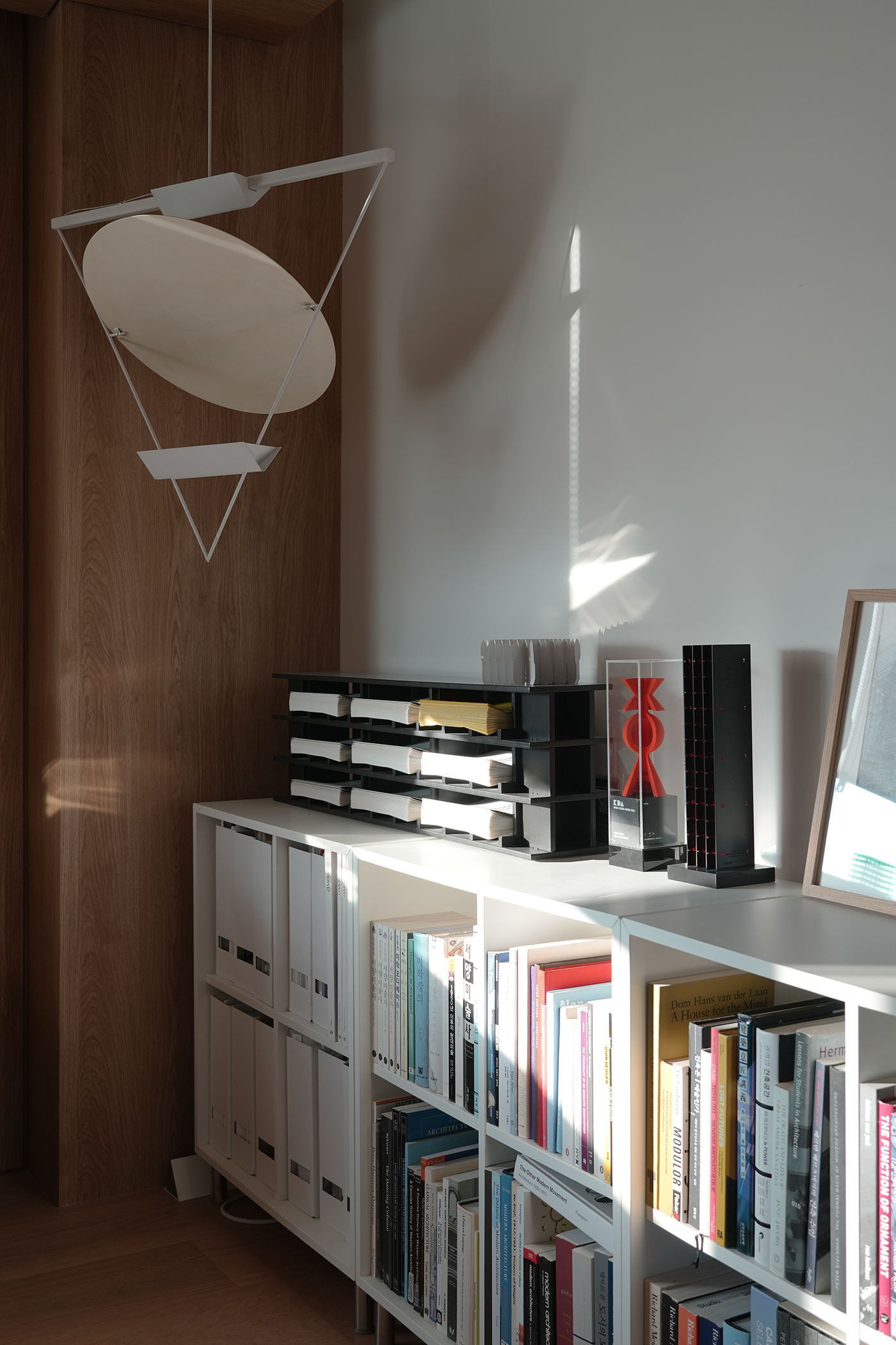
Photo by Kiwoong Hong, SeungBum Ma
This room is one of the spaces in the house where I spend the most time. To create a comfortable and warm atmosphere, wood was actively applied to the ceiling and walls. This room originally had a bathroom and a walk-in closet door on both sides, but the bathroom door was blocked, and the circulation was only directed toward the storage closet to increase the utilization of indoor space.
A long desk was placed on the newly created wall to facilitate computer workspace and other work activities, and lighting attached to the wall was installed to avoid interference with the large monitor. Simple line structures and thin strings in bright mint color cross the space, and round blown glass gently scatters light by grinding the surface.
Art furniture designed by Studio SMA located throughout the room, stores architecture and art books of various sizes. They are modular and stack vertically or expand horizontally. The colors of the structural element give vitality to the space and highlight the presence of the books. Store large, heavy books that do not fit in a ready-made bookshelf lying down to prevent them from bending.
A long desk was placed on the newly created wall to facilitate computer workspace and other work activities, and lighting attached to the wall was installed to avoid interference with the large monitor. Simple line structures and thin strings in bright mint color cross the space, and round blown glass gently scatters light by grinding the surface.
Art furniture
이 방은 집에서 가장 오랜 시간을 보내는 공간 중 하나다. 편안하고 따뜻한 분위기를 만들기 위해서 천장과 벽에 적극적으로 나무를 적용했다. 이 방은 본래 화장실과 워크인클로짓 문이 양쪽으로 있었는데, 화장실 문을 벽으로 막고 수납장쪽으로만 동선을 두어 실내 공간의 활용도를 높였다.
새롭게 만들어진 벽에는 긴 책상을 두어 컴퓨터 작업공간과 다른 작업활동을 용이하게 하였고, 커다란 모니터와 간섭되지 않도록 벽면에 부착되는 조명을 설치했다. 밝은 민트색의 간결한 라인 구조체와 가느다란 스트링이 공간을 가로지르고, 둥글게 불어낸 유리는 표면을 갈아내어 빛을 부드럽게 산란시킨다.
방의 곳곳에 위치한 Op 시리즈들은 다양한 크기의 건축, 예술 서적들을 수납한다. 이들은 모듈화되어 수직적으로 쌓이거나 수평적으로 확장한다. 부재들의 색상은 공간에 활력을 부여하고, 책들의 존재감을 부각시킨다. 기성 책장에는 들어가지 않는 거대하고 무거운 책들을 눕혀서 보관하여 휘지 않도록 한다.
Master Bathroom
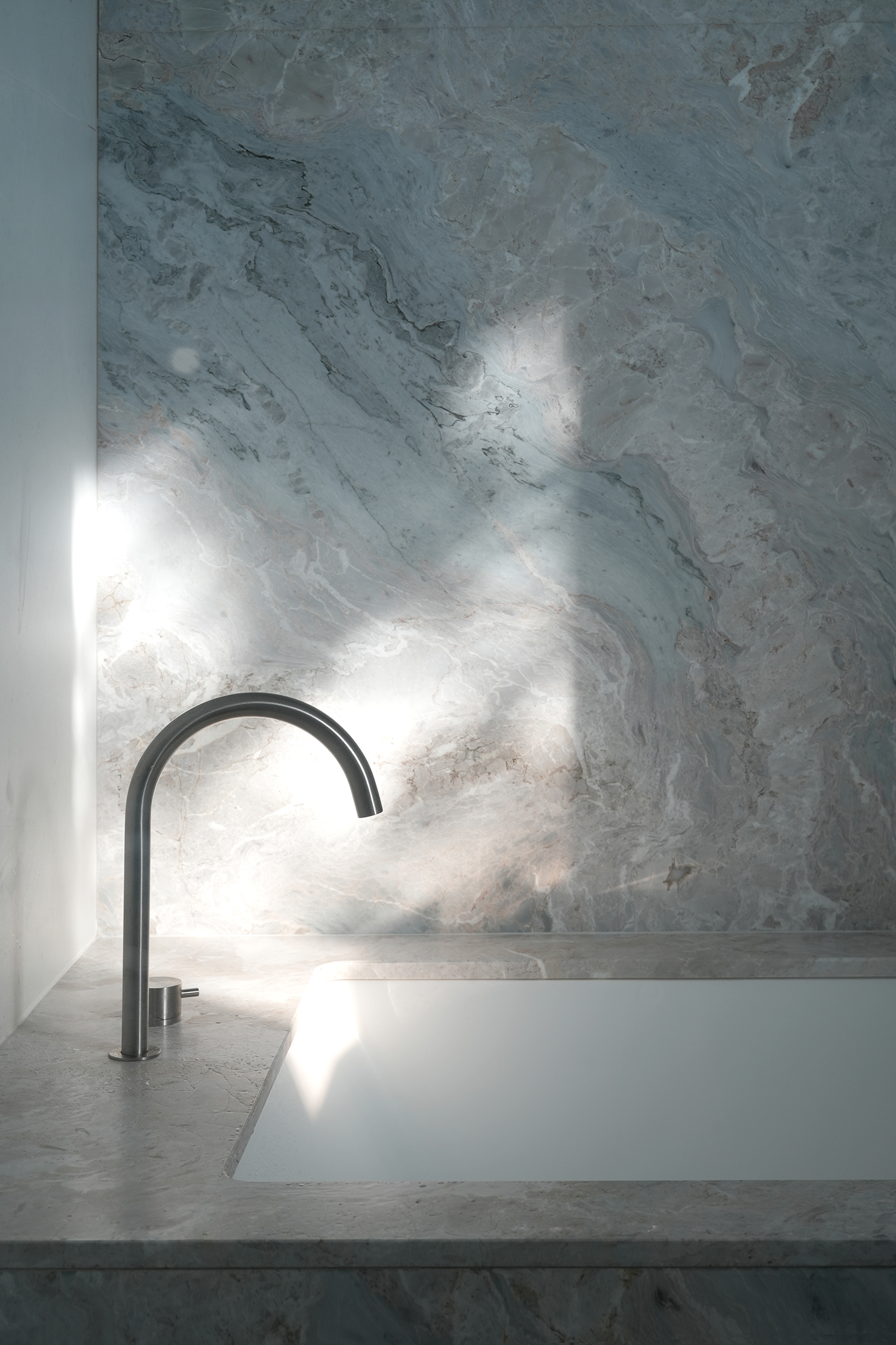
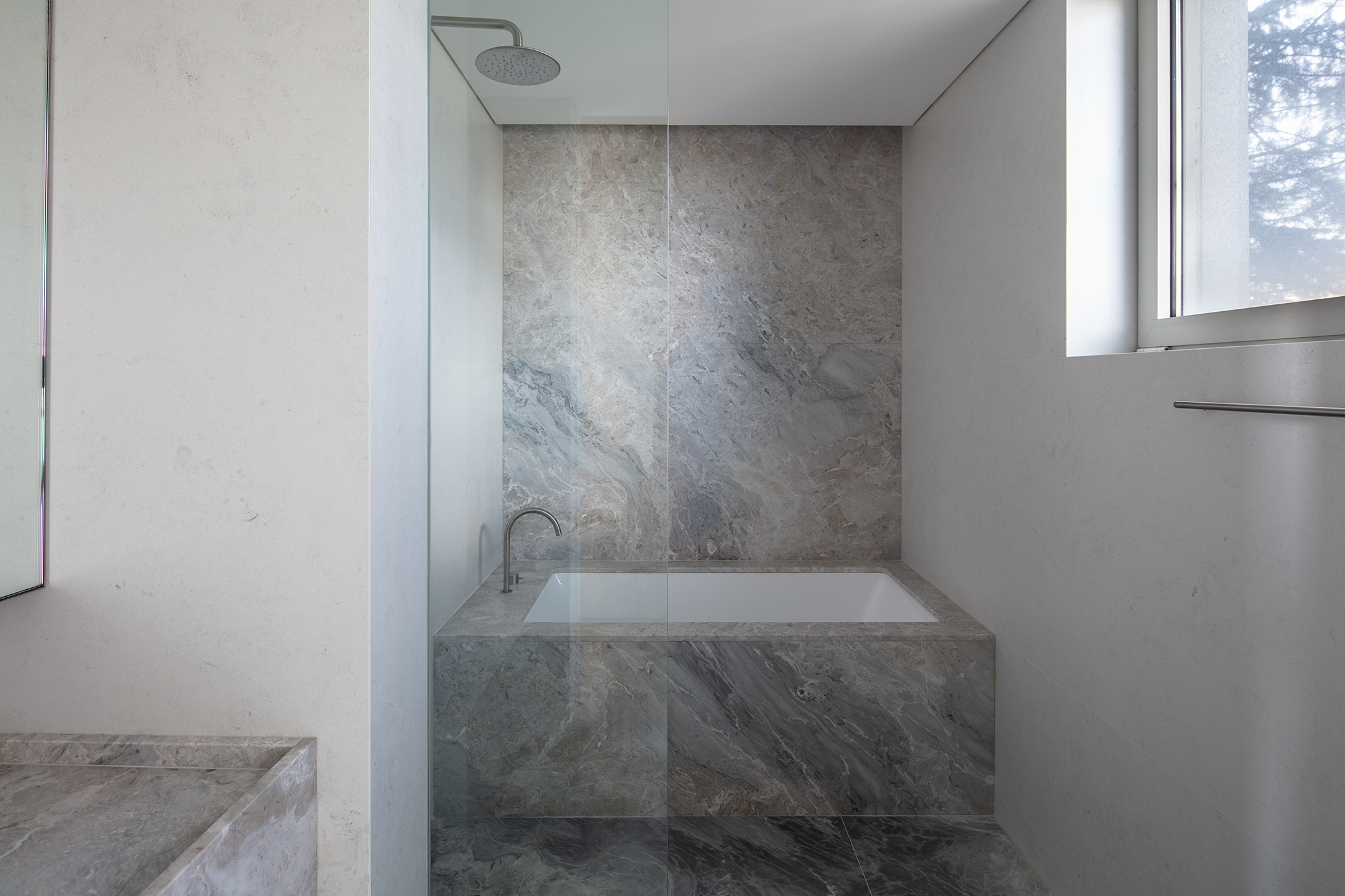
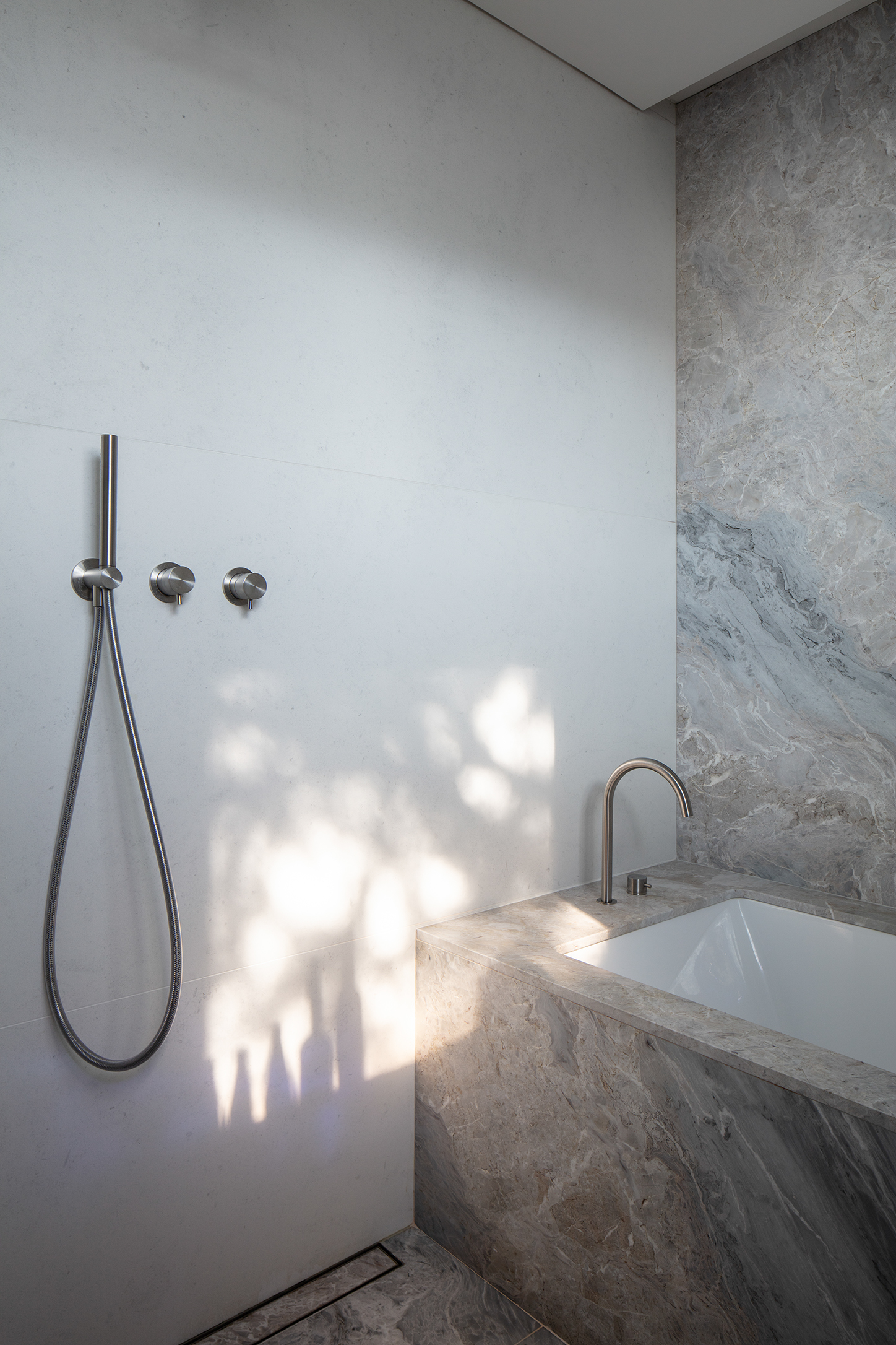
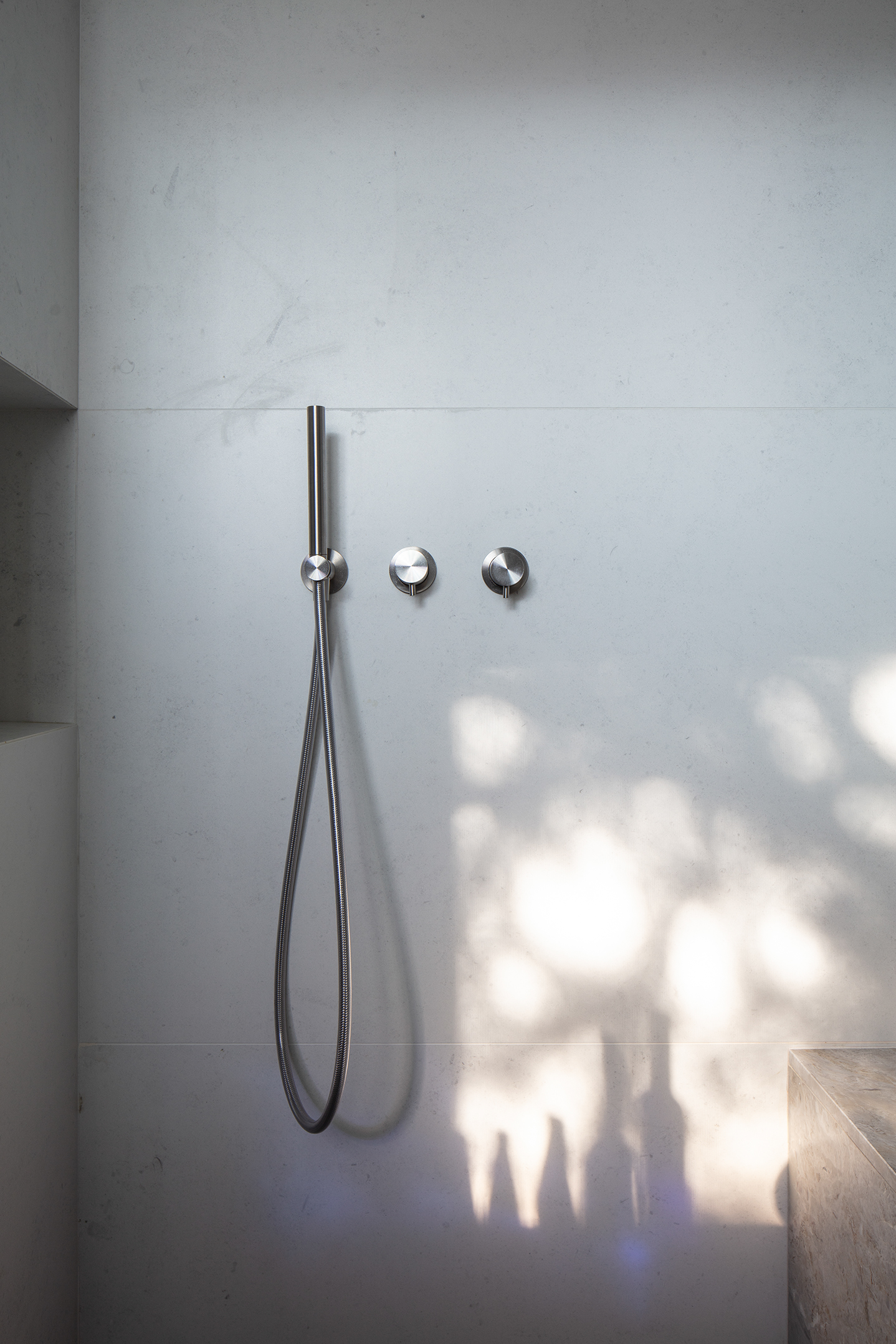
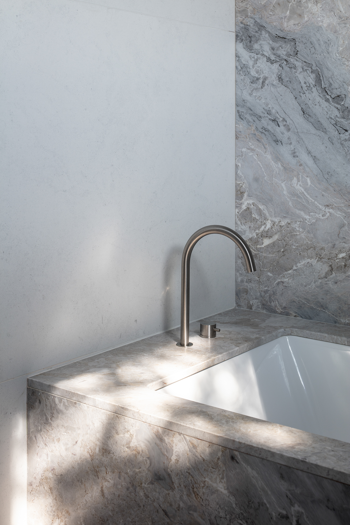
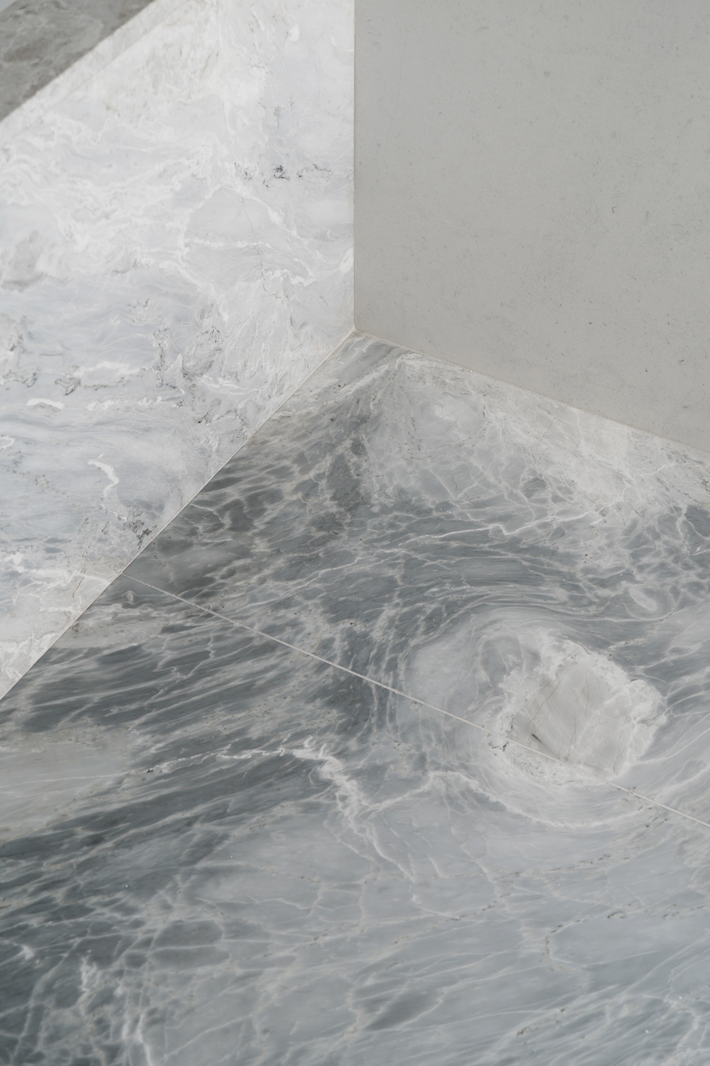
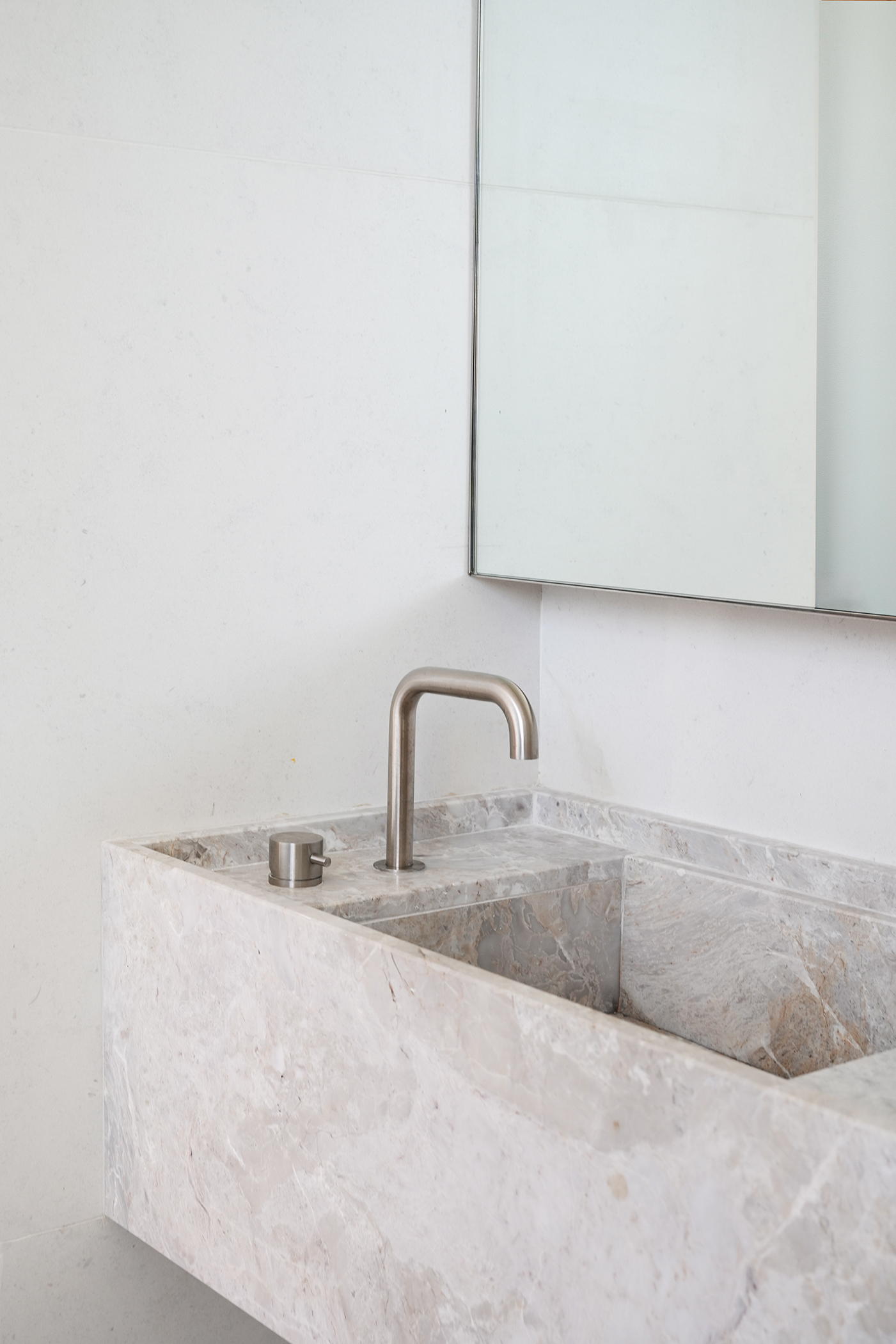
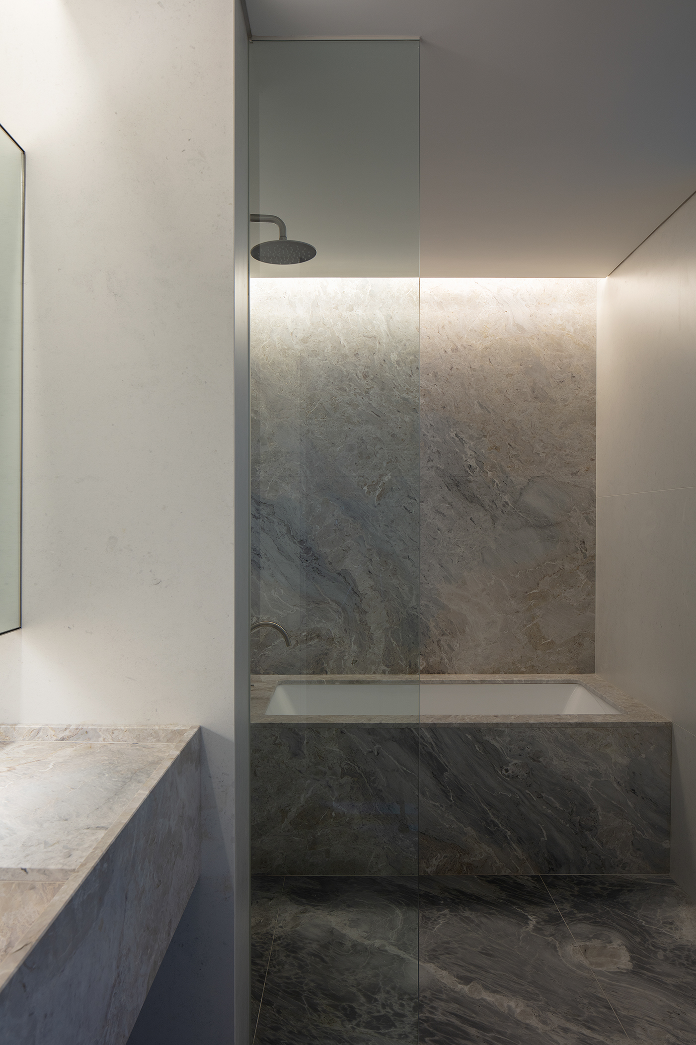
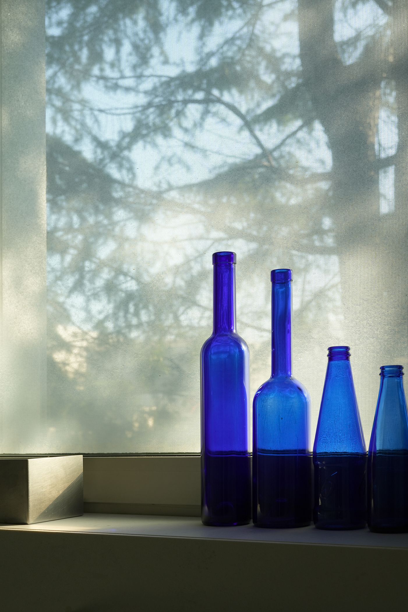
Photo by Kiwoong Hong, SeungBum Ma
It is finished with Versilys marble with a pattern reminiscent of the surface of water. The patterns created by various minerals over a long period become beautiful paintings in themselves and create the atmosphere of a space. When water falls on the floor, it looks as if it overlaps the waves flowing between the rocks in the valley.
Because Versilys is a marble made up of many colors, it was not easy to choose tiles that matched it. After considering various tiles, we found big slab tiles with colors and patterns that matched the Versilys and arranged them horizontally to minimize joints and create a feeling of horizontal expansion.
This place has windows facing east, allowing different morning sunlight depending on the season. To capture the sunlight beautifully, blue bottles that I received as a gift from an acquaintance were placed.
물의 표면을 연상케하는 패턴의 베실리스 석재로 마감했다. 여러 광물이 오랜시간에 걸쳐 만들어낸 패턴은 그 자체가 아름다운 회화가 되어 공간의 분위기를 만든다. 바닥에 물이 떨어지면 마치 계곡의 바위들 사이로 흐르는 물결을 겹쳐보는 듯 하다.
베실리스는 여러 색상으로 이루어진 돌이라서 이와 어울리는 타일을 고르는 것이 쉽지 않았다. 여러 타일을 고민한 결과, 베실리스와 어울리는 색상과 무늬를 머금고 있는 빅 슬랩 타일을 찾았고, 줄눈을 최소화하고 수평적으로 확장되는 느낌을 위해서 가로로 배열했다.
이곳은 동향으로 창문이 있어 계절별로 다른 모습의 아침 햇살을 드리운다. 햇살을 아름답게 담기 위해 지인분께 선물받은 파란색 병들을 두었다.
베실리스는 여러 색상으로 이루어진 돌이라서 이와 어울리는 타일을 고르는 것이 쉽지 않았다. 여러 타일을 고민한 결과, 베실리스와 어울리는 색상과 무늬를 머금고 있는 빅 슬랩 타일을 찾았고, 줄눈을 최소화하고 수평적으로 확장되는 느낌을 위해서 가로로 배열했다.
이곳은 동향으로 창문이 있어 계절별로 다른 모습의 아침 햇살을 드리운다. 햇살을 아름답게 담기 위해 지인분께 선물받은 파란색 병들을 두었다.
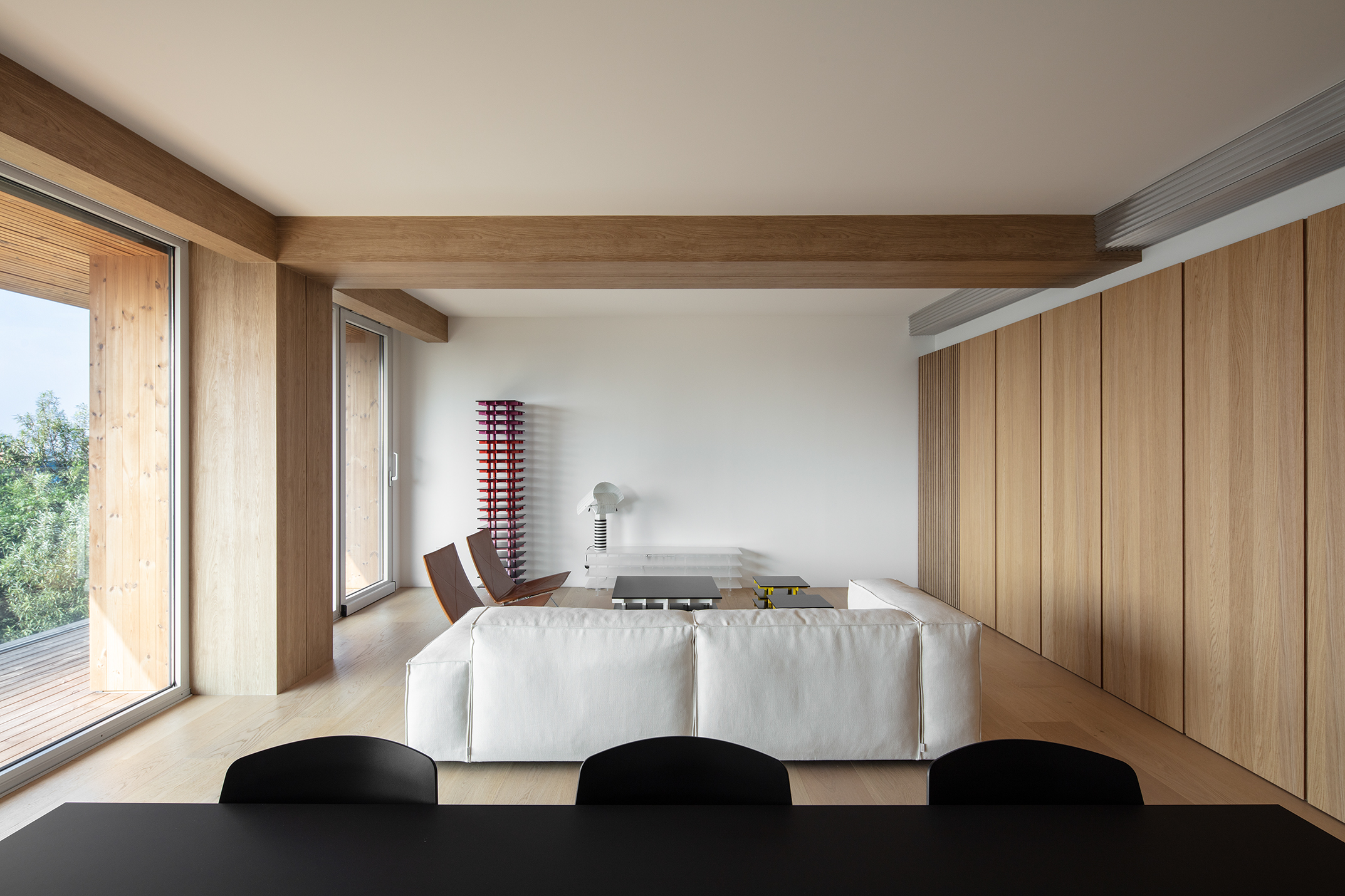
Living room

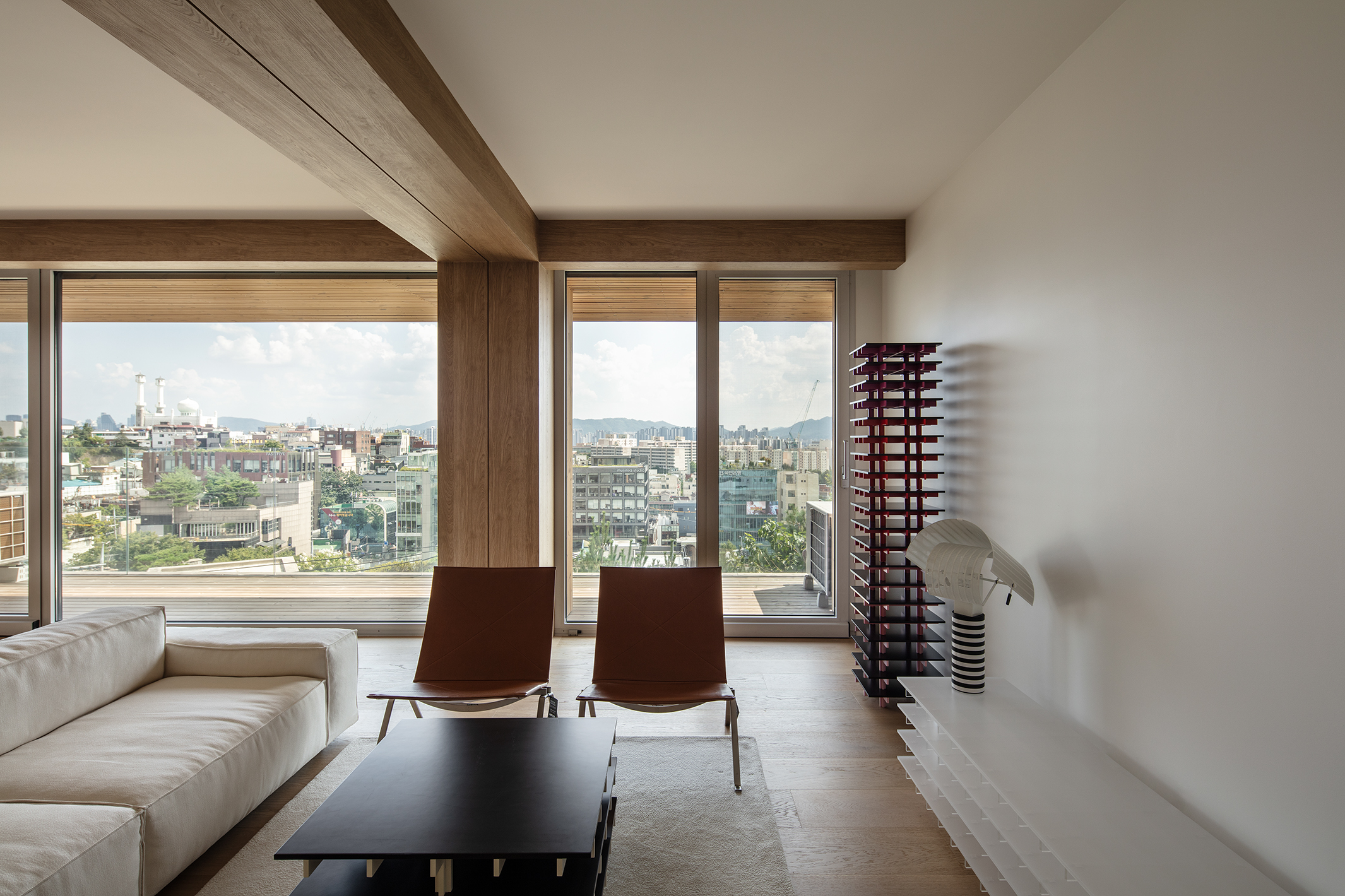
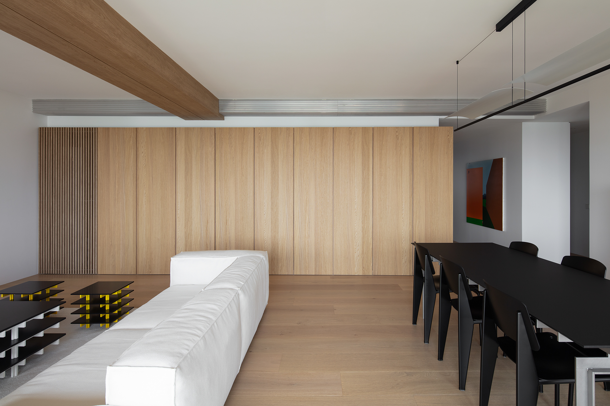
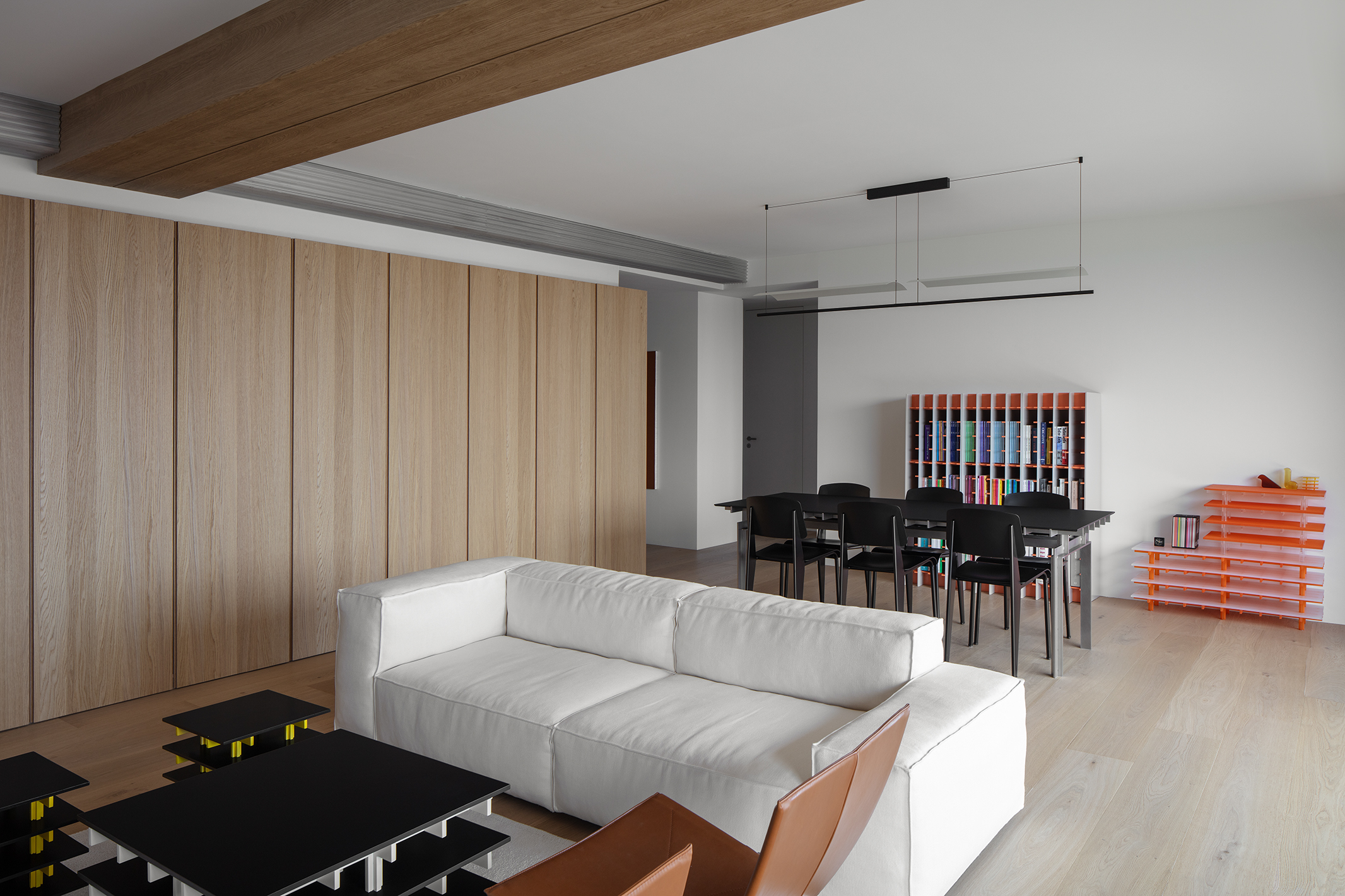
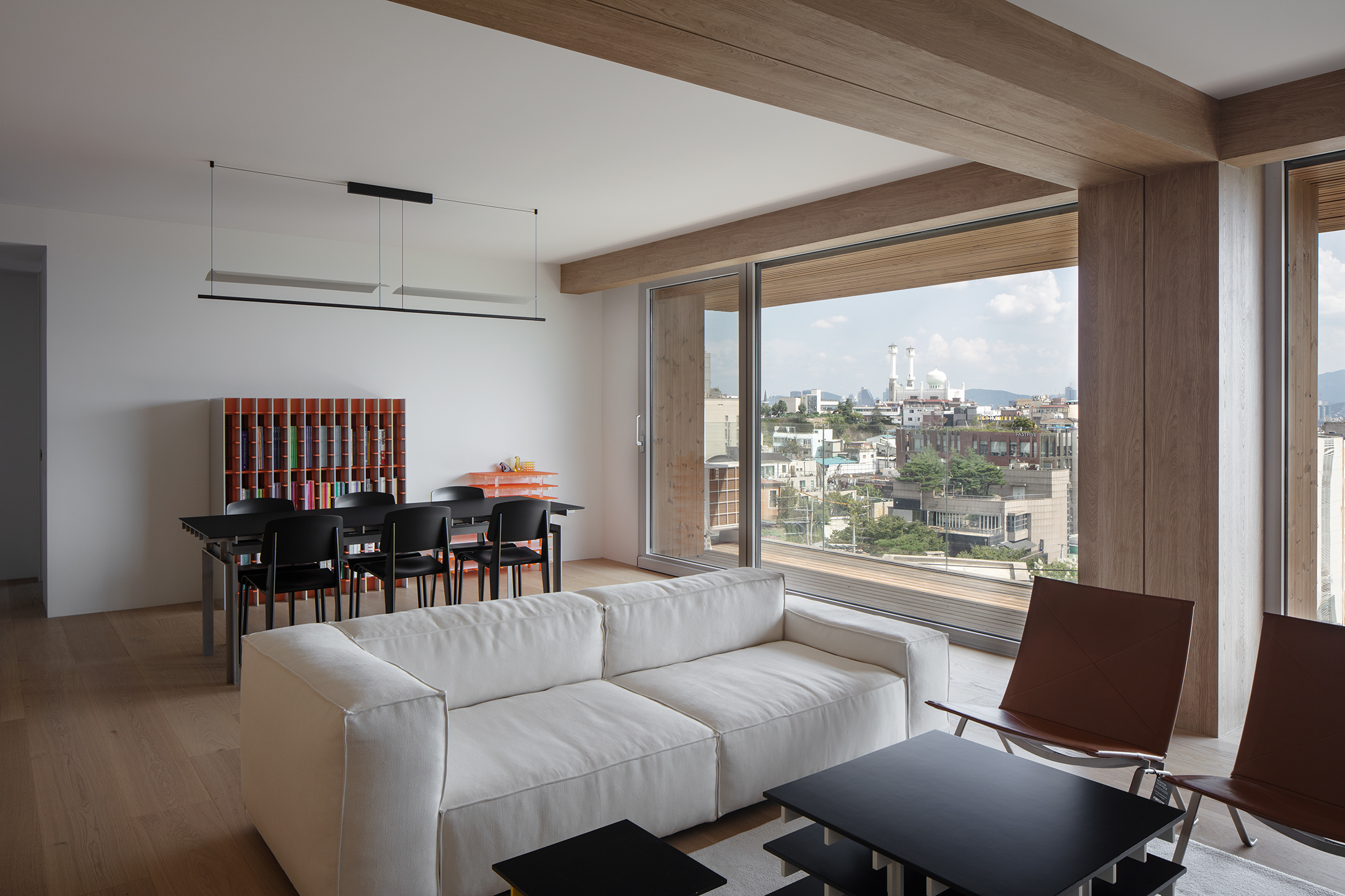
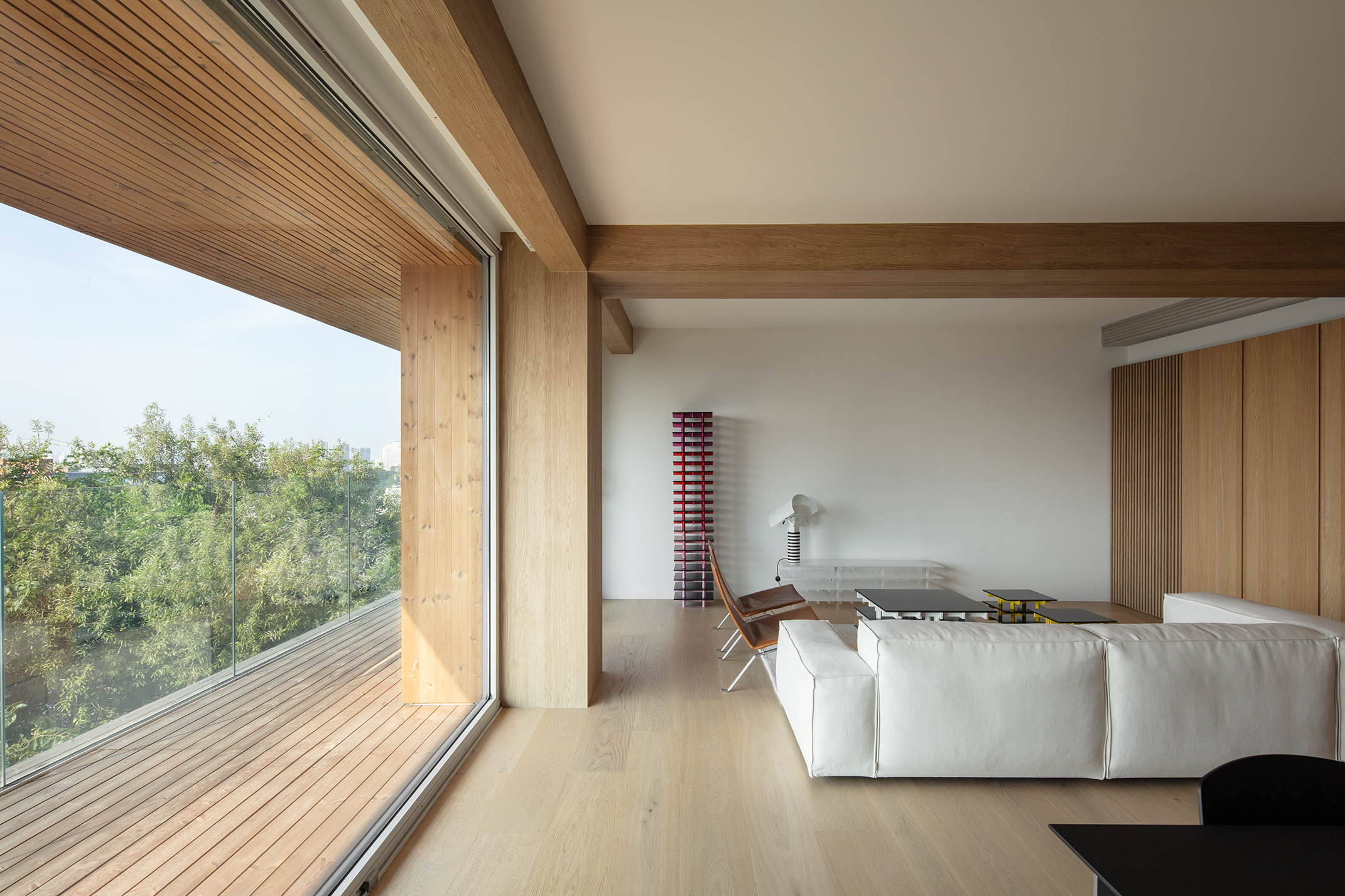
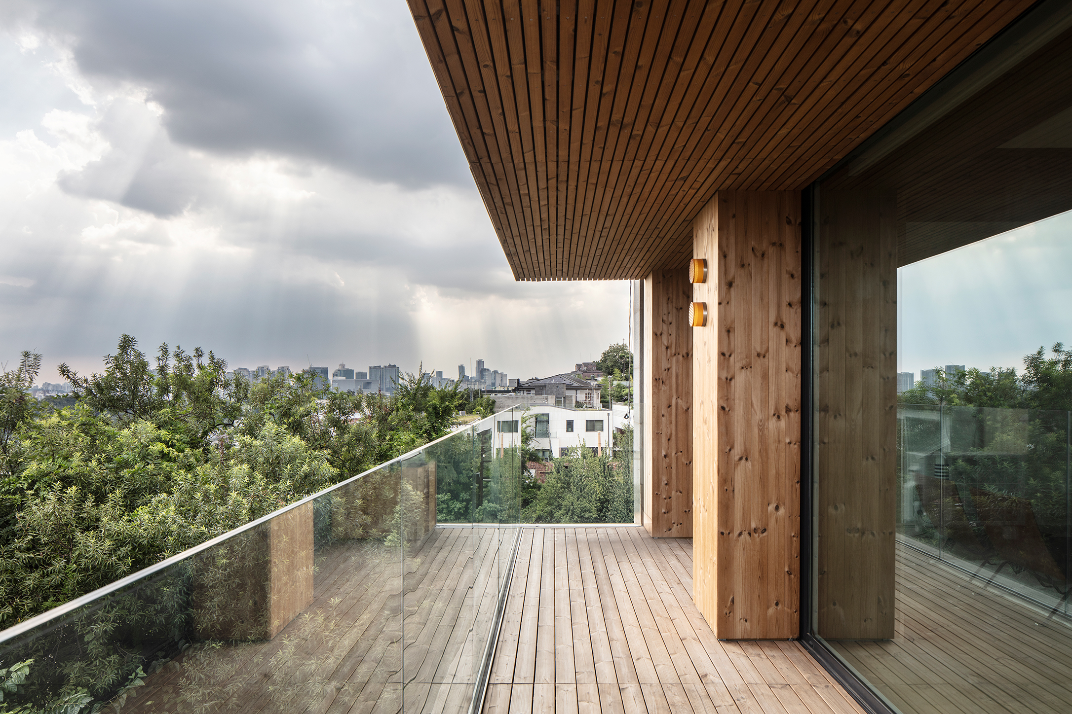
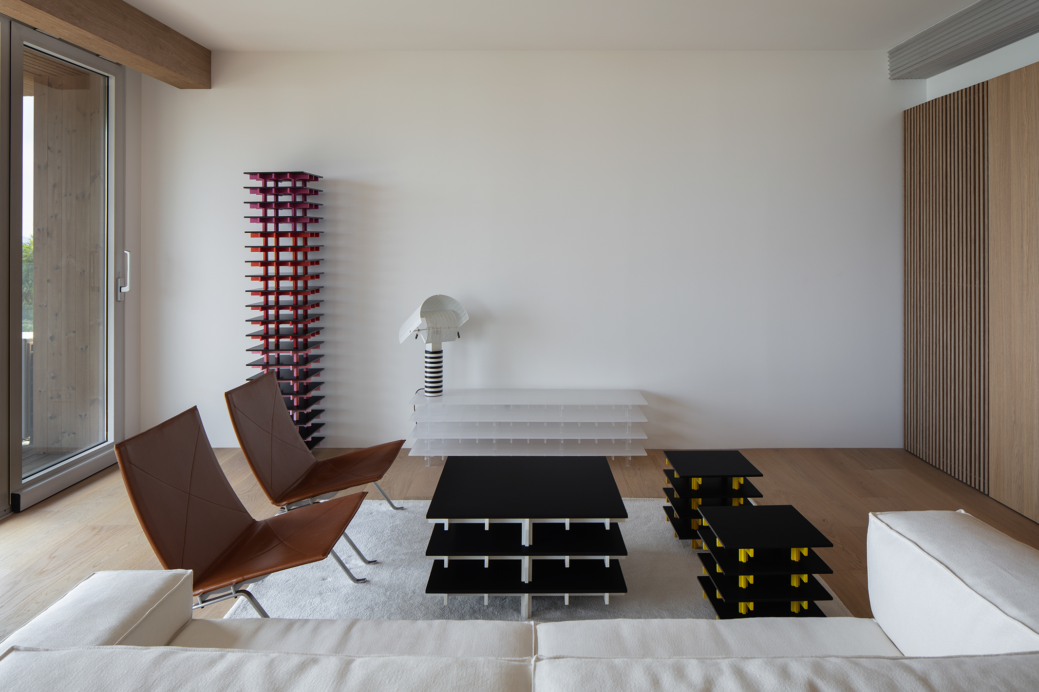
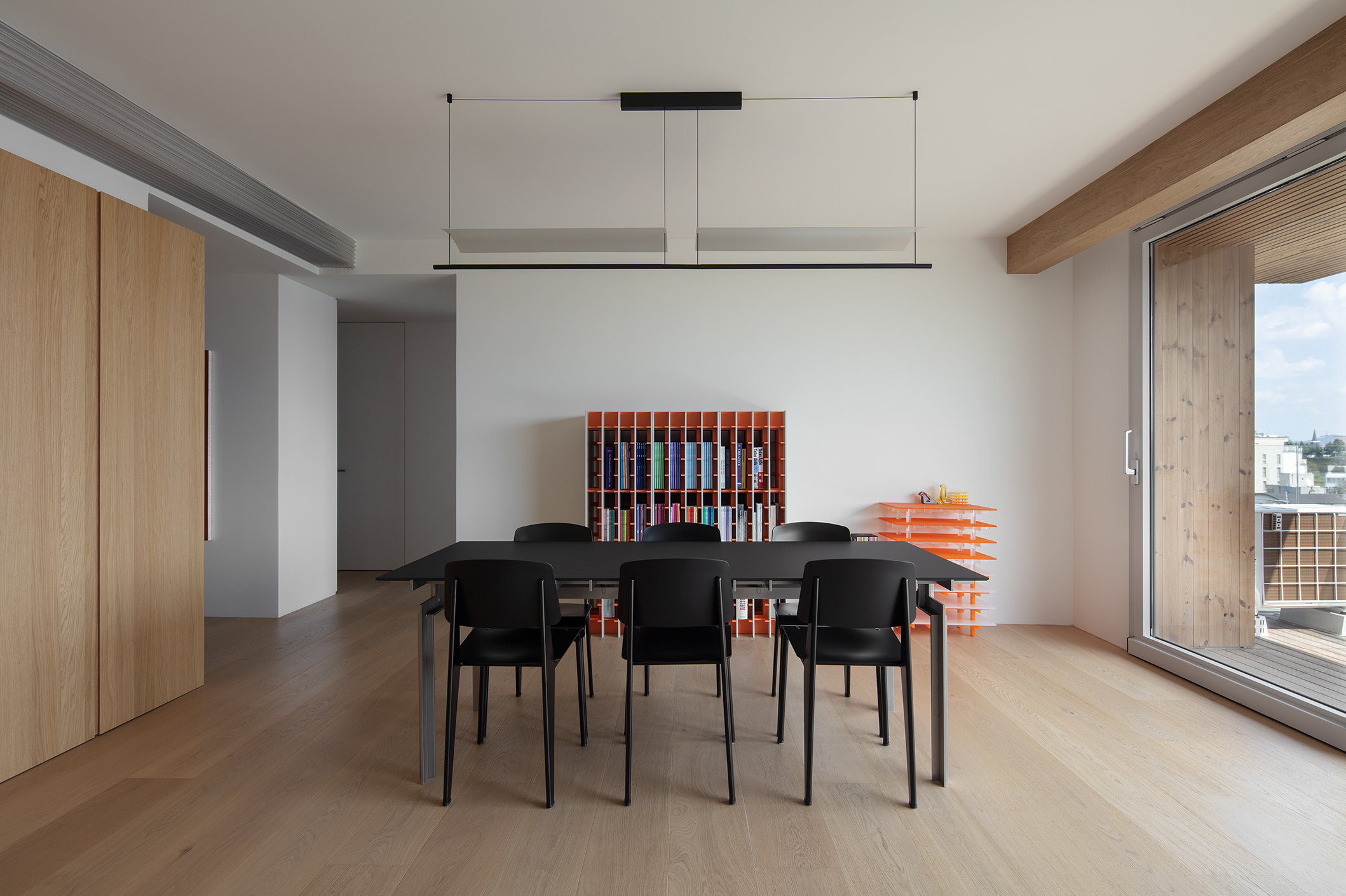
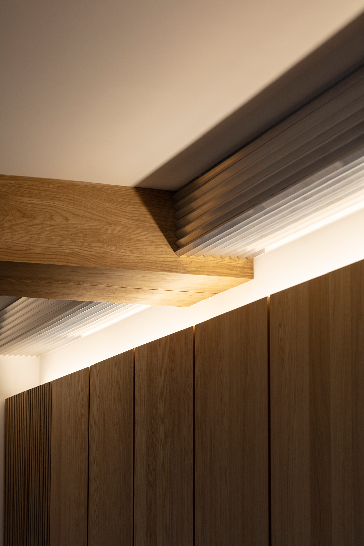
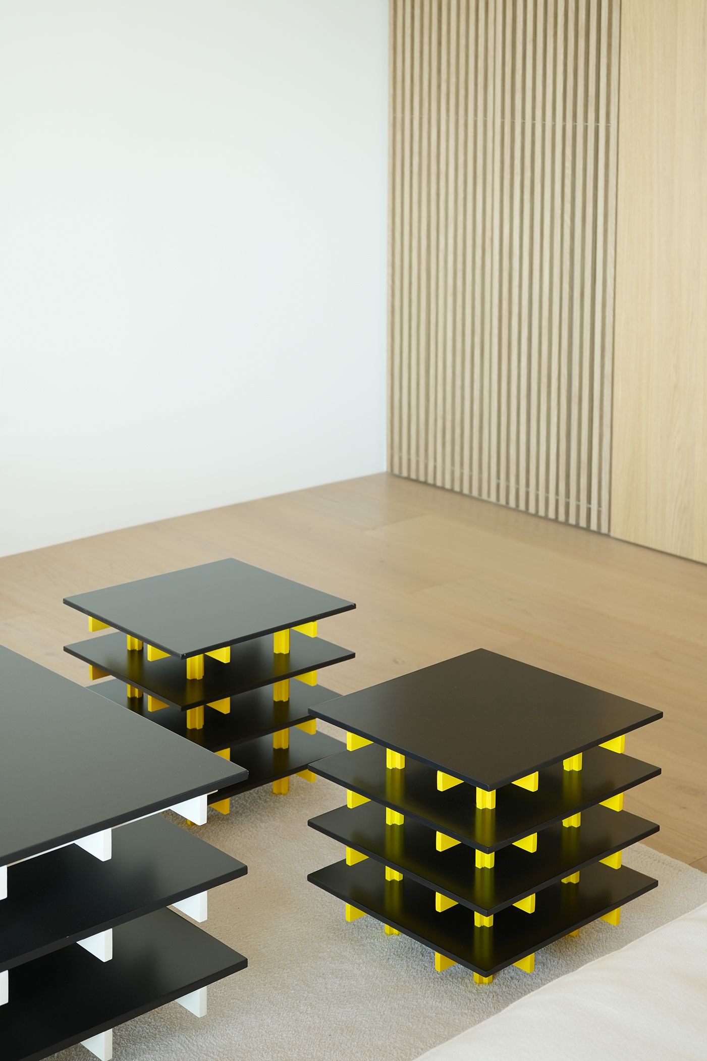
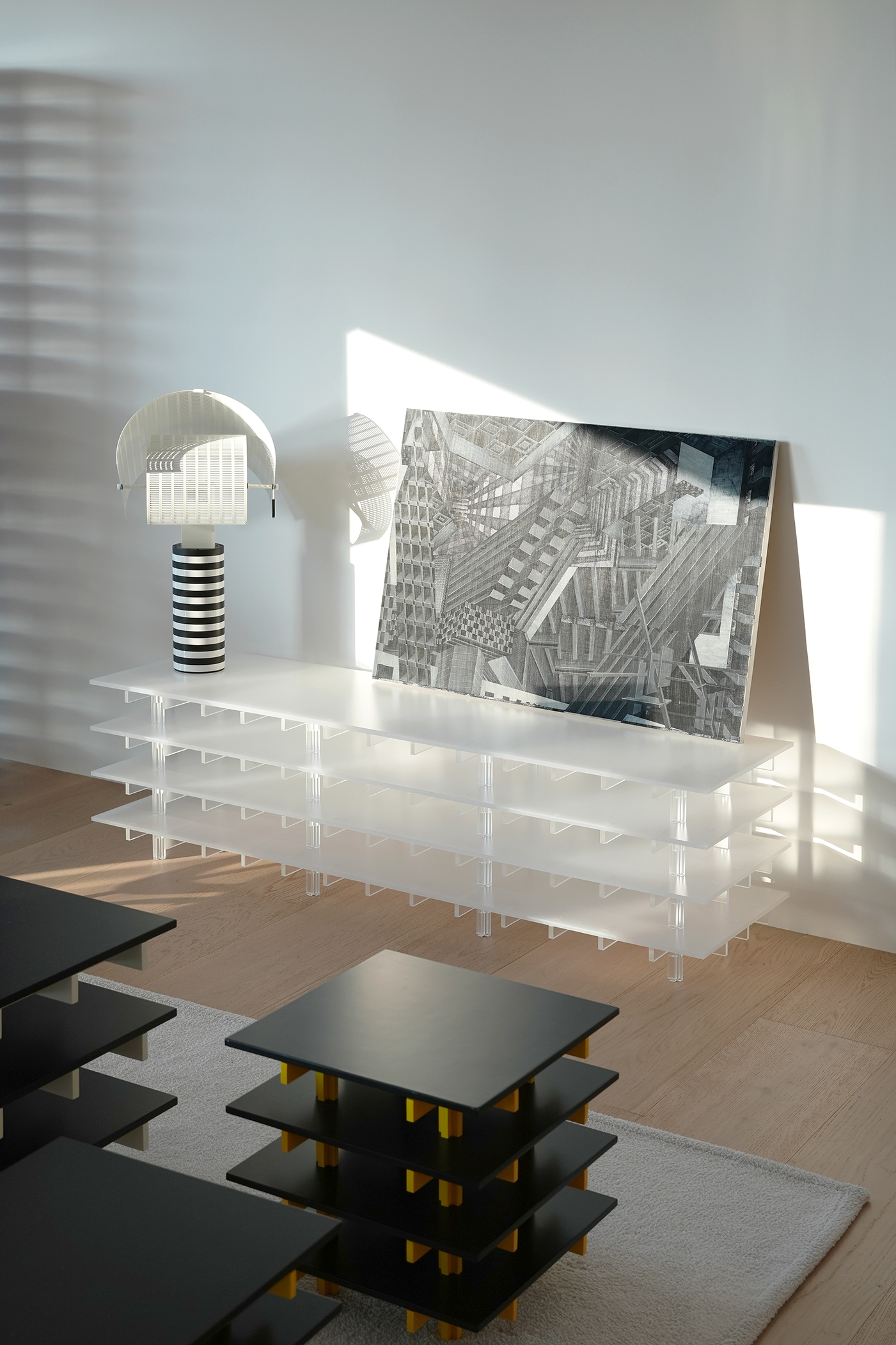
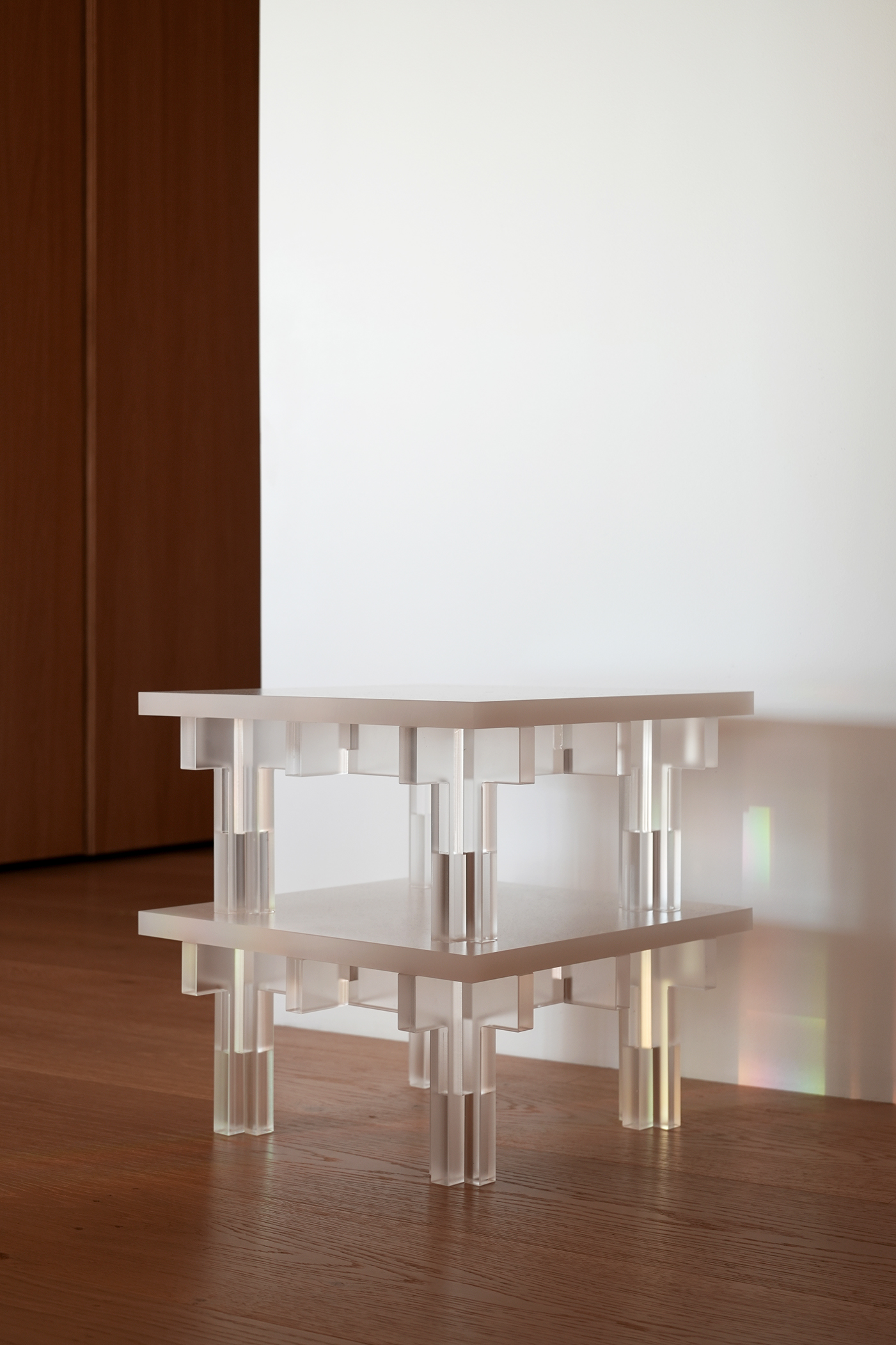
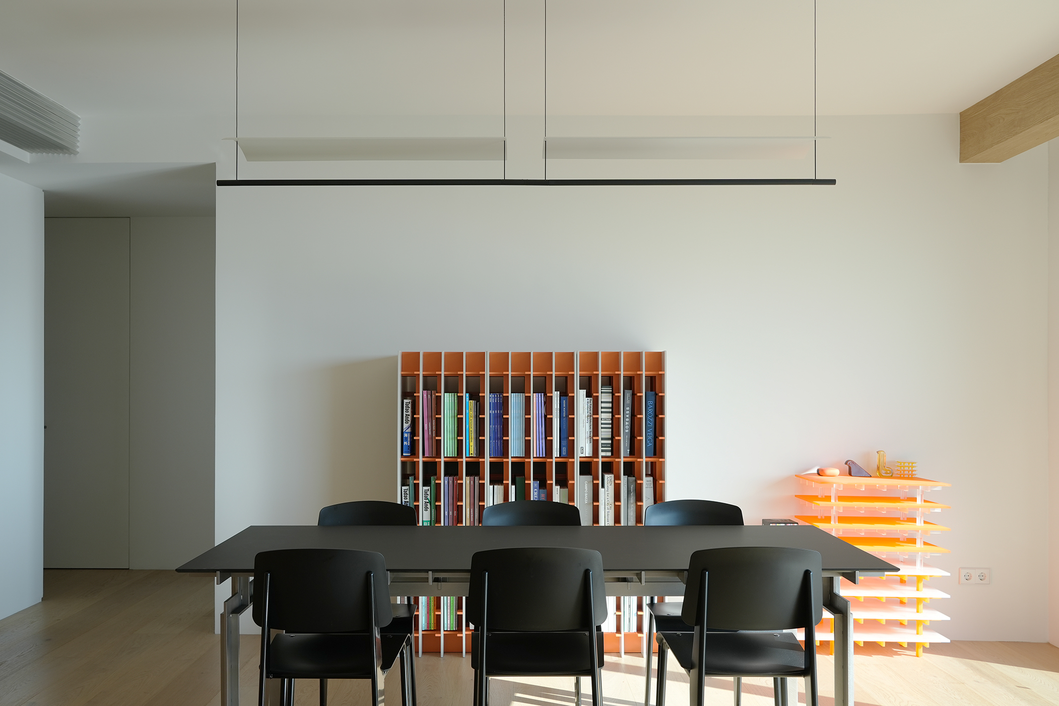
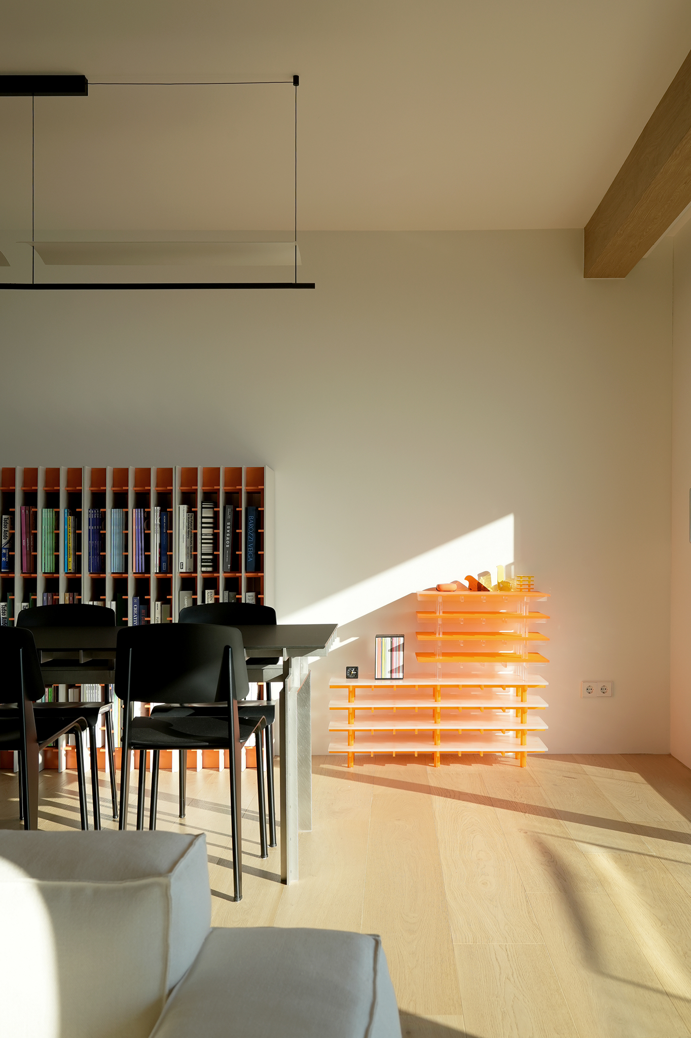
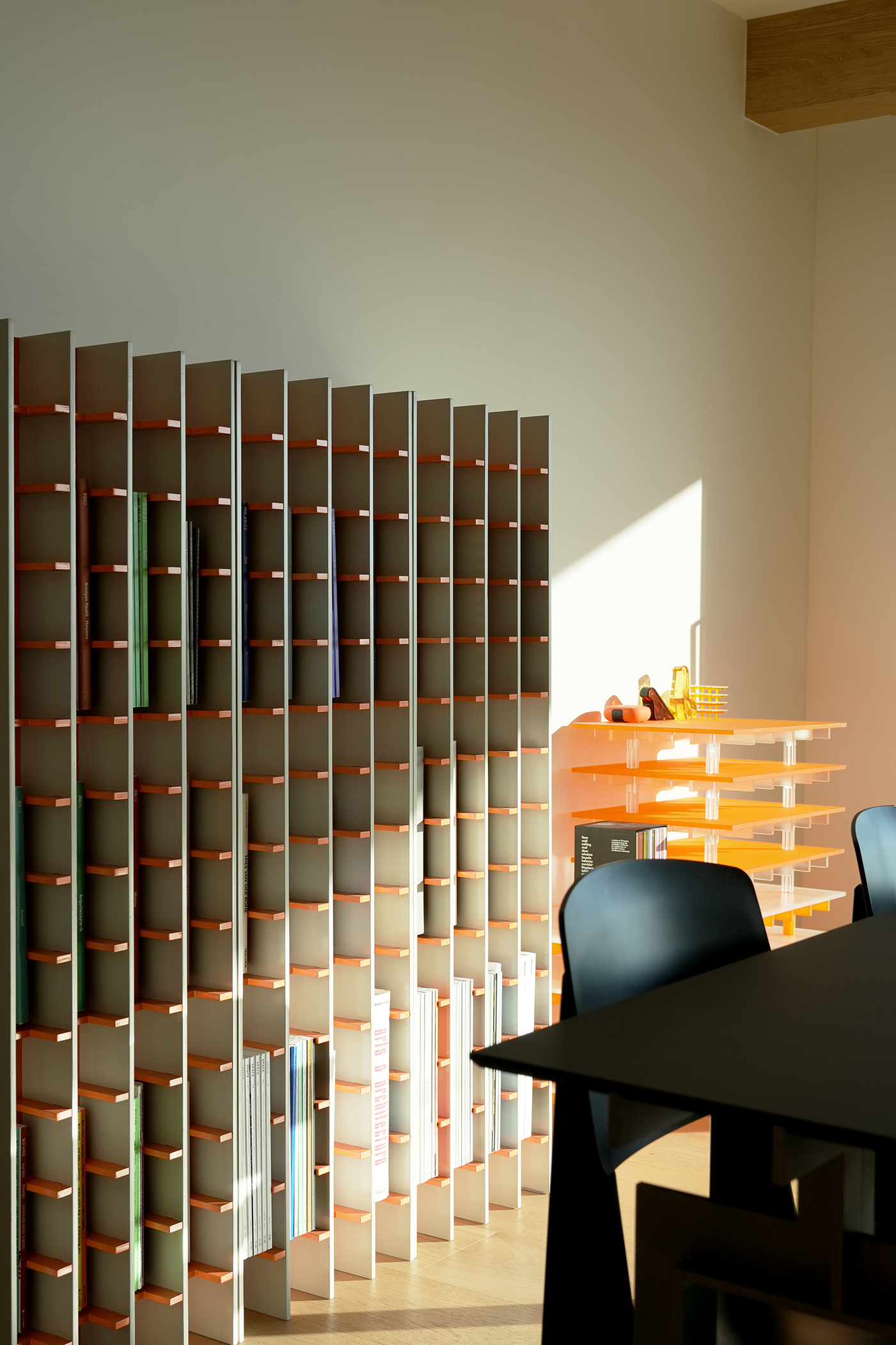
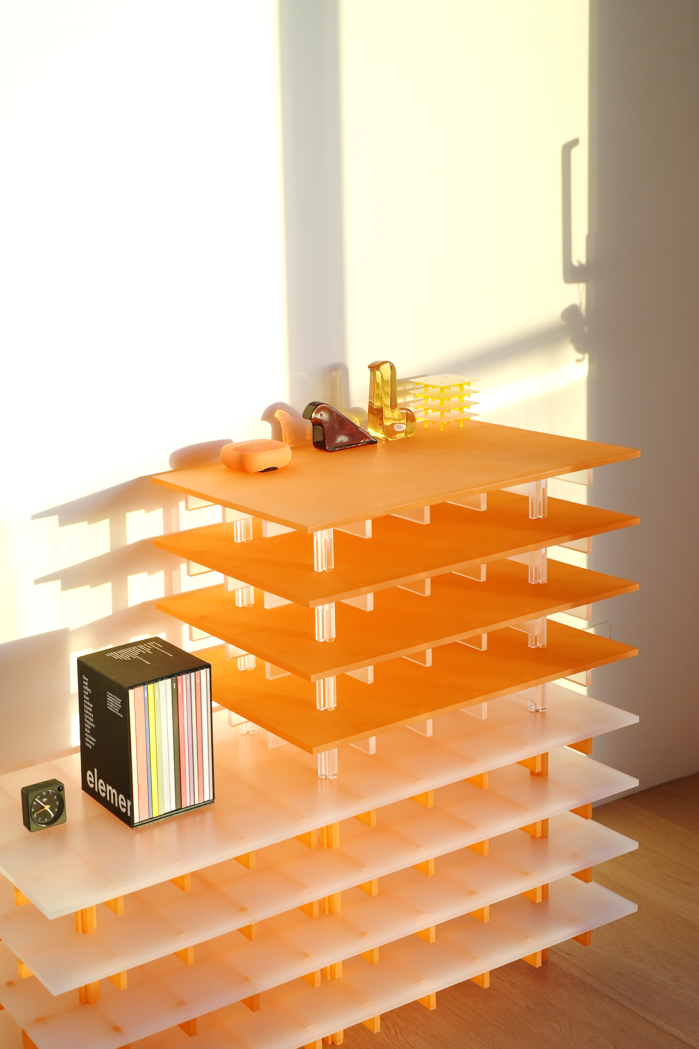
Photo by Kiwoong Hong, SeungBum Ma
The living room is where the family spends the most time and is where they stay with visitors. It is largely divided into an area with tables and chairs and an area with sofas and low armchairs.
Here, I wanted to create an atmosphere for the entire space by utilizing the original arrangement of columns and beams. The ceiling was raised as high as possible, but the small beams were hidden, and only the beams connected to the pillars were emphasized, creating the appearance of trees growing from the pillars extending in three directions. To emphasize this, white oak was applied to the columns and beams, and a joint was placed in the middle to segment the excessive thickness. These elements naturally frame the view outside the window and separate the table and sofa areas. The beam in front of the window also serves to hide the blinds and lights.
Above the table (Op. 7), lighting consisting of black lines and white curved surfaces was placed to create a cheerful yet elegant atmosphere. Because the positions and sizes of the tables, lights, and chairs were decided at the interior design stage, they create a complete atmosphere even though they were installed at different times.
The white oak volume of the entrance continues here and becomes a storage cabinet. An unusual metal passes through the top of this volume. This element is made of extruded aluminum, and its folded and curved surface reflects light at various angles, creating a mysterious and secret atmosphere in the living room. After sunset, it is illuminated and glows silver.
The original terrace had rusty, gaudy-looking railings, and the deck and ceiling materials had been damaged over the years. To ensure the completeness and safety of the space, complete demolition was carried out.
The design extends the living room's warm wooden materials to the outdoor space. The floor, walls, and ceiling finishing materials are all made of heat-treated wood (carbonized wood) so that it can be read as an independent area. The height of the ceiling was lowered to create a single plane with no irregularities, and an air layer above prevents mold issues. This material gradually changes to gray as it receives natural light, capturing changes over time, and on rainy days, it exudes a subtle woody scent, making it refreshing. The railing maximizes the openness of the interior space by making its presence disappear as much as possible.
거실은 가장 많은 시간을 보내는 곳이기도 하고, 방문하는 이들과 머무르는 장소다. 크게 테이블과 의자가 놓여진 영역과 소파와 낮은 안락의자가 있는 곳으로 구분된다.
이곳은 원래 있던 기둥과 보의 배열을 활용해 전체 공간의 분위기를 만들고 싶었다. 천장을 최대한 높이되 작은 보들은 숨기고 기둥과 이어지는 보만 강조하여 마치 기둥에서 자라난 나무가 세 가지 방향으로 뻗어나가는 모습을 만들었다. 이를 강조하기 위해 기둥과 보에 화이트 오크를 적용하였고, 중간에는 줄눈을 두어 너무 과한 두께감을 분절했다. 이러한 요소들은 자연스레 창 밖의 풍경을 프레임짓고, 테이블과 소파 영역을 구분한다. 창문 앞의 보는 블라인드와 조명을 숨기는 역할을 겸한다.
테이블(Op.7) 위에는 검정색의 라인과 흰색의 곡면으로 구성된 조명을 두어 경쾌하면서도 우아한 분위기를 만들었다. 테이블과 조명, 의자는 인테리어 디자인 단계에서부터 위치와 사이즈가 결정되었기 때문에, 비록 설치된 시기는 다르지만 하나의 완결된 분위기를 만들어낸다.
현관의 무늬목 볼륨은 이곳에서도 이어지고 수납장이 된다. 이 볼륨의 상부에는 특이한 금속이 지나간다. 이 요소는 알루미늄을 사출해서 만들어졌는데, 접혀지고 굴곡진 표면은 다양한 각도로 빛을 반사해서 거실에 신비하고 비밀스러운 분위기를 형성한다. 해질녘 이후에는 조명을 받아 은빛으로 발광한다.
본래 테라스에는 녹이 슬고 요란하게 생긴 난간이 있었고, 데크와 천장재들도 오랜 세월에 걸쳐 훼손되어 있었다. 공간의 완성도와 안전을 위해 전면 철거를 진행했다.
디자인은 거실의 따뜻한 나무 재료를 외부공간으로 연장하되, 독립된 하나의 영역으로 읽힐 수 있도록 바닥, 벽, 천장 마감재 모두를 열처리 목재(탄화목)로 만들었다. 천장은 요철이 없는 하나의 평면이 될 수 있도록 높이를 낮추었고, 위에 공기층을 지녀 곰팡이 이슈를 예방한다. 이 재료는 자연광을 받으면서 점점 회색으로 변화하여 시간에 따른 변화를 담아내며, 비가 오는 날에는 은은한 나무향을 풍겨 상큼하다. 난간은 최대한 그 존재감을 사라지게 하여 실내공간의 개방감을 극대화한다.
Drawing by SeungBum Ma